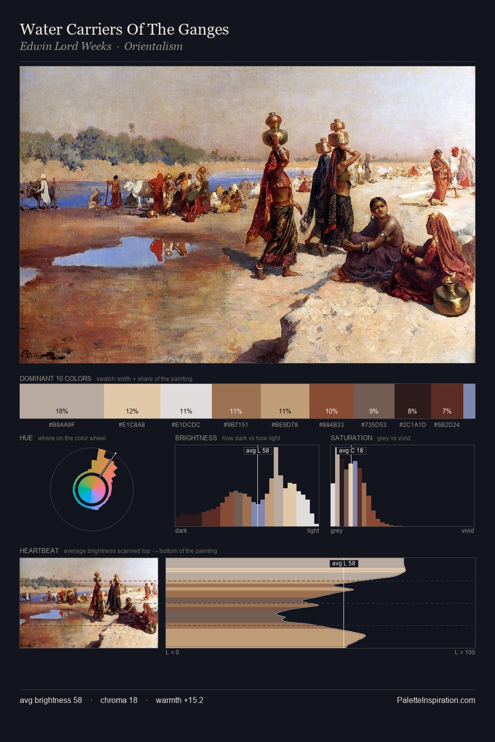
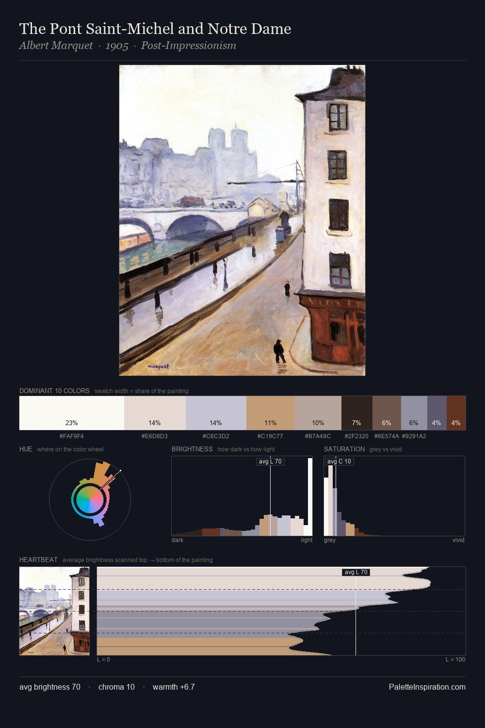
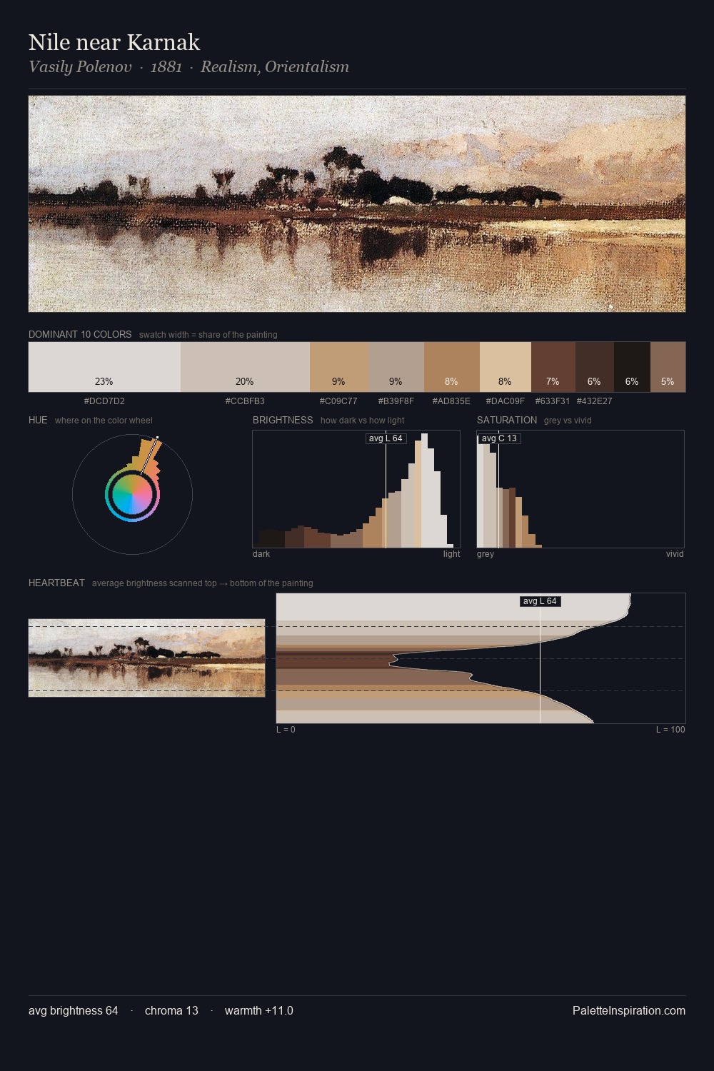
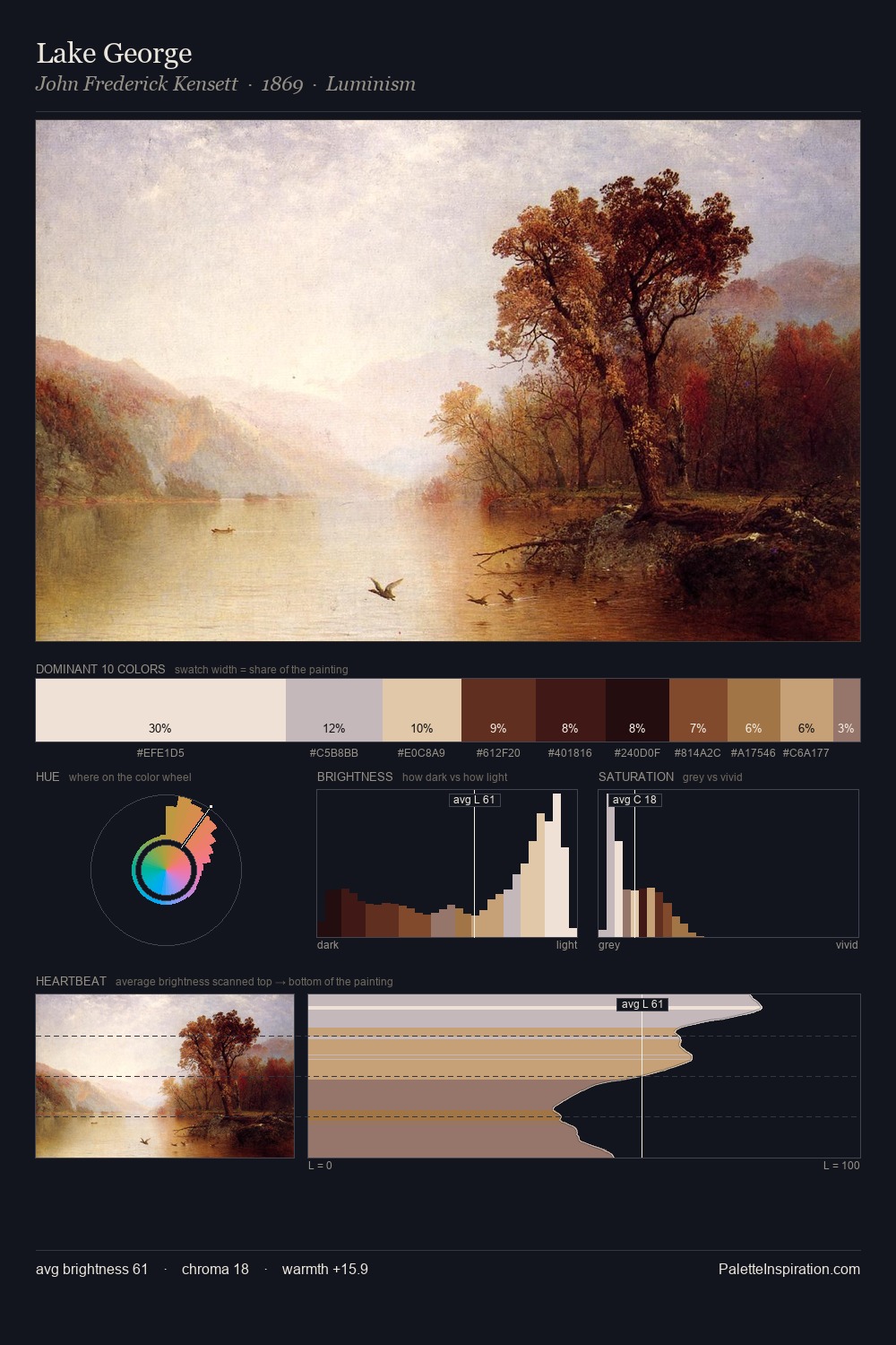
George Clausen Palette 1

Palette Analysis
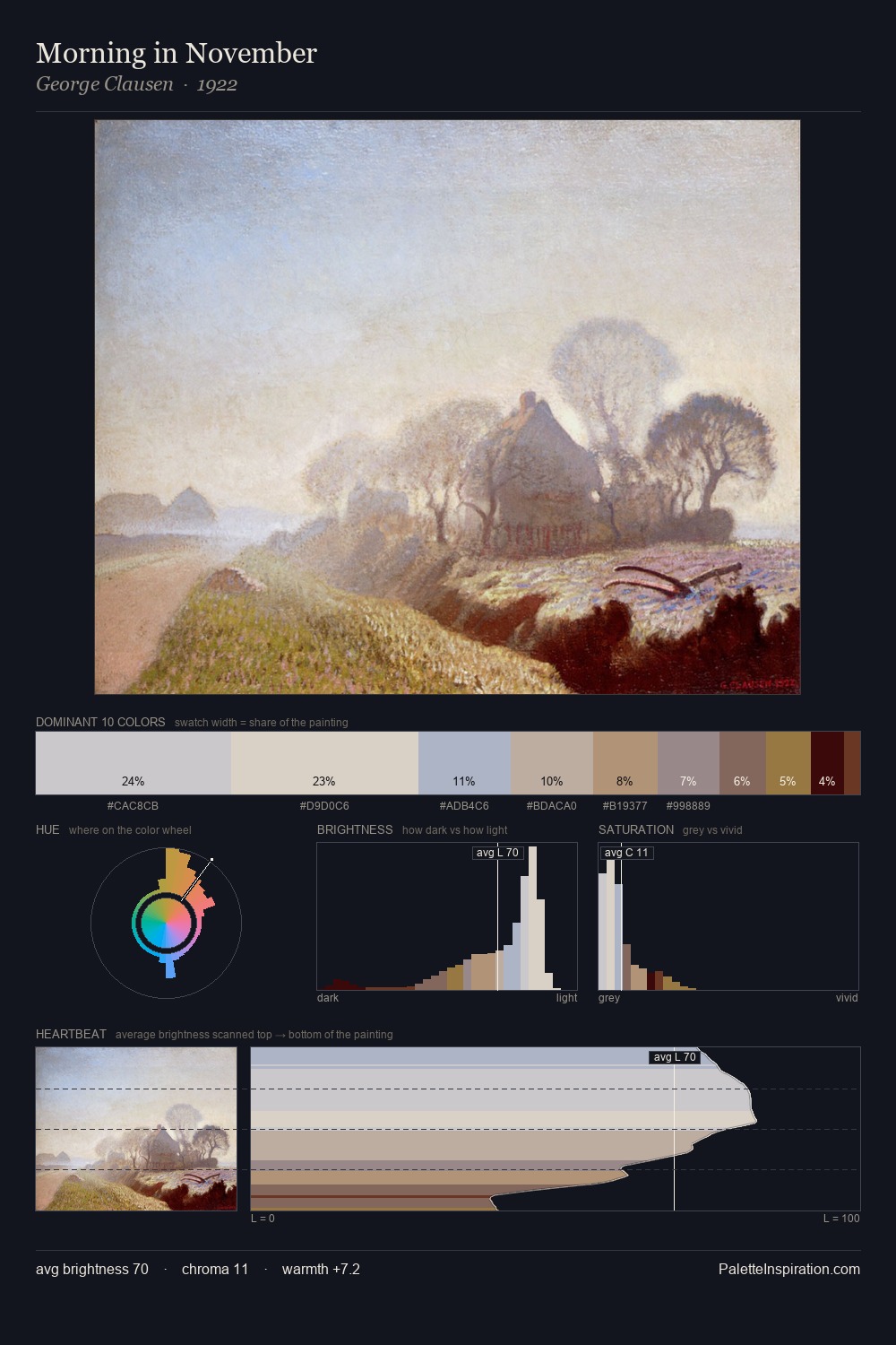
George Clausen is high-key - luminous, open, and weighted toward light. Warm hues command this palette; George Clausen favours the reds, oranges, and yellows of firelight and earth. Chroma is kept low across all colours, producing the soft, enveloping quality that characterises tonal painting. A single dominant - #D0CAC5 at 27.7% - sets the character of the whole composition. At 6.7%, #A27D57 carries the palette's sharpest chromatic charge: an accent that earns its place precisely because it is withheld. From deepest dark to palest light, the palette traverses 60 units of the value scale - a span that creates natural depth. George Clausen's palette 1 carries its own internal logic while remaining in conversation with the artist's broader colour intelligence.
Example use cases
- florist branding
- event design
- real estate
- jewelry retail
- hospitality branding
I Love This!
Copy, export, or download for your project