Childe Hassam Palette 10

Palette Analysis
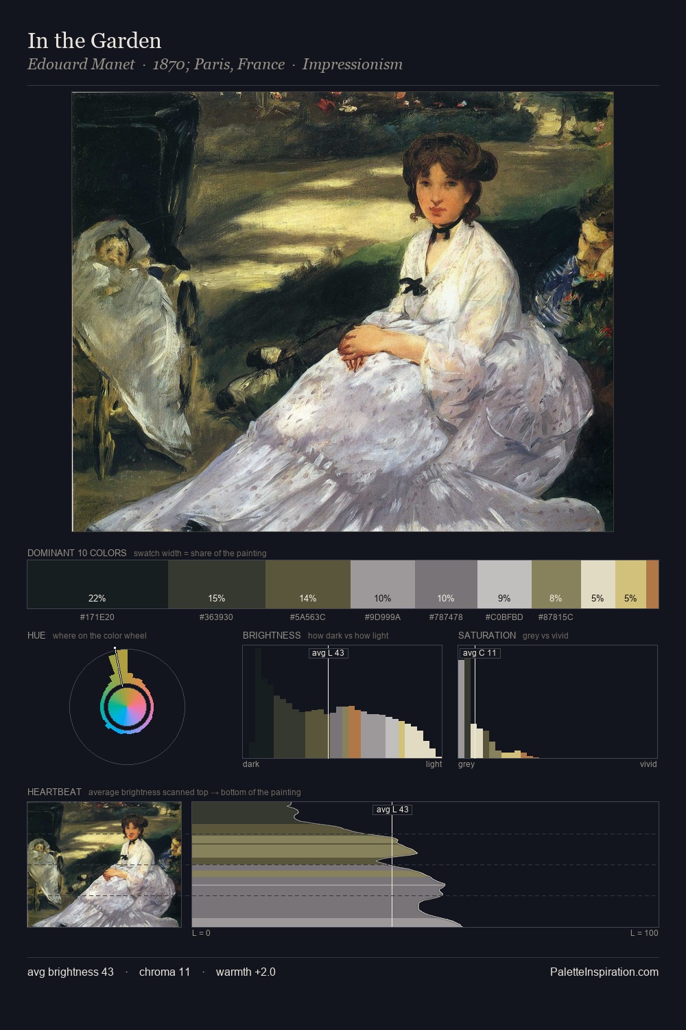
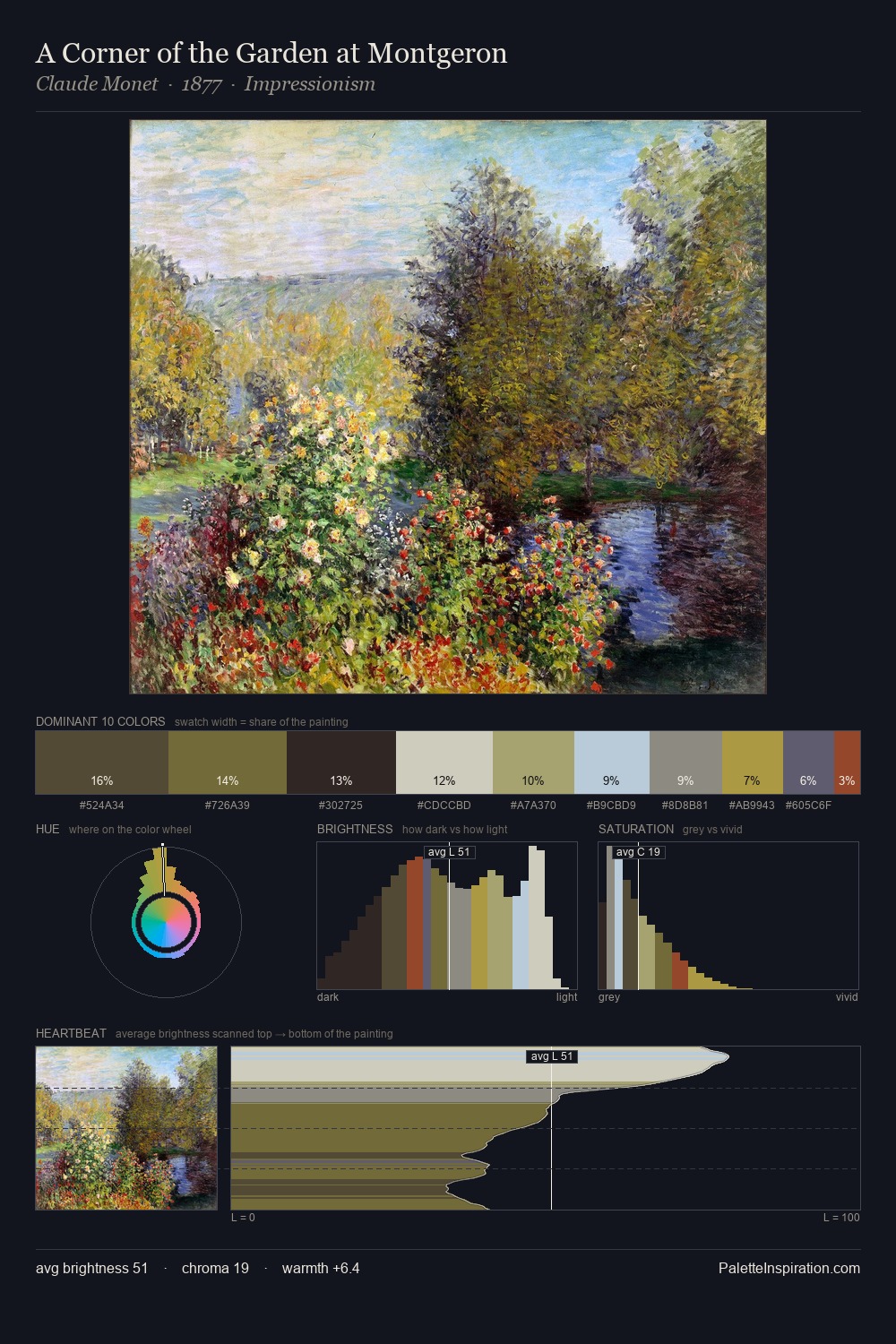
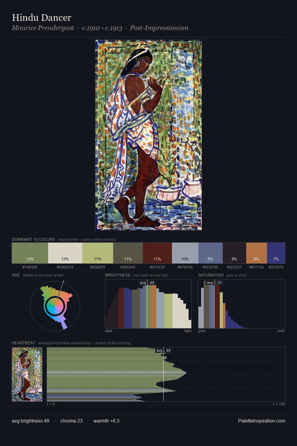
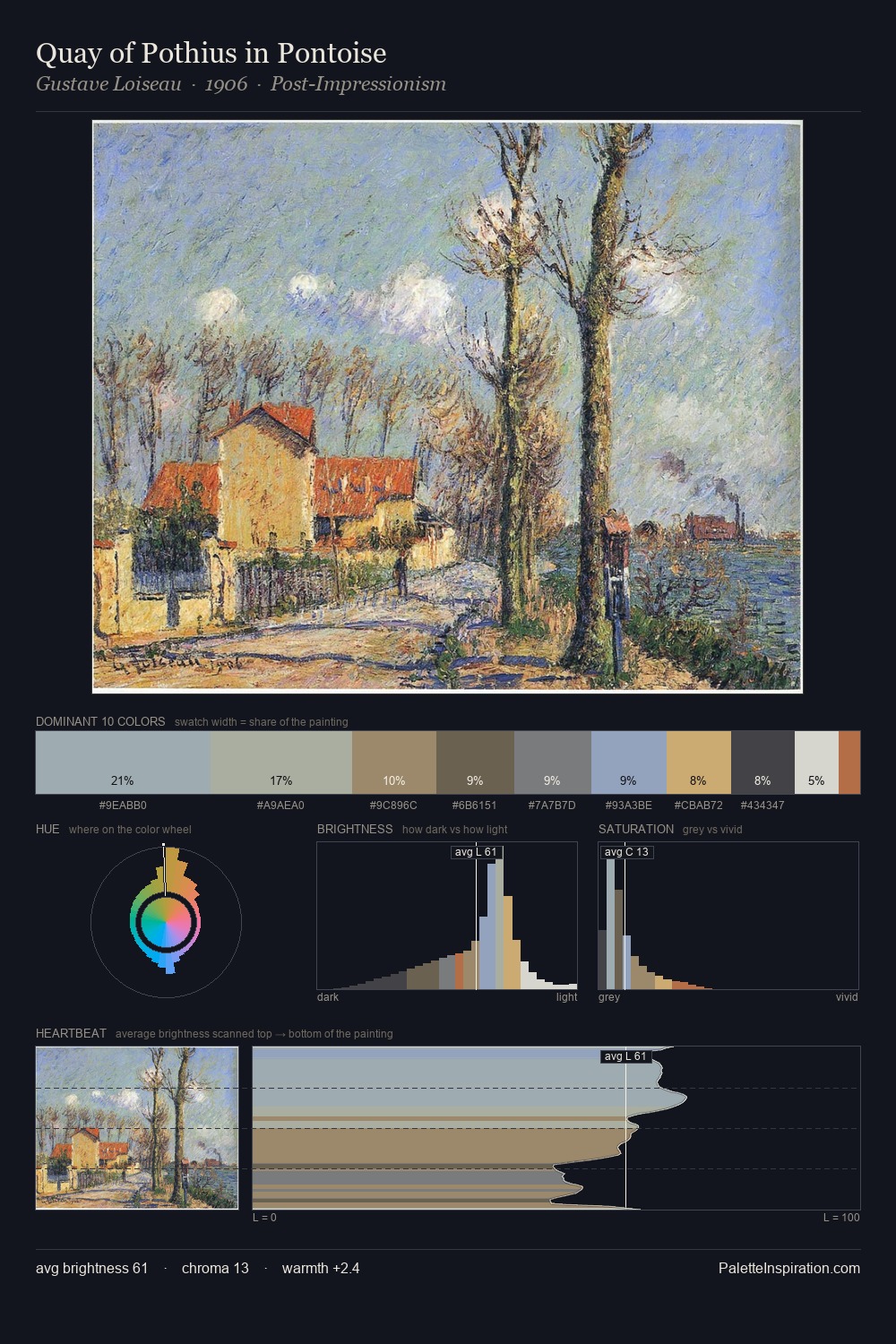
The high-key values of Childe Hassam give it an effulgent, almost bleached quality. Childe Hassam tilts toward cool - blues and silver-greys carry the structural weight. Muted throughout, the palette achieves its effects through value and temperature rather than chromatic force. The dominant colour, #E5E2DC, takes 25.2% of the total area, establishing the overall mood before any other hue is introduced. The highest-chroma note - #B5694E - appears at just 1.9%, deployed as a precision accent against the quieter ground. From deepest dark to palest light, the palette traverses 60 units of the value scale - a span that creates natural depth. High luminosity and cool temperature suggest the plein-air condition: unfiltered daylight and open sky. Childe Hassam's palette 10 carries its own internal logic while remaining in conversation with the artist's broader colour intelligence.
Example use cases
- florist branding
- event design
- real estate
- jewelry retail
- hospitality branding
I Love This!
Copy, export, or download for your project