Childe Hassam Palette 3

Palette Analysis
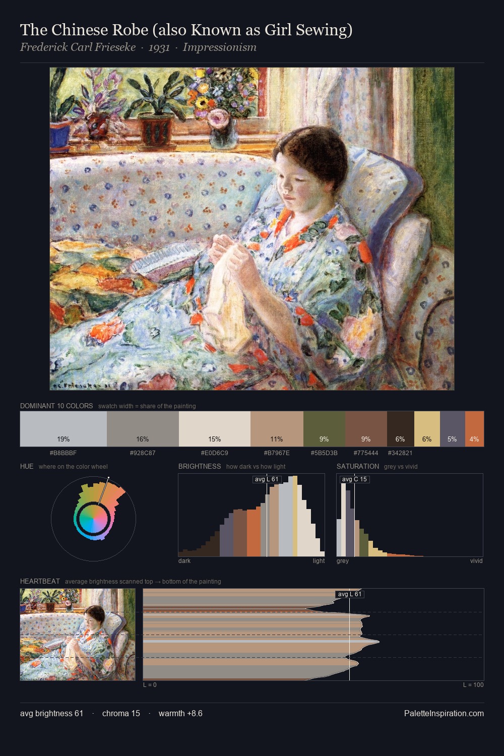
The high-key values of Childe Hassam give it an effulgent, almost bleached quality. Childe Hassam tilts toward cool - blues and silver-greys carry the structural weight. All colours lean toward grey, building depth through value rather than colour punch. At 32.7%, #E9E6D7 functions less as a colour accent and more as a complete atmospheric environment. The most saturated colour, #C6AD8A, is reserved to 4.2% of the surface, where it acts as a focal punctuation. At 64 units of value range, the palette has the tonal breadth to sustain complex spatial readings. The mid-to-high key, cool bias, and moderate chroma point to outdoor observation - sky and diffused daylight as the dominant light source. Palette 3 sits within the larger chromatic argument that Childe Hassam's complete body of work advances.
Example use cases
- fashion retail
- home textiles
- travel platforms
- beauty packaging
- food & beverage
I Love This!
Copy, export, or download for your project