George Clausen Palette 2

Palette Analysis
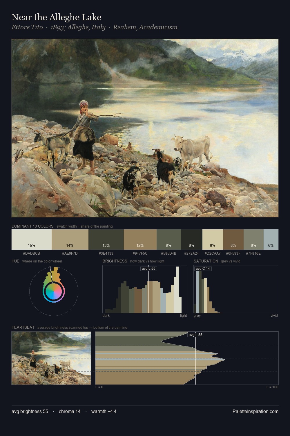
George Clausen distributes its values across the middle register, creating harmony without high contrast. Cool tones set the register here - the blues and greens easily outweigh any warm accents. Saturation is deliberately withheld - the beauty here lies in the near-monochromatic gradations rather than colour difference. #9FBBC1 functions as the palette's exclamation mark: highest chroma, lowest percentage (5.9%). From deepest dark to palest light, the palette traverses 58 units of the value scale - a span that creates natural depth. The palette has the character of outdoor light: cool, mid-bright, with colour rendered faithfully rather than expressively. Palette 2 sits within the larger chromatic argument that George Clausen's complete body of work advances.
Example use cases
- exhibition design
- foundation branding
- estate management
- art education
- museums & galleries
I Love This!
Copy, export, or download for your project