Esaias van de Velde Palette 5
Muted Parchment
Muted Deliberately desaturated - chroma pulled toward gray, the restraint of tonal painting.
Parchment Aged warm neutral - the color of old manuscript parchment, tan and slightly yellowed.

Palette Analysis
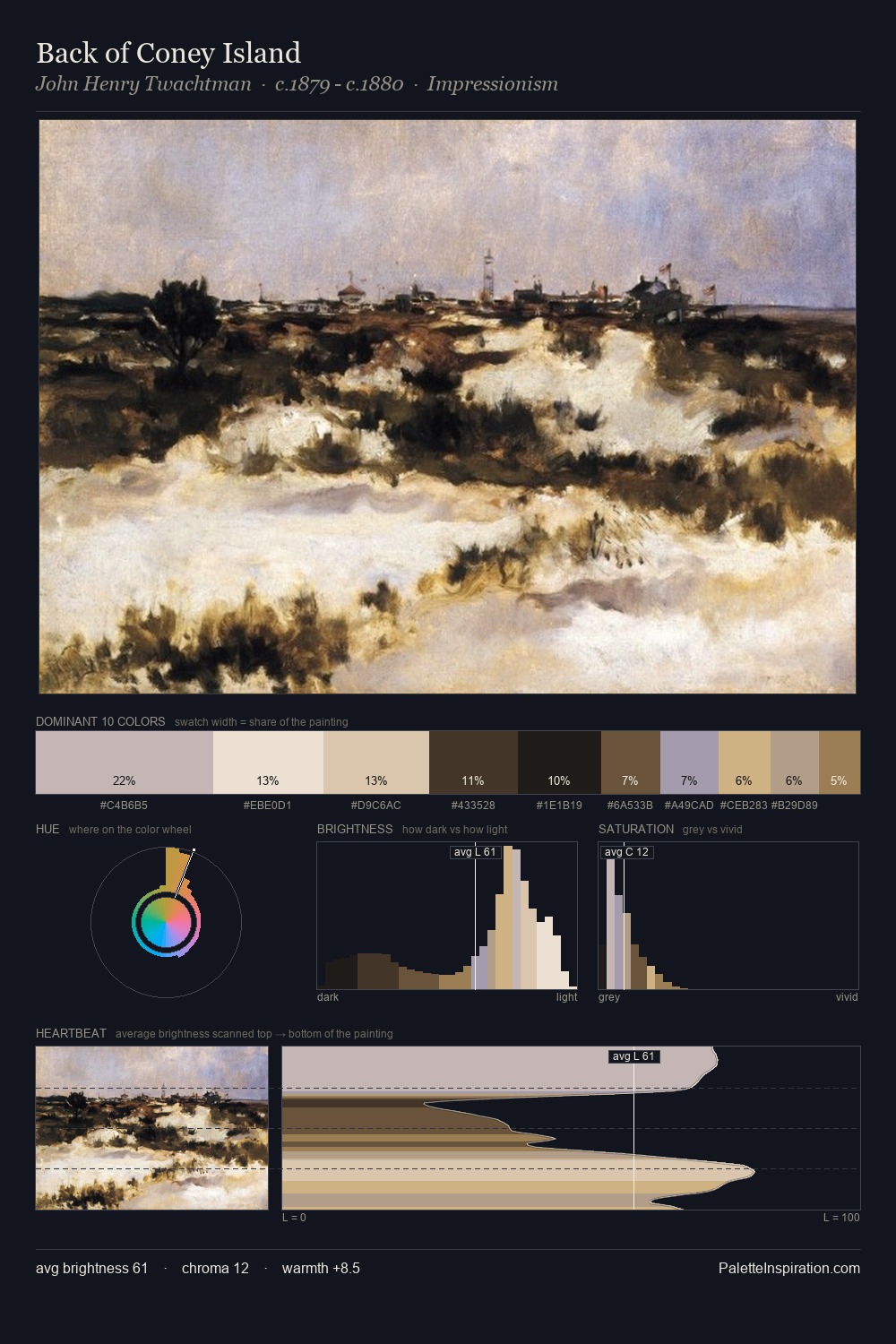
Esaias van de Velde distributes its values across the middle register, creating harmony without high contrast. Temperature is balanced: the palette pits warm earth against cool sky without declaring a winner. Chroma hovers near zero; colour declares itself through subtle shifts in hue rather than outright saturation. The saturated accent, #794E46, registers at 10.5% - sparse enough to feel like a deliberate surprise. The full value range is 66 units: broad enough to build convincing three-dimensional form. Esaias van de Velde's palette 5 carries its own internal logic while remaining in conversation with the artist's broader colour intelligence.
Example use cases
- exhibition design
- foundation branding
- estate management
- art education
- museums & galleries
I Love This!
Use This Palette
Copy, export, or download for your project
Copy, export, or download for your project
Copy:
Download:
Share: