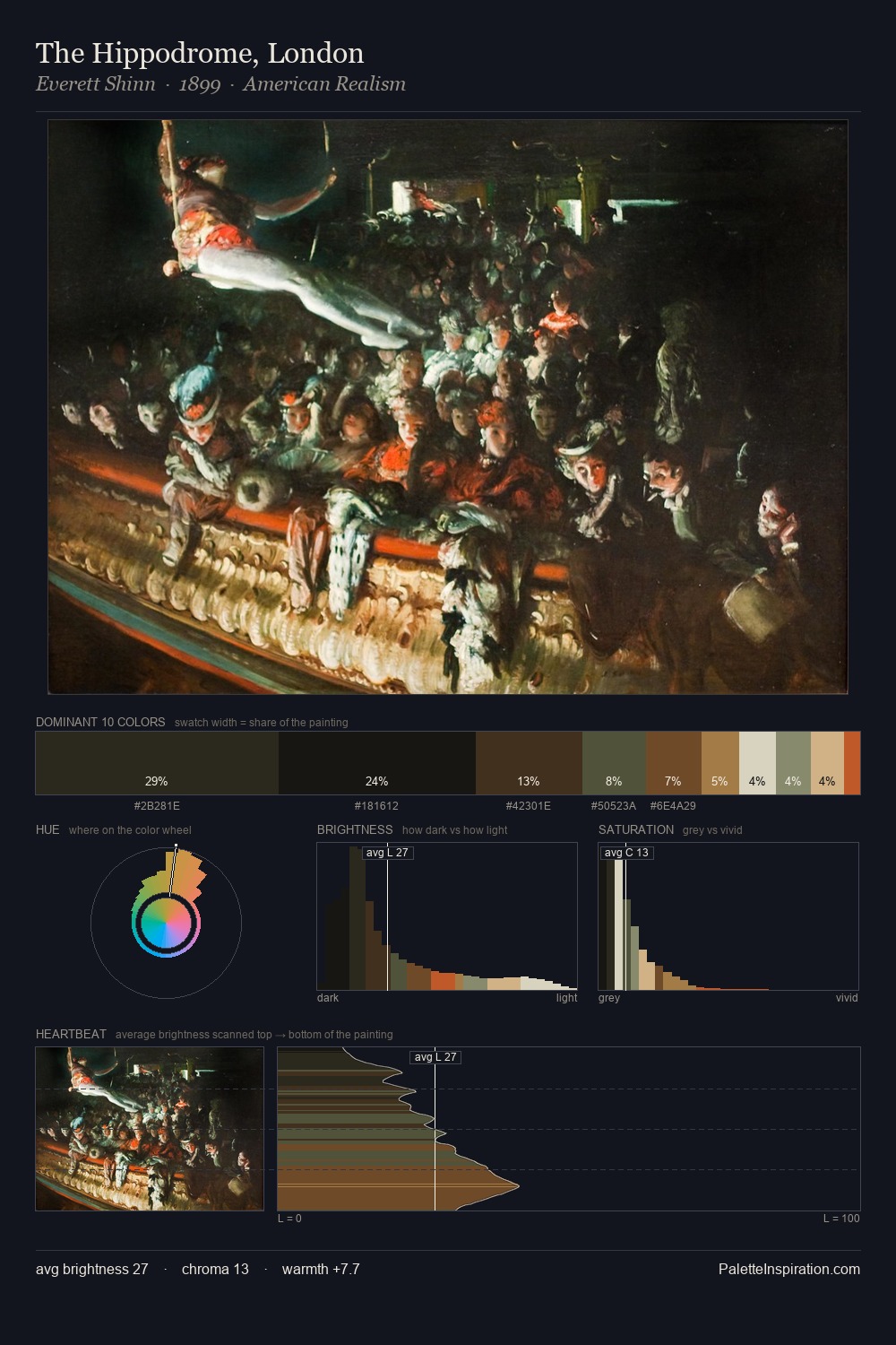
Edward Armitage Palette 5
Tenebrous Bister
Tenebrous Dark and murky - low-key values with obscured form, Baroque in temperament.
Bister Dark warm brown - a traditional ink and wash pigment made from wood soot.

Palette Analysis
Darkness anchors Edward Armitage; light is rationed, creating dramatic contrast rather than open air. Temperature is cool-dominant, with blue and green families claiming the largest areas. Every colour is desaturated; the palette proceeds through near-neutrals and gently-coloured greys. #70562C delivers the chromatic peak at only 8.1% - a small shot of colour with outsized visual impact. 48 units of value spread create a palette that is varied but unified - contrast in the service of harmony. Together these qualities place Edward Armitage firmly in the tonal tradition - concerned with mood and atmosphere rather than chromatic display. Palette 5 sits within the larger chromatic argument that Edward Armitage's complete body of work advances.
Example use cases
- theater design
- jewelry brands
- tobacco-adjacent retail
- event branding
- film & entertainment
I Love This!
Use This Palette
Copy, export, or download for your project
Copy, export, or download for your project
Copy:
Download:
Share: