Thomas Eakins Palette 12

Palette Analysis
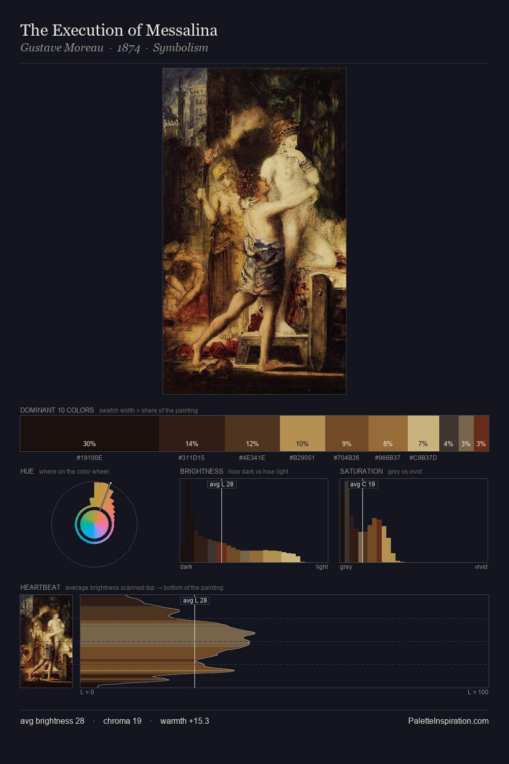
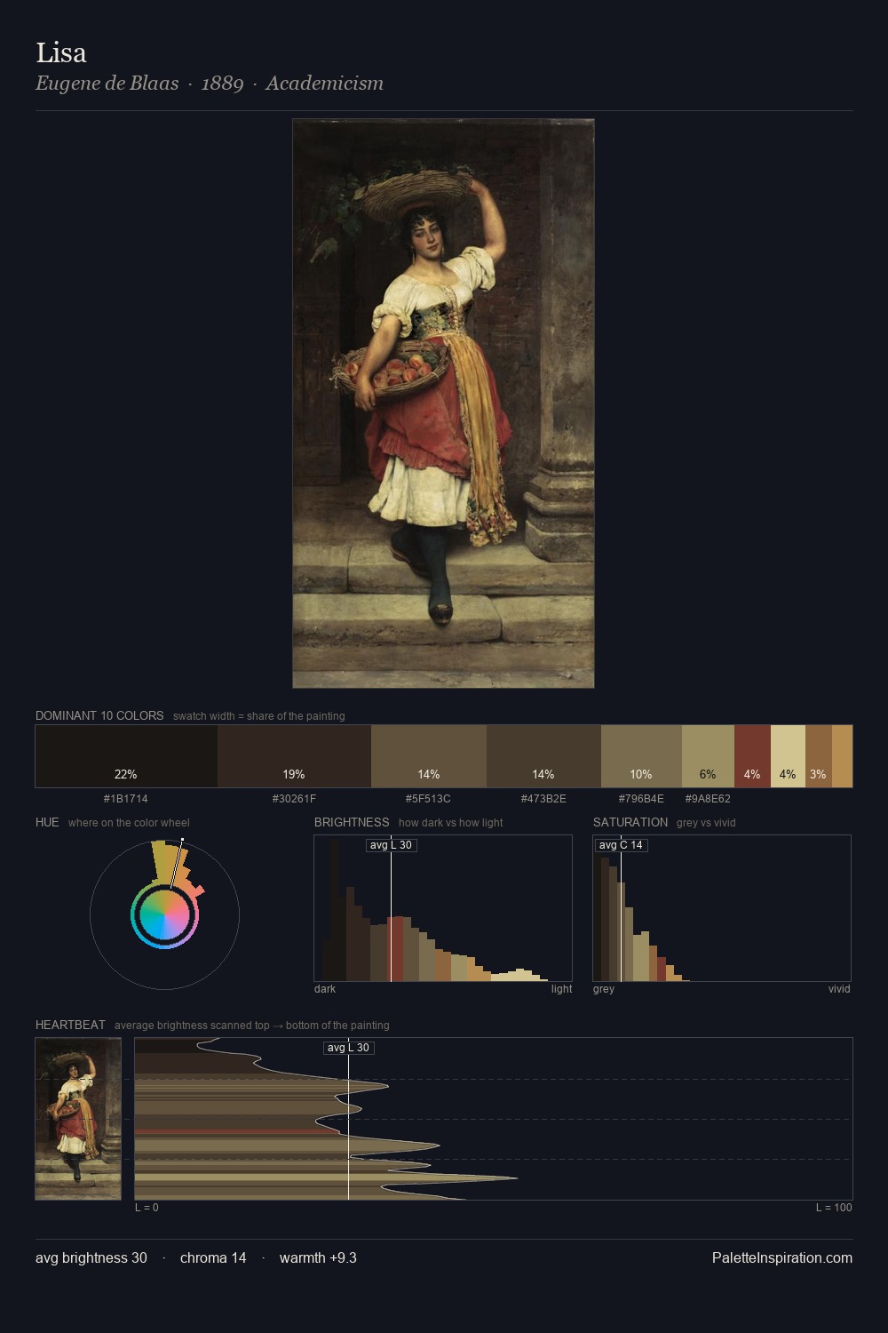
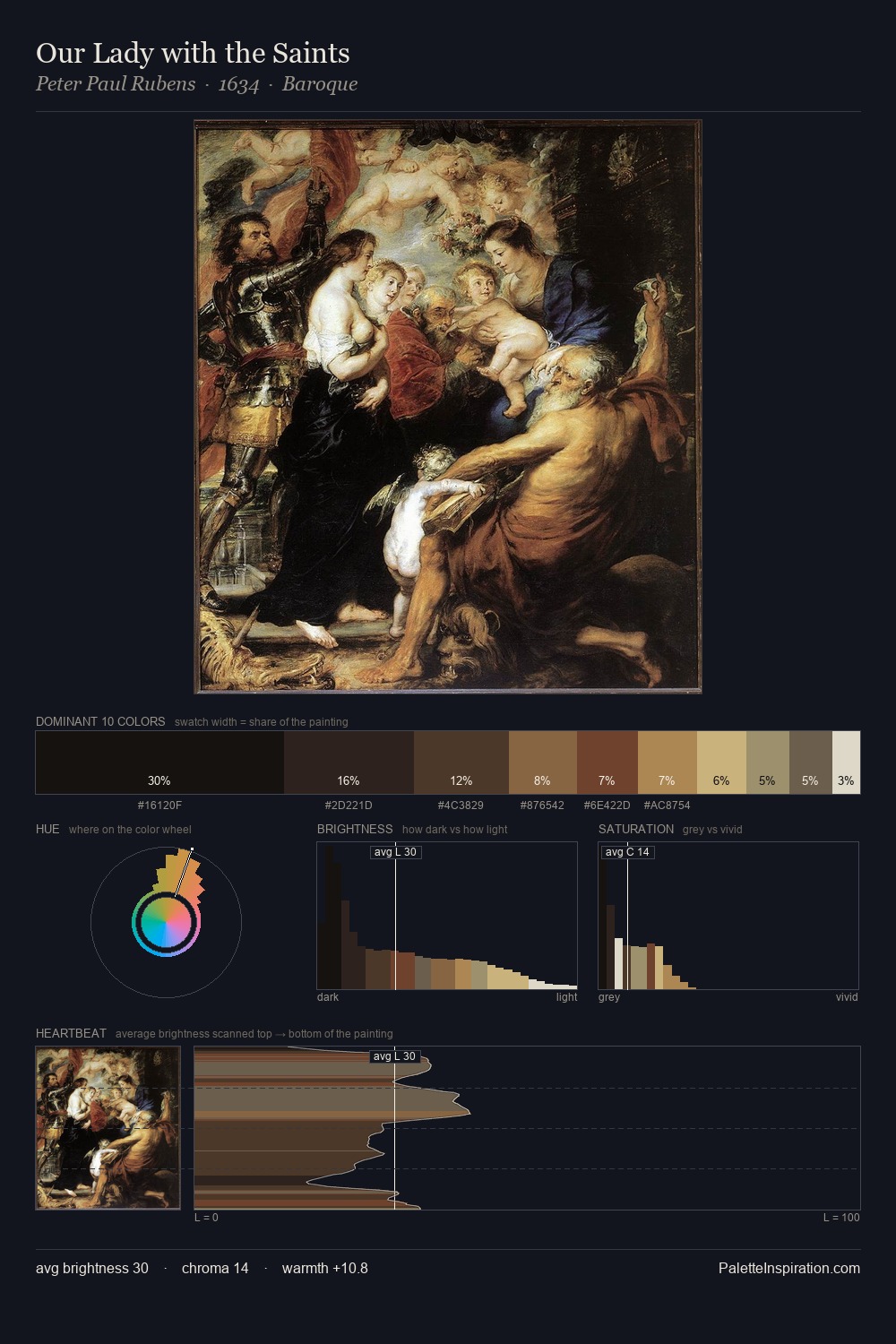
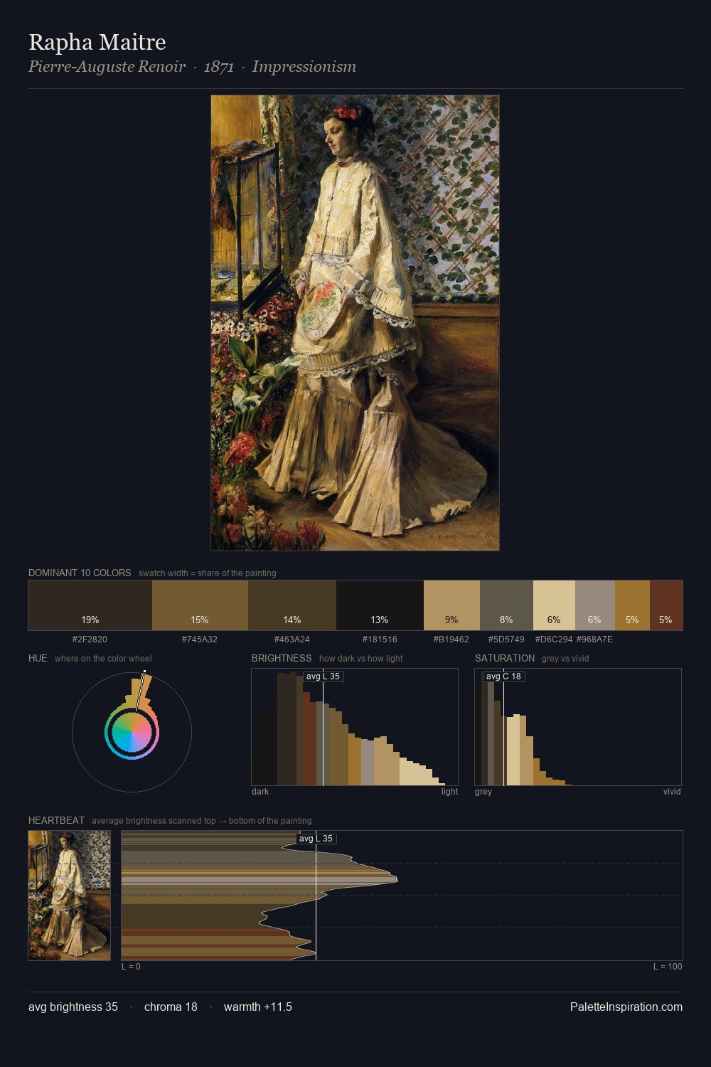
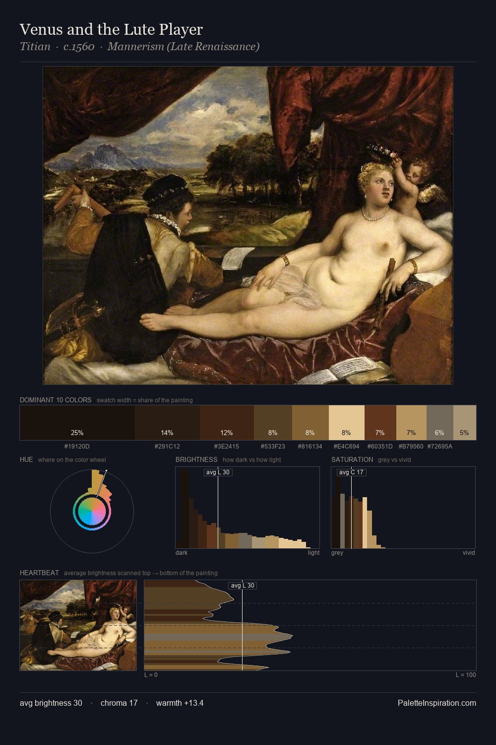
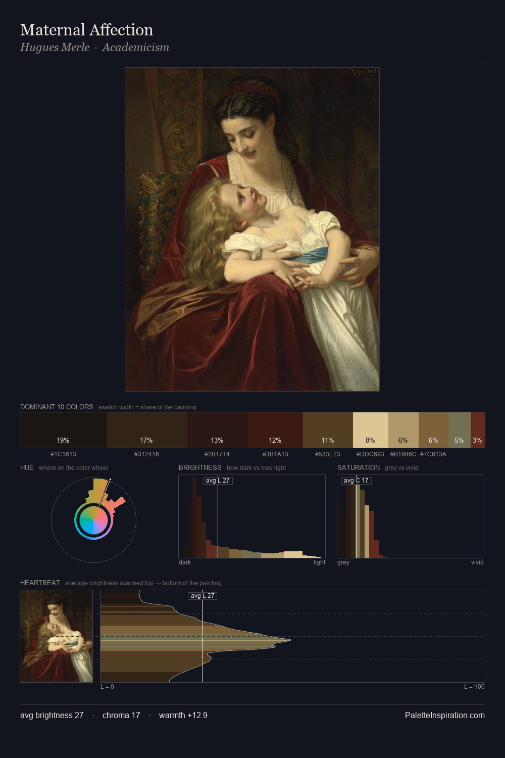
Thomas Eakins works almost entirely in the lower half of the value scale, privileging depth over brilliance. Warmth dominates - the palette of Thomas Eakins leans heavily on the yellow-orange-red arc of the colour wheel. All colours lean toward grey, building depth through value rather than colour punch. The most saturated colour, #D5BF92, is reserved to 2.2% of the surface, where it acts as a focal punctuation. A value spread of 64 units gives the palette both depth and air - shadows are genuinely dark, lights genuinely light. This tonal restraint is characteristic of the Thomas Eakins approach: colour serves light, not the reverse. Thomas Eakins's palette 12 carries its own internal logic while remaining in conversation with the artist's broader colour intelligence.
Example use cases
- music labels
- luxury hospitality
- editorial photography
- leather goods
- premium streaming
I Love This!
Copy, export, or download for your project