Thomas Eakins Palette 1

Palette Analysis
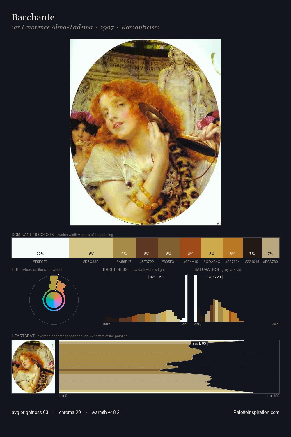
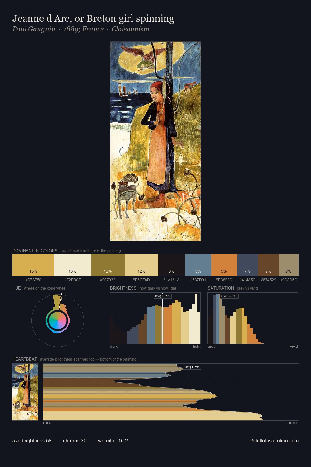
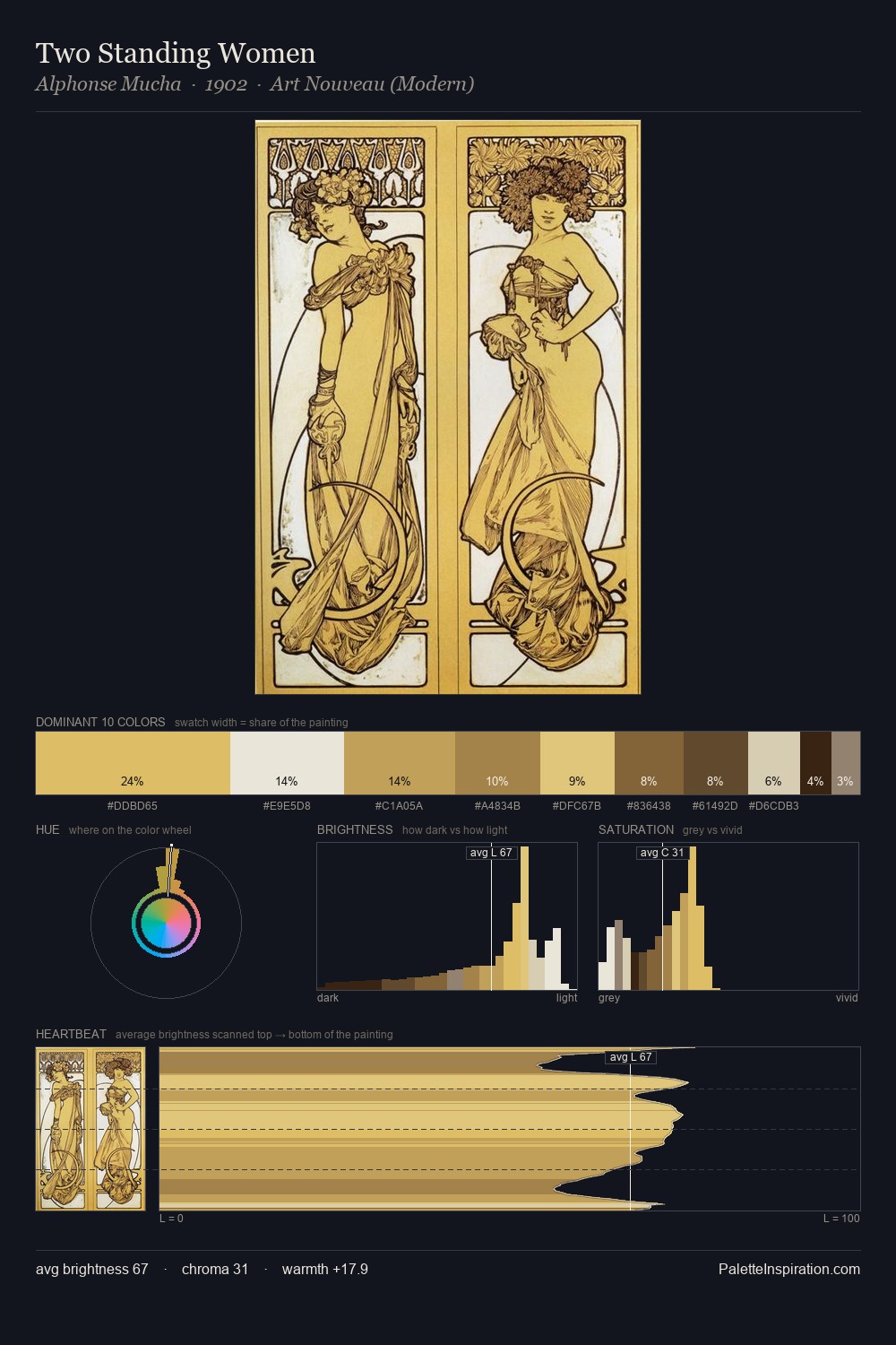
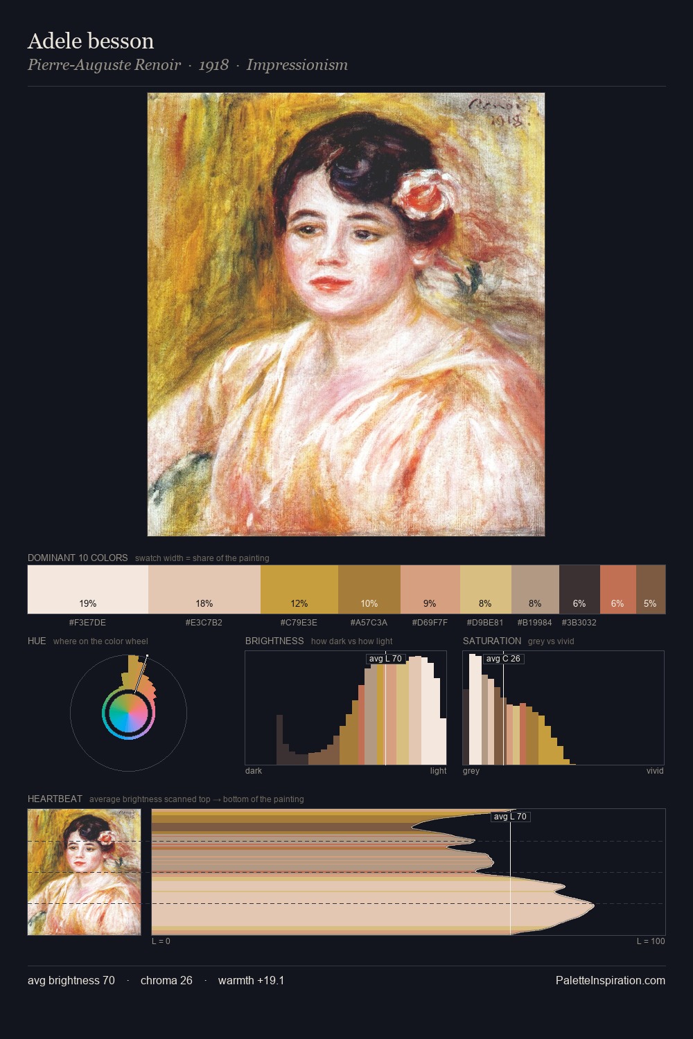
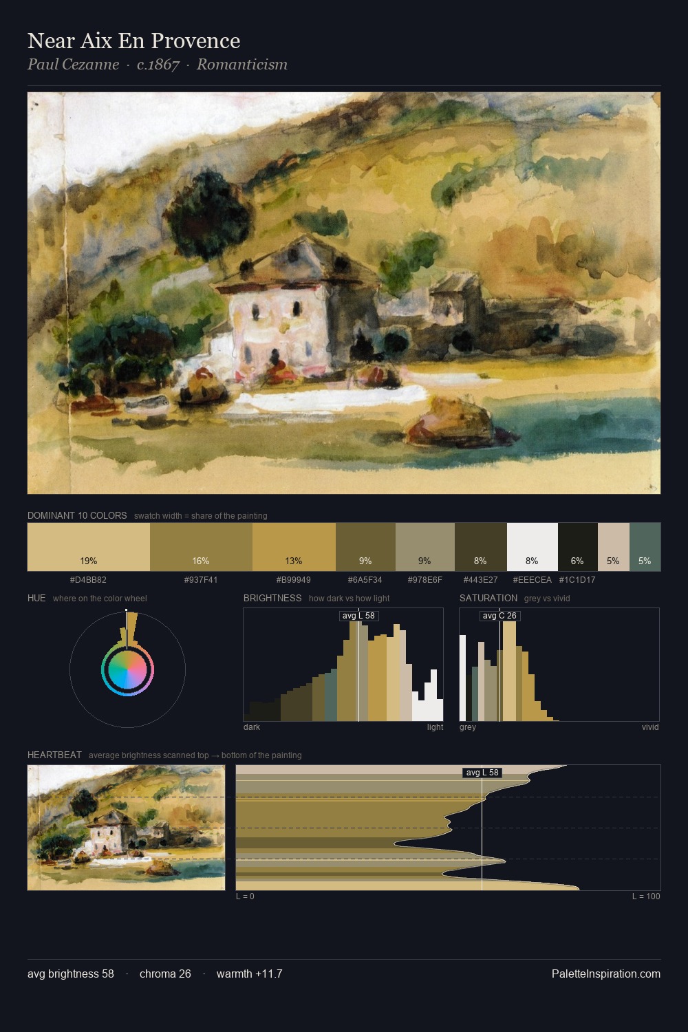
Thomas Eakins is high-key - luminous, open, and weighted toward light. Blues and teal-greys govern the palette, lending it an aquatic or atmospheric quality. Saturation is deliberately withheld - the beauty here lies in the near-monochromatic gradations rather than colour difference. At 34.1%, #F2F3EC functions less as a colour accent and more as a complete atmospheric environment. #C7AB62 delivers the chromatic peak at only 5.3% - a small shot of colour with outsized visual impact. The full value range is 75 units: broad enough to build convincing three-dimensional form. The palette has the character of outdoor light: cool, mid-bright, with colour rendered faithfully rather than expressively. Palette 1 sits within the larger chromatic argument that Thomas Eakins's complete body of work advances.
Example use cases
- publishing
- corporate identity
- consumer apps
- hospitality
- design agencies
I Love This!
Copy, export, or download for your project