Design Master Palette

Palette Analysis
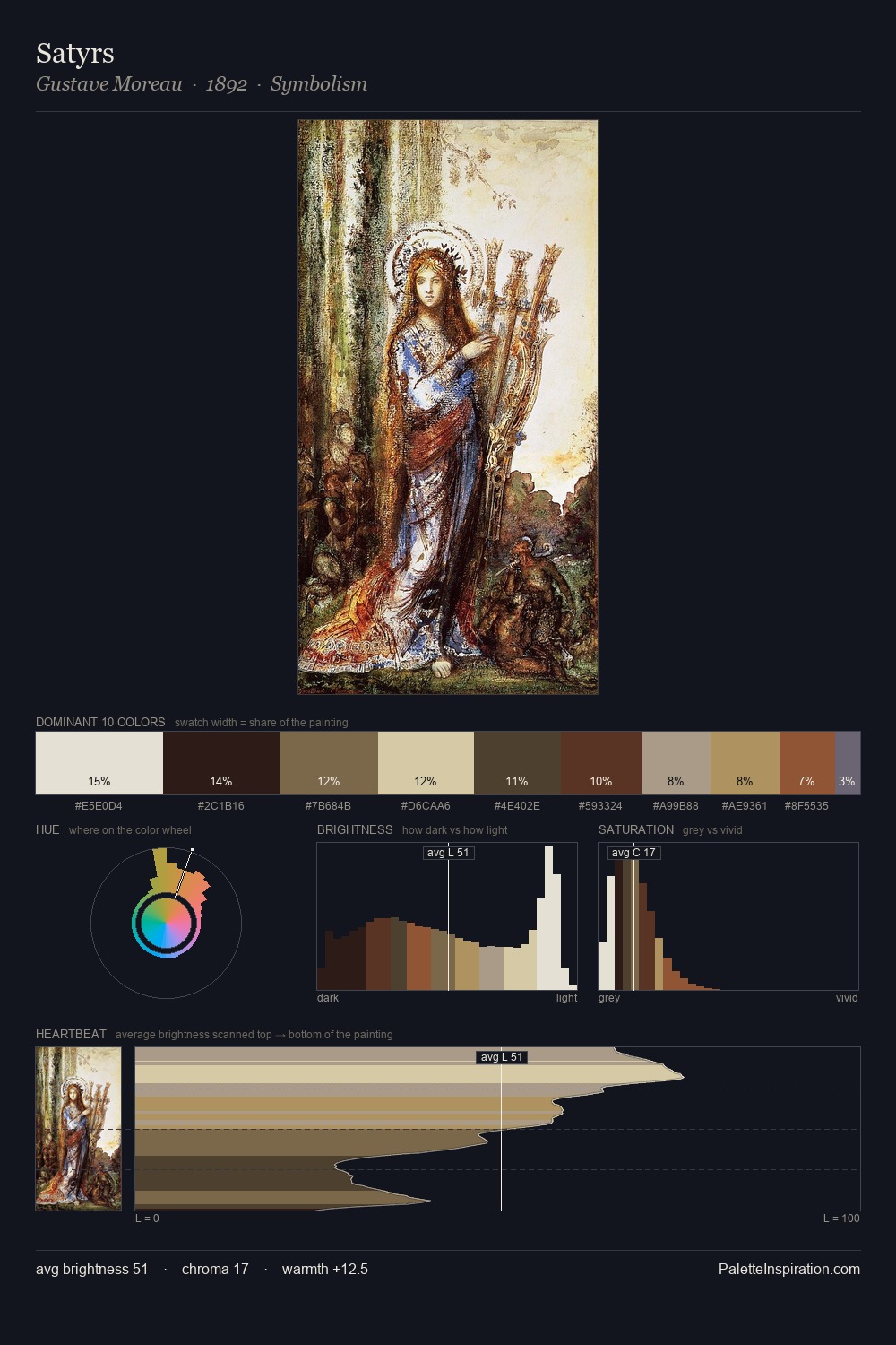
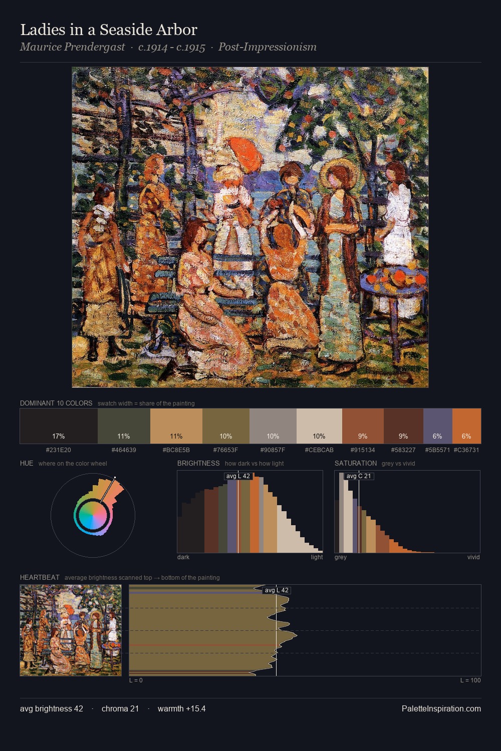
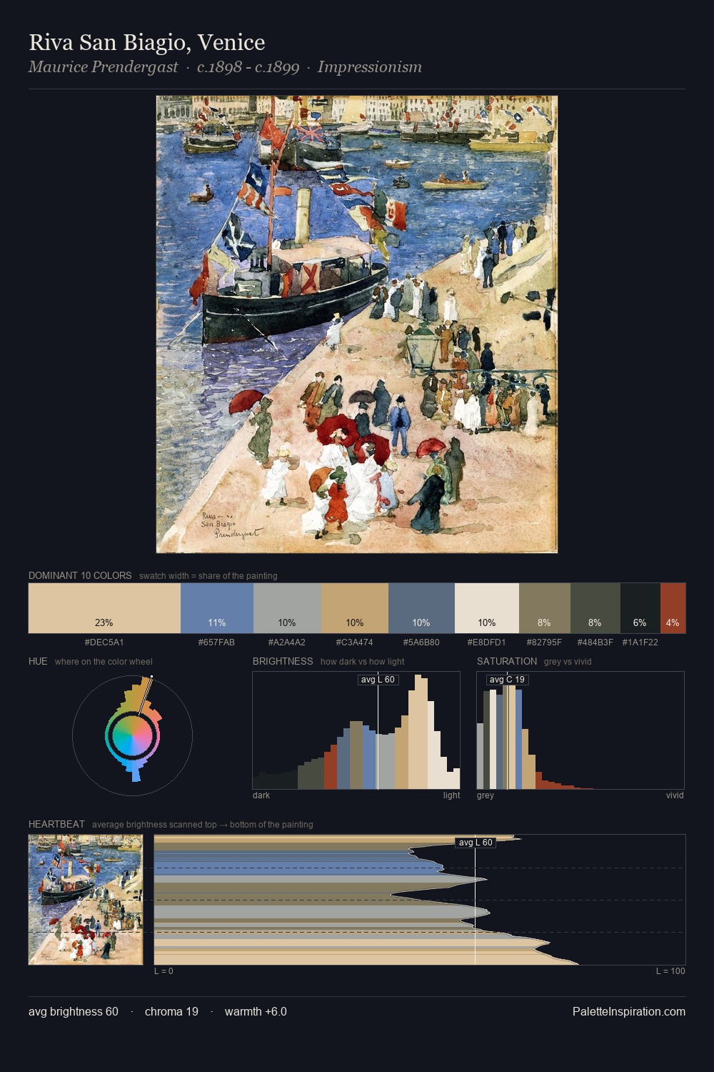
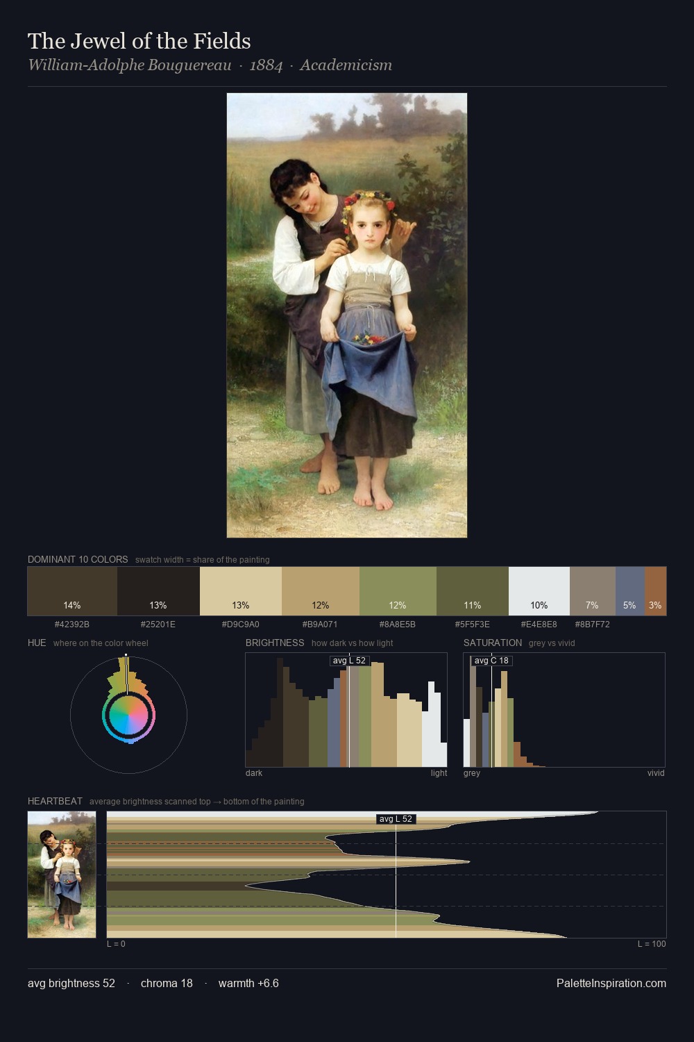
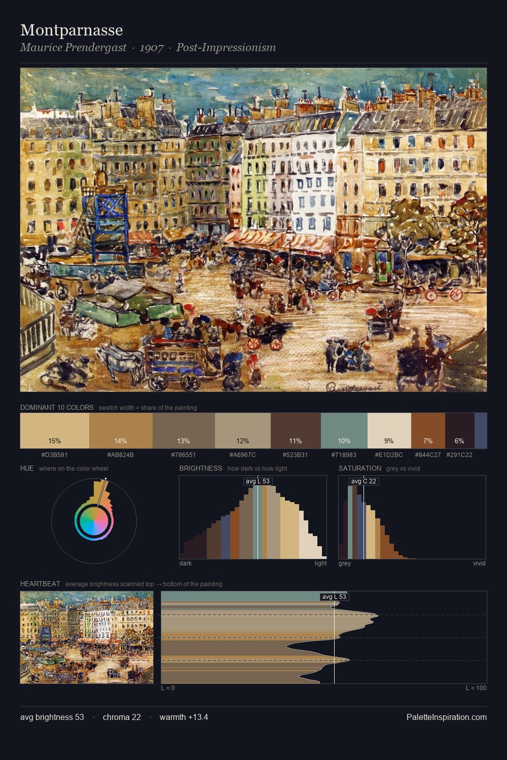
Across the design movement, certain palette qualities recur - this distillation makes them visible at a glance. design occupies the comfortable middle of the value scale, avoiding both extremes to hold the eye in a sustained middle grey. The palette balances warm and cool with remarkable evenness, giving the composition its characteristic vibrancy. Saturation is deliberately withheld - the beauty here lies in the near-monochromatic gradations rather than colour difference. The saturated accent, #9D5437, registers at 6.5% - sparse enough to feel like a deliberate surprise. From deepest dark to palest light, the palette traverses 73 units of the value scale - a span that creates natural depth. The design movement spoke in this palette's vocabulary.
Example use cases
- craft & artisan brands
- specialty coffee
- home goods
- lifestyle retail
- ceramics & pottery
I Love This!
Copy, export, or download for your project