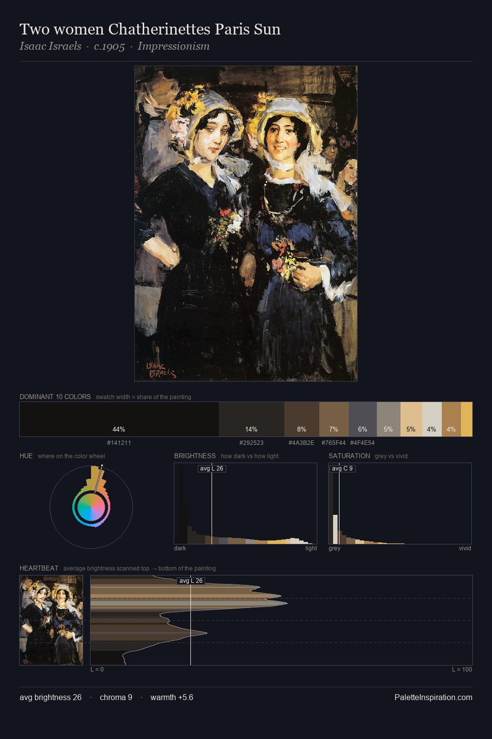
Design Palette 12
Veiled Tawny
Veiled Partially obscured light - mid-dark with a hazy, scrim-filtered quality.
Tawny Warm orange-brown - a traditional term for the color of tanned leather or lion fur.

Palette Analysis
design sits in the centre of the value range, lending the palette a sense of even, sustained light. Temperature reads distinctly warm: the reds and earth tones carry the compositional weight. Every colour is desaturated; the palette proceeds through near-neutrals and gently-coloured greys. The most saturated colour, #7A4B31, is reserved to 7.0% of the surface, where it acts as a focal punctuation. 61 units of value range underpin the palette's structural clarity: the eye always knows where light falls.
Example use cases
- exhibition design
- foundation branding
- estate management
- art education
- museums & galleries
I Love This!
Use This Palette
Copy, export, or download for your project
Copy, export, or download for your project
Copy:
Download:
Share: