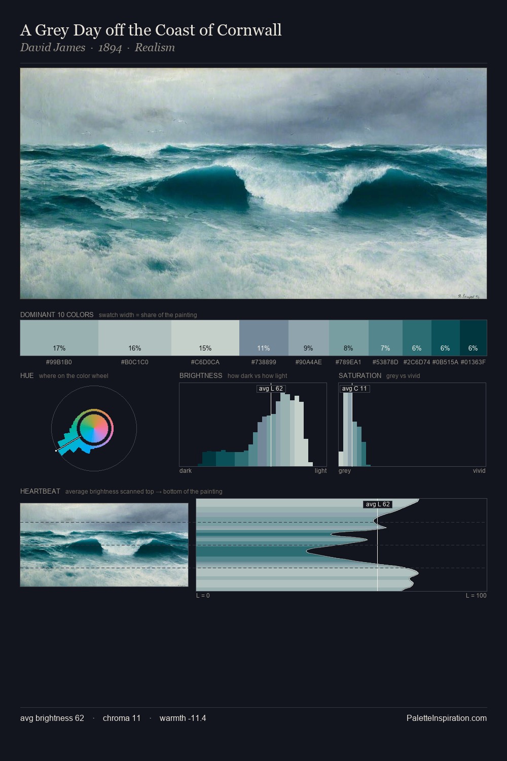
David James Palette 6
Pearlescent Gossamer
Pearlescent Iridescent light quality - high-key with subtle hue variation, like mother-of-pearl.
Gossamer Nearly transparent pale - delicate, wispy, like fine spider silk.

Palette Analysis
David James is high-key - luminous, open, and weighted toward light. A distinctly cool atmosphere runs through this palette: sky, water, and mist given colour form. The absence of saturated colour is itself an expressive choice: this is a palette of restraint and atmosphere. The saturated accent, #02353E, registers at 3.4% - sparse enough to feel like a deliberate surprise. Spanning 54 units on the value axis, the palette achieves the balance between tonal flatness and fragmentation. The palette has the character of outdoor light: cool, mid-bright, with colour rendered faithfully rather than expressively. This is palette 6 of David James's sequence - a single chapter in a chromatic story told across many works.
Example use cases
- publishing
- corporate identity
- consumer apps
- hospitality
- design agencies
I Love This!
Use This Palette
Copy, export, or download for your project
Copy, export, or download for your project
Copy:
Download:
Share: