David James Master Palette

Palette Analysis
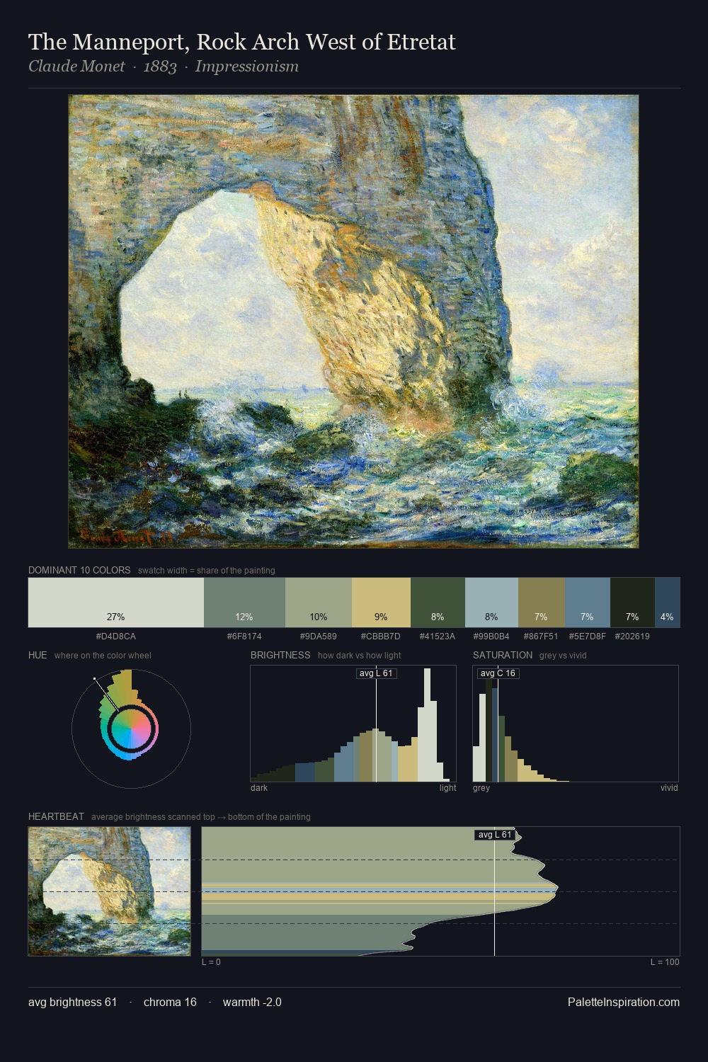
Mid-key values give David James its characteristic quietness - nothing blazes, nothing disappears. A distinctly cool atmosphere runs through this palette: sky, water, and mist given colour form. Chroma hovers near zero; colour declares itself through subtle shifts in hue rather than outright saturation. The most saturated colour, #4E3E28, is reserved to 1.4% of the surface, where it acts as a focal punctuation. Value range is moderate at 49 units - enough contrast for legibility, not so much as to fragment the tonal unity. The palette has the character of outdoor light: cool, mid-bright, with colour rendered faithfully rather than expressively. These proportions encode David James's instinctive sense of how much of each quality the eye can hold.
Example use cases
- archival print
- university identity
- rare books
- cultural institutions
- nonprofit identity
I Love This!
Copy, export, or download for your project