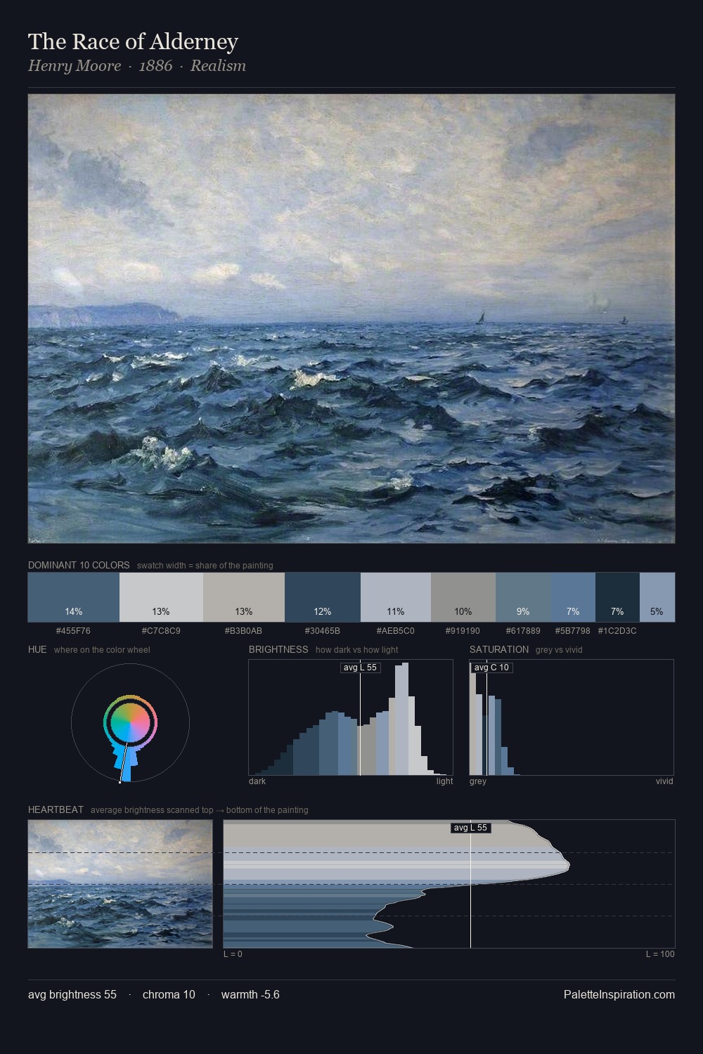
Henry Moore Palette 4
Dusky Whisper
Dusky Twilight register - warm mid-darks, the palette of dusk and fading light.
Whisper Barely-there pale neutral - so light it barely registers, the quietest color.

Palette Analysis
Mid-key values give Henry Moore its characteristic quietness - nothing blazes, nothing disappears. Henry Moore tilts toward cool - blues and silver-greys carry the structural weight. Saturation is deliberately withheld - the beauty here lies in the near-monochromatic gradations rather than colour difference. #2B405C functions as the palette's exclamation mark: highest chroma, lowest percentage (5.4%). The full value range is 55 units: broad enough to build convincing three-dimensional form. The mid-to-high key, cool bias, and moderate chroma point to outdoor observation - sky and diffused daylight as the dominant light source. This is palette 4 of Henry Moore's sequence - a single chapter in a chromatic story told across many works.
Example use cases
- exhibition design
- foundation branding
- estate management
- art education
- museums & galleries
I Love This!
Use This Palette
Copy, export, or download for your project
Copy, export, or download for your project
Copy:
Download:
Share: