Henry Moore Master Palette

Palette Analysis
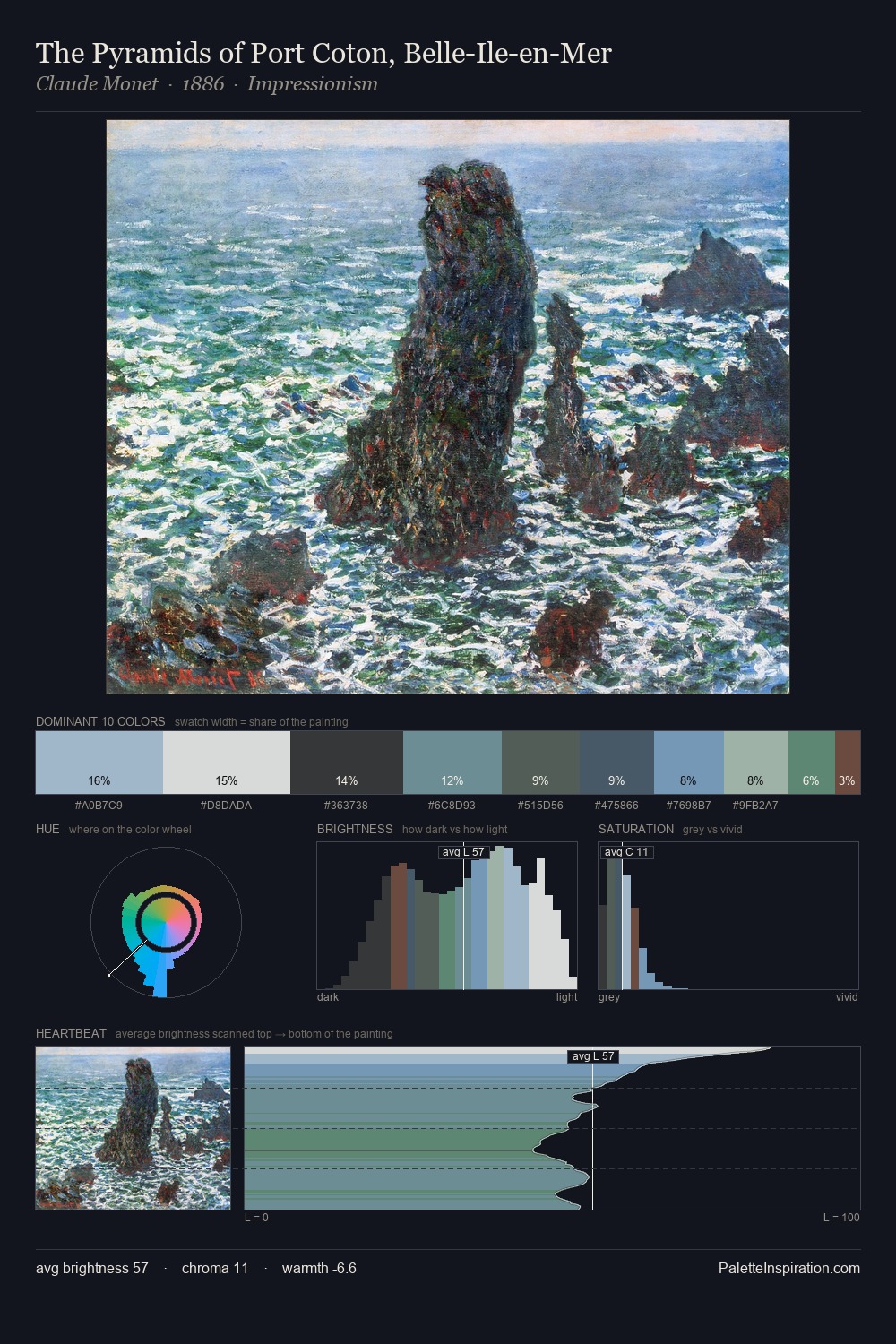
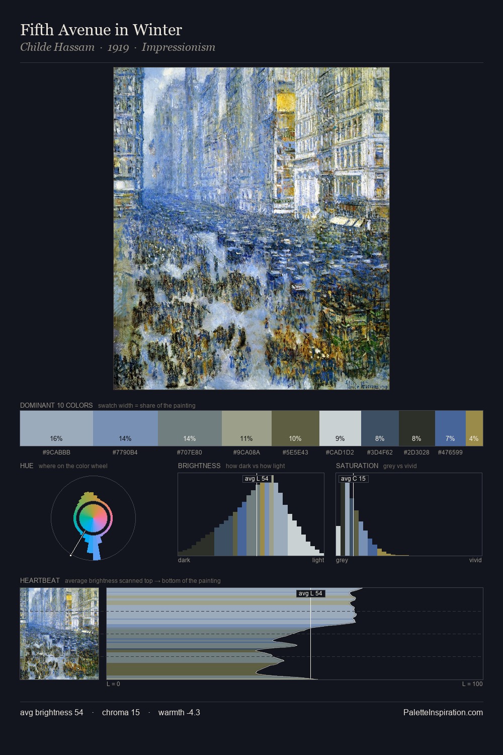
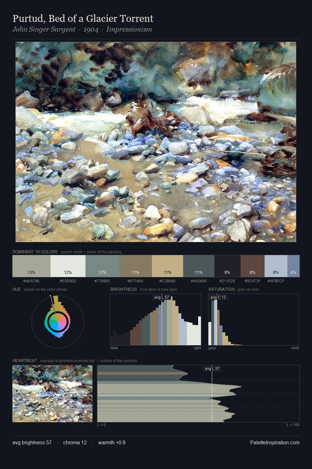
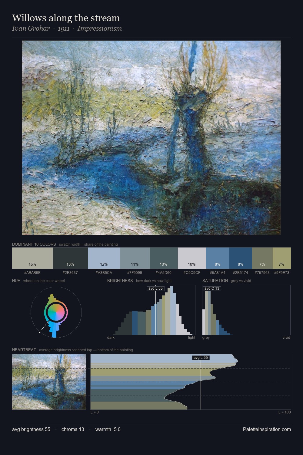
Values in Henry Moore rest in the mid-range - neither dramatically lit nor steeped in shadow. Temperature is cool-dominant, with blue and green families claiming the largest areas. Chroma is kept low across all colours, producing the soft, enveloping quality that characterises tonal painting. The most saturated colour, #1E2F34, is reserved to 10.0% of the surface, where it acts as a focal punctuation. From deepest dark to palest light, the palette traverses 57 units of the value scale - a span that creates natural depth. The palette has the character of outdoor light: cool, mid-bright, with colour rendered faithfully rather than expressively. Taken together, these qualities constitute Henry Moore's chromatic voice - distinctive enough to be read across an entire body of work.
Example use cases
- exhibition design
- foundation branding
- estate management
- art education
- museums & galleries
I Love This!
Copy, export, or download for your project