Cornelis Vreedenburgh Palette 2

Palette Analysis
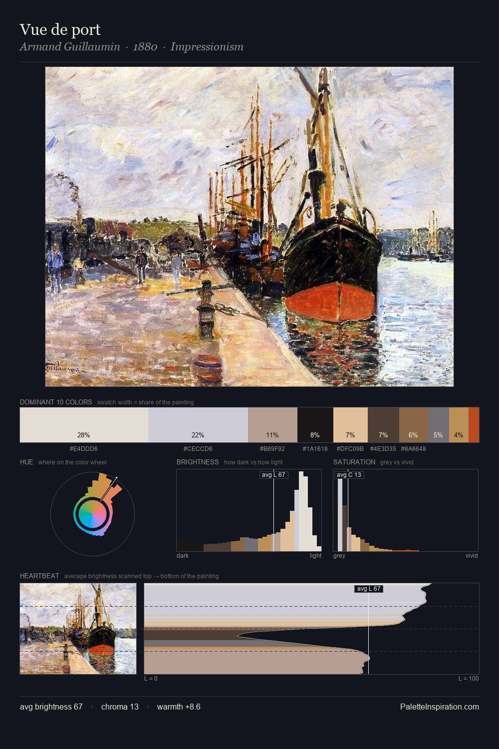
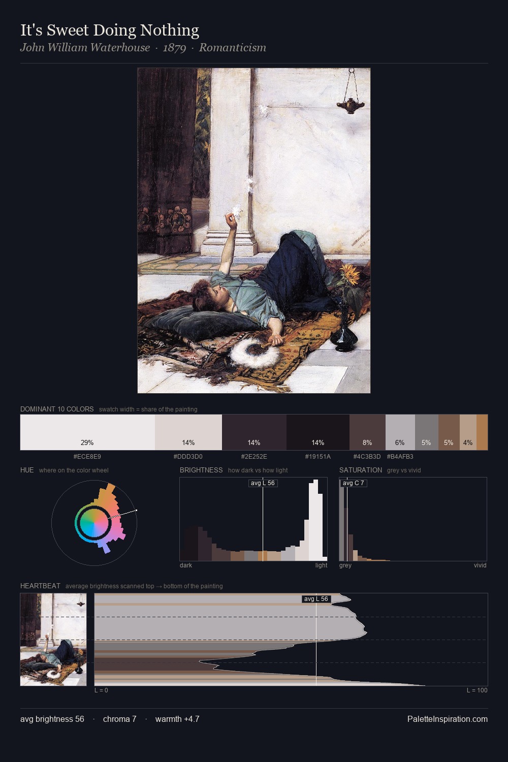
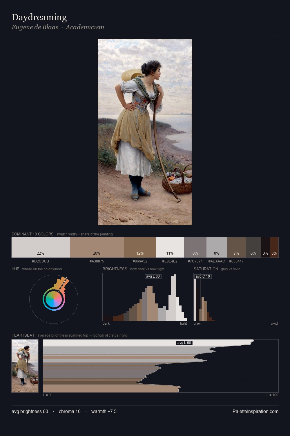
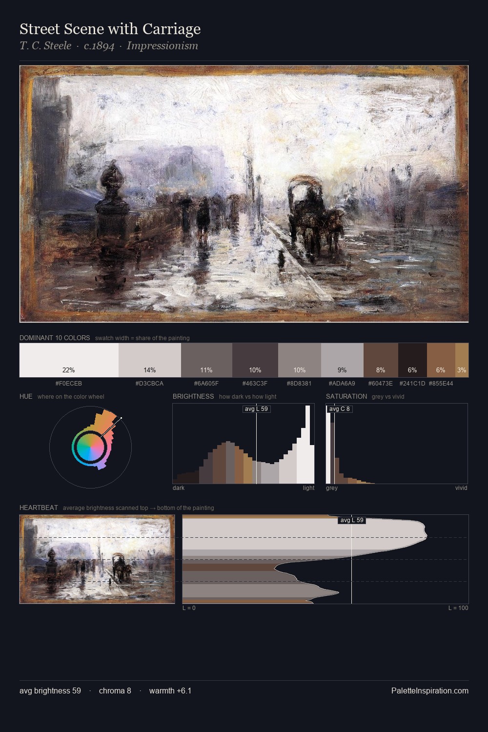
Cornelis Vreedenburgh is strongly light-biased - shadow is suggested rather than declared. Cool tones set the register here - the blues and greens easily outweigh any warm accents. The absence of saturated colour is itself an expressive choice: this is a palette of restraint and atmosphere. #E7E8E8 at 31.3% of the palette: an overwhelming presence that pulls all other colours into its gravitational field. The saturated accent, #9E734F, registers at 1.9% - sparse enough to feel like a deliberate surprise. 74 units of value range underpin the palette's structural clarity: the eye always knows where light falls. High luminosity and cool temperature suggest the plein-air condition: unfiltered daylight and open sky. Cornelis Vreedenburgh's palette 2 carries its own internal logic while remaining in conversation with the artist's broader colour intelligence.
Example use cases
- food & beverage
- wedding stationery
- lifestyle brands
- interior design
- fashion retail
I Love This!
Copy, export, or download for your project