Abraham van Strij Palette 1

Palette Analysis
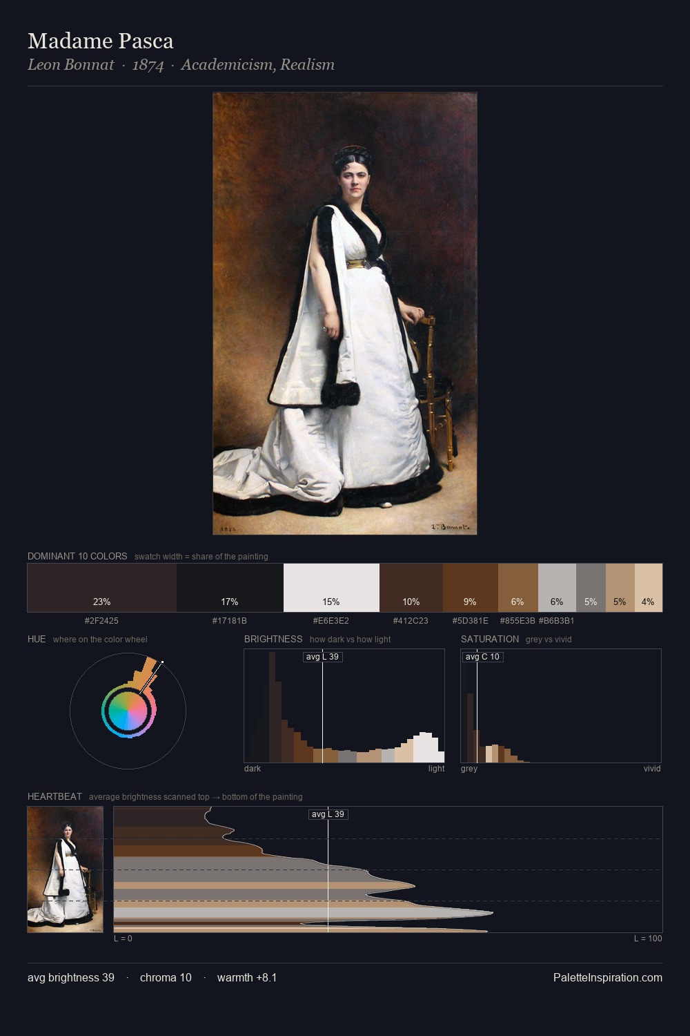
Abraham van Strij is high in key: pale, luminous, and filled with optical air. A distinctly cool atmosphere runs through this palette: sky, water, and mist given colour form. Every colour is desaturated; the palette proceeds through near-neutrals and gently-coloured greys. #E7E5E0 claims 31.8% of the surface, functioning as the work's tonal foundation. #A15D29 functions as the palette's exclamation mark: highest chroma, lowest percentage (1.8%). At 62 units of value range, the palette has the tonal breadth to sustain complex spatial readings. The mid-to-high key, cool bias, and moderate chroma point to outdoor observation - sky and diffused daylight as the dominant light source. In the context of Abraham van Strij's full range of palettes, group 1 represents one movement in an ongoing chromatic dialogue.
Example use cases
- florist branding
- event design
- real estate
- jewelry retail
- hospitality branding
I Love This!
Copy, export, or download for your project