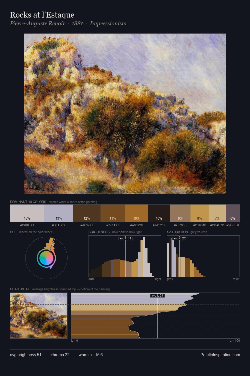
Cornelis Vreedenburgh Palette 3

Palette Analysis
Values in Cornelis Vreedenburgh tilt decisively toward white, giving the palette its luminous character. Temperature is balanced: the palette pits warm earth against cool sky without declaring a winner. Chroma is held at a comfortable level - distinct colours, but no single hue is allowed to overwhelm. #533322 is not a small accent - at 8.6% it qualifies as a major presence and gives the palette its chromatic identity. A value spread of 60 units gives the palette both depth and air - shadows are genuinely dark, lights genuinely light. The palette reads as an Impressionist one - light-biased, chromatically direct, and built on temperature contrast rather than value opposition. Palette 3 sits within the larger chromatic argument that Cornelis Vreedenburgh's complete body of work advances.
Example use cases
- ceramics & pottery
- boutique hospitality
- menswear
- heritage food brands
- craft & artisan brands
I Love This!
Copy, export, or download for your project