Cornelis van Noorde Palette 1

Palette Analysis
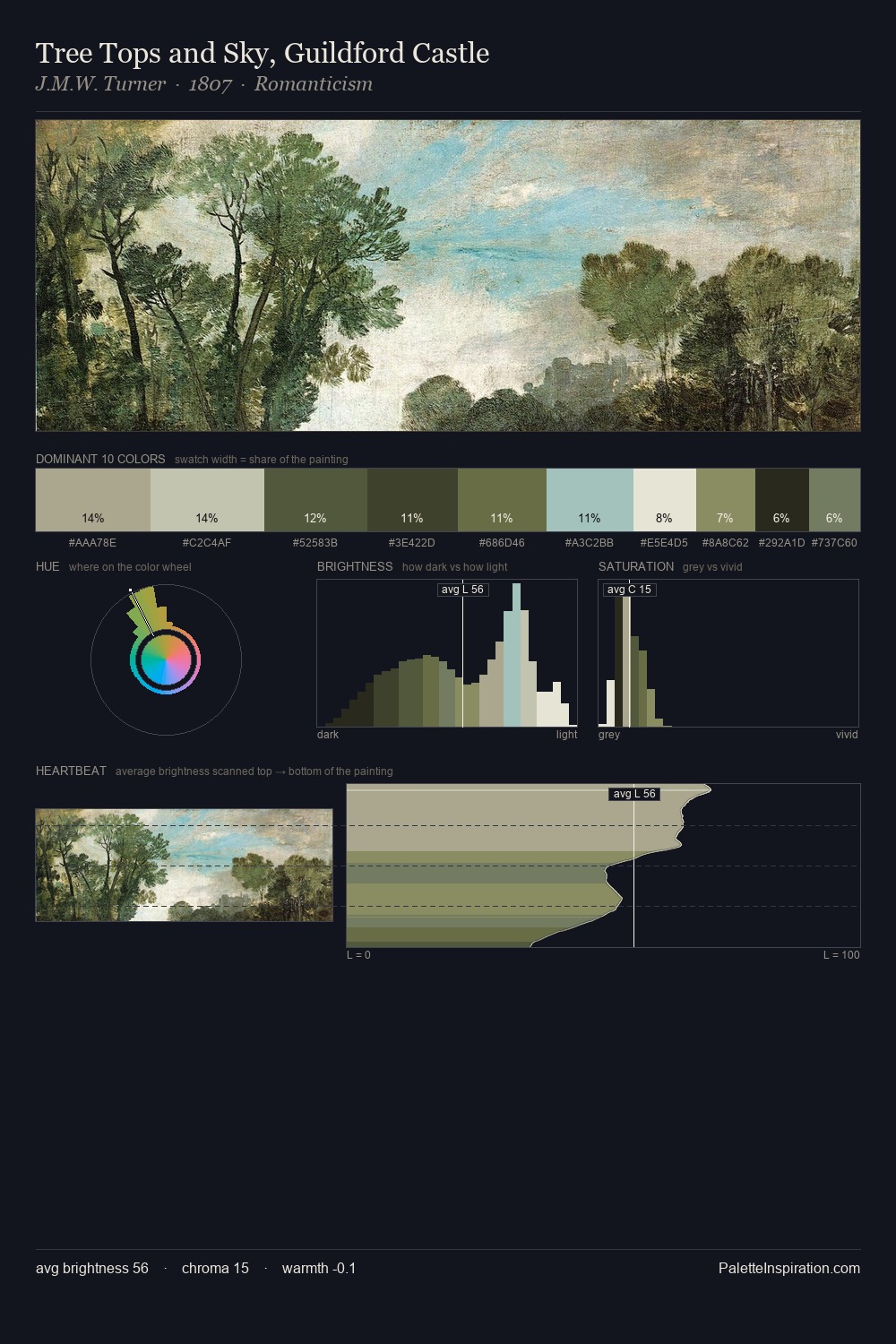
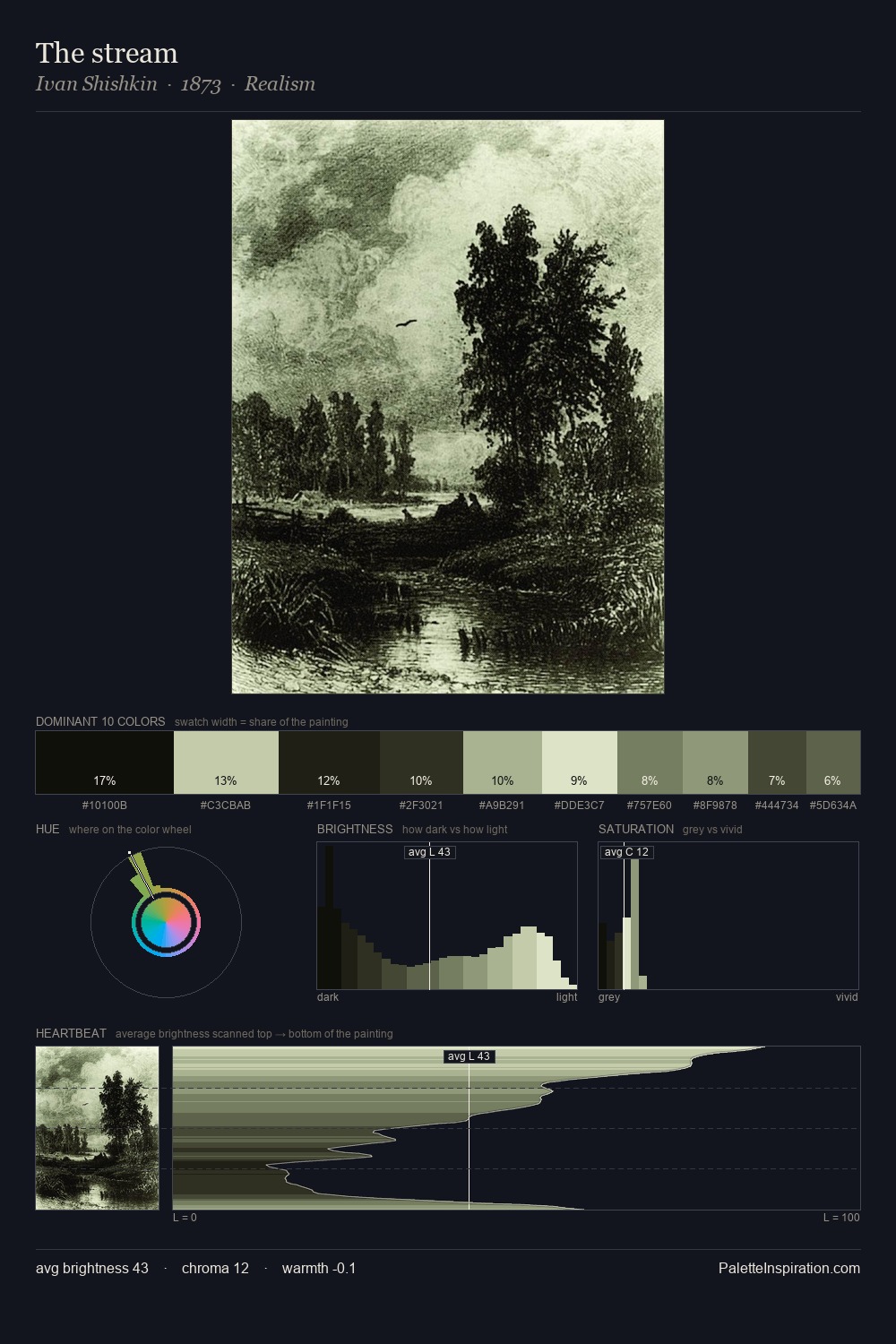
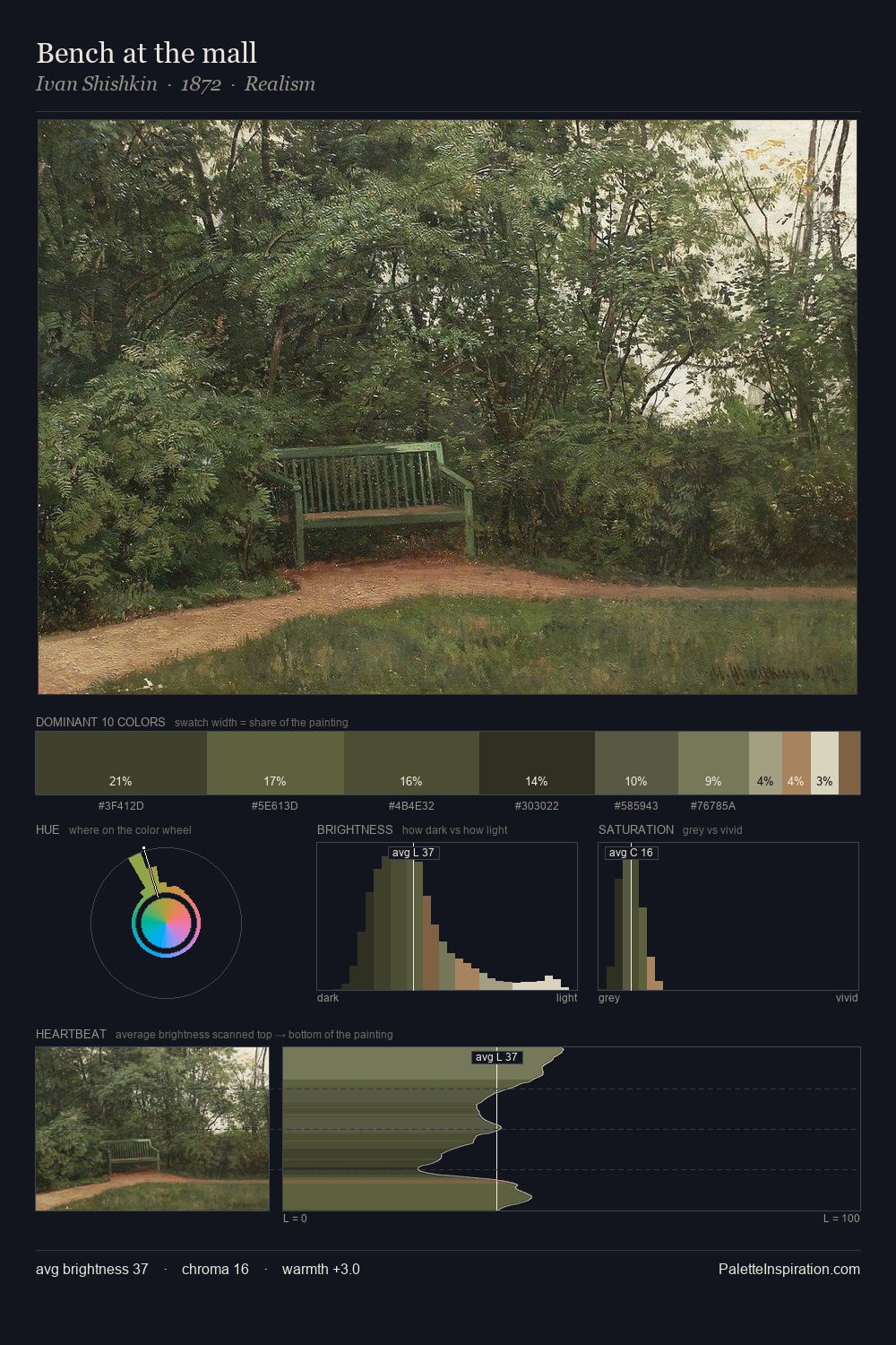
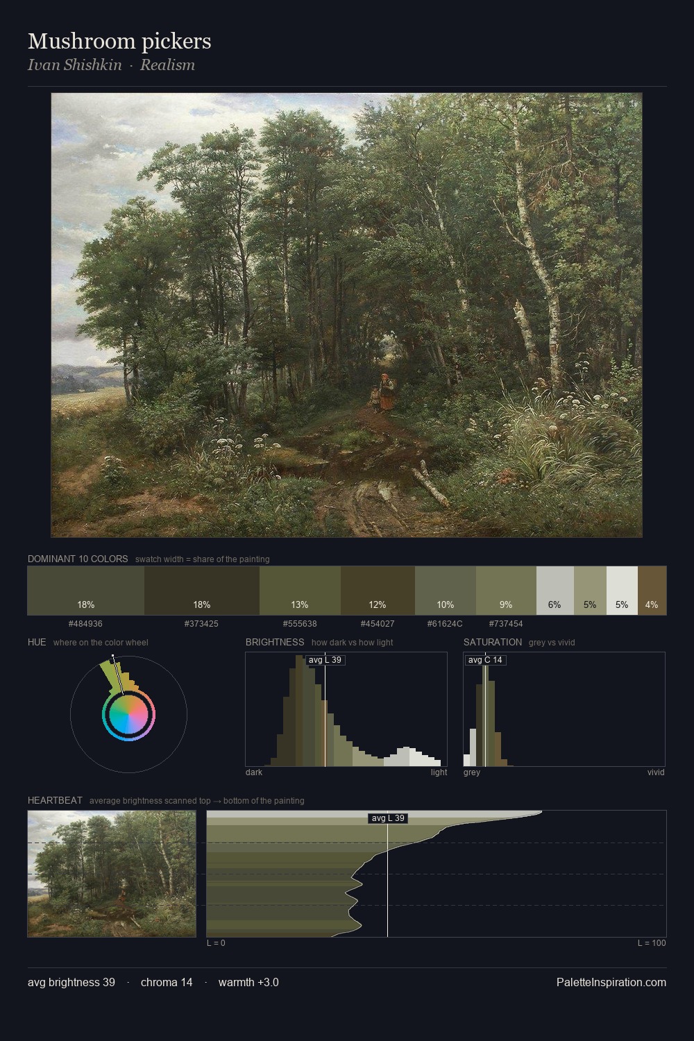
Cornelis van Noorde is strongly light-biased - shadow is suggested rather than declared. Cool hues prevail: blues, greens, and greys anchor the palette's emotional temperature. Saturation is deliberately withheld - the beauty here lies in the near-monochromatic gradations rather than colour difference. At 5.7%, #67764E carries the palette's sharpest chromatic charge: an accent that earns its place precisely because it is withheld. At 61 units of value range, the palette has the tonal breadth to sustain complex spatial readings. The mid-to-high key, cool bias, and moderate chroma point to outdoor observation - sky and diffused daylight as the dominant light source. This is palette 1 of Cornelis van Noorde's sequence - a single chapter in a chromatic story told across many works.
Example use cases
- exhibition design
- foundation branding
- estate management
- art education
- museums & galleries
I Love This!
Copy, export, or download for your project