Cornelis van Noorde Palette 2
Shadowed Ash
Shadowed Low-key - values weighted toward shadow, the palette of dim interiors and overcast skies.
Ash Mid cool-gray - the neutral residue of fire, between white and charcoal.

Palette Analysis
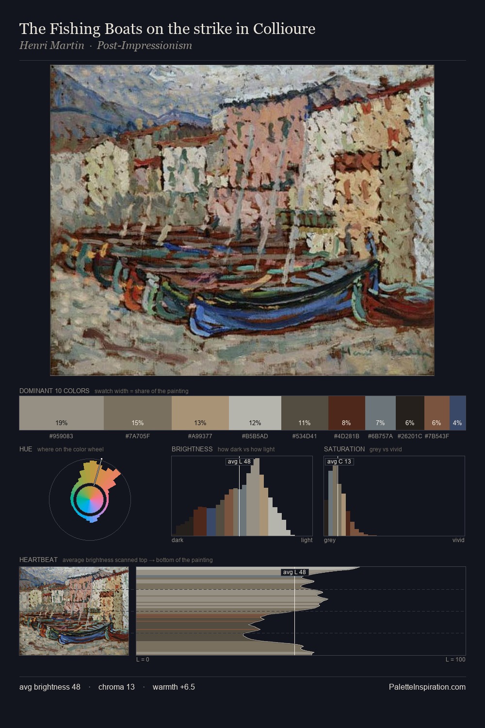
Cornelis van Noorde sits in the centre of the value range, lending the palette a sense of even, sustained light. Warm hues command this palette; Cornelis van Noorde favours the reds, oranges, and yellows of firelight and earth. All colours lean toward grey, building depth through value rather than colour punch. Only 7.5% is devoted to #C5B7A8, yet that small allocation delivers the palette's entire chromatic tension. The value range of 47 units sits in the comfortable middle: enough depth, enough light, neither extreme. In the context of Cornelis van Noorde's full range of palettes, group 2 represents one movement in an ongoing chromatic dialogue.
Example use cases
- theater design
- jewelry brands
- tobacco-adjacent retail
- event branding
- film & entertainment
I Love This!
Use This Palette
Copy, export, or download for your project
Copy, export, or download for your project
Copy:
Download:
Share: