Colors that go with

Timberwolf

#DBD7D2

Or pick a different color

Open on color wheel →

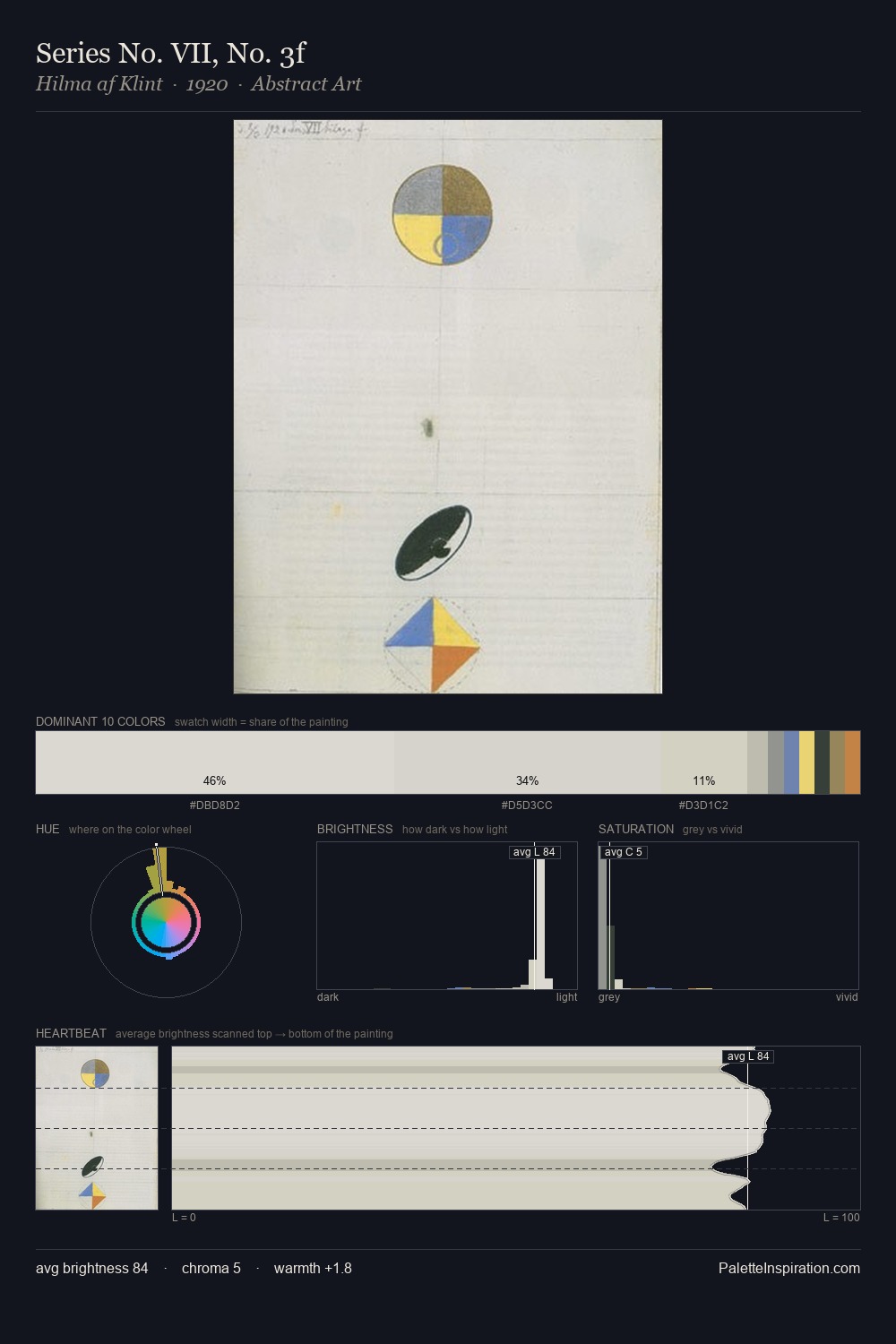
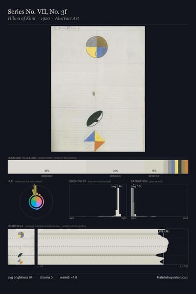
Timberwolf (#DBD7D2) is a light neutral shade that appears across 19 master palettes in our corpus, most prominently in the work of Anton von Beust, Otto Eckmann, and Fernand Leger and the Realism tradition. Master painters paired it most often with Raisin black (#242124), Khaki (#C3B091), and Silver chalice (#ACACAC). The combination forms a pale, paper-and-plaster chord, pairs with restrained, near-neutral companions that let the source carry the chord, with a moderate step down in value that keeps the source forward.
Artworks Featuring This Color

Hurricane on a sea palette card
Hurricane on a sea
Ivan Aivazovsky · 1899
Nile near Karnak palette card
Nile near Karnak
Vasily Polenov · 1881
Reading palette card
Reading
Julius LeBlanc Stewart · 1884
Summer Breeze in the Channel palette card
Summer Breeze in the Channel
Henry Moore · 1893
Autumn in Abramtsevo palette card
Autumn in Abramtsevo
Vasily Polenov · 1890
Bridge in Winter palette card
Bridge in Winter
John Henry Twachtman · 1901

Master palettes

Palettes Featuring Timberwolf

6 palettes where Timberwolf appears prominently — one per artist.

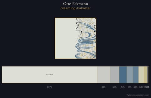
Otto Eckmann Palette 2 - Gleaming Alabaster

Otto Eckmann

64.8% Timberwolf

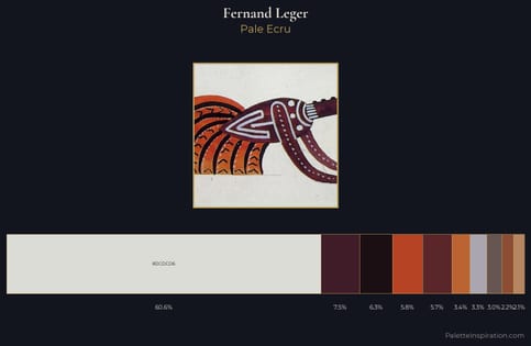
Fernand Leger Palette 11 - Pale Ecru

Fernand Leger

60.6% Timberwolf

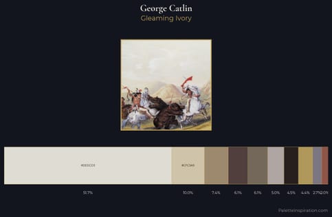
George Catlin Palette 4 - Gleaming Ivory

George Catlin

51.7% Timberwolf

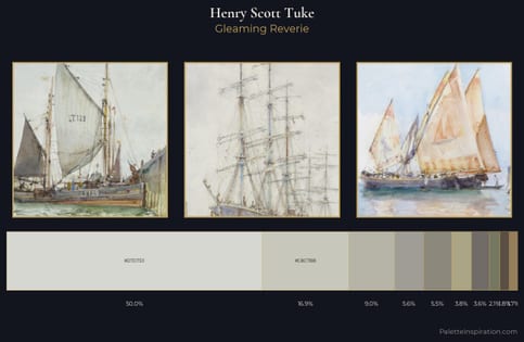
Henry Scott Tuke Palette 4 - Gleaming Reverie

Henry Scott Tuke

50.0% Timberwolf

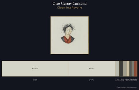
Otto Gustav Carlsund Palette 2 - Gleaming Reverie

Otto Gustav Carlsund

48.9% Timberwolf

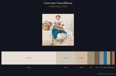
Guerrino Guardabassi Palette 2 - Gleaming Linen

Guerrino Guardabassi

48.4% Timberwolf

Choose another color