Colors that go with

Gainsboro

#DCDCDC

Or pick a different color

Open on color wheel →

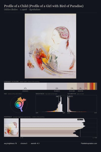
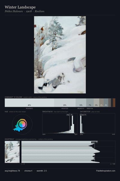
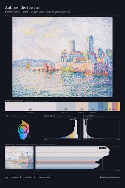
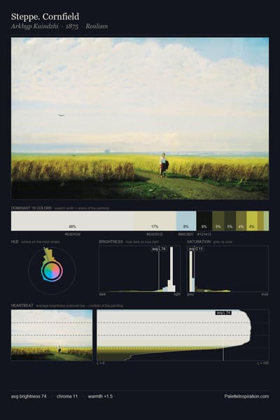
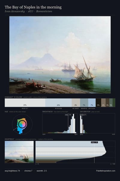
Gainsboro (#DCDCDC) is a very pale neutral shade that appears across 19 master palettes in our corpus, most prominently in the work of Jean Paul Lemieux, Émile Prisse d'Avennes, and Constantin Artachino and the Romanticism tradition. Master painters paired it most often with Khaki (#C3B091), Gold Fusion (#85754E), and Coffee (#6F4E37). The combination forms a chalk-and-linen chord, pulls a neutral anchor into a warm composition, with a sharp light/dark contrast that lets the darker companions read as depth.
Artworks Featuring This Color

Tilla Durieux as Circe palette card
Tilla Durieux as Circe
Franz Stuck
Himalayas palette card
Himalayas
Nicholas Roerich
Tervus palette card
Tervus
Nicholas Roerich · 1918
Niagara palette card
Niagara
John Henry Twachtman · 1893
A canoes palette card
A canoes
Georges Seurat · 1884
The Greatest and Holiest of Tangla palette card
The Greatest and Holiest of Tangla
Nicholas Roerich · 1929

Master palettes

Palettes Featuring Gainsboro

6 palettes where Gainsboro appears prominently — one per artist.

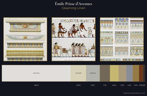
Émile Prisse d'Avennes Palette 3 - Gleaming Linen

Émile Prisse d'Avennes

48.1% Gainsboro

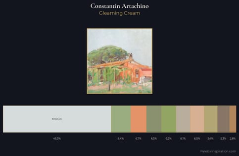
Constantin Artachino Palette 2 - Gleaming Cream

Constantin Artachino

46.3% Gainsboro

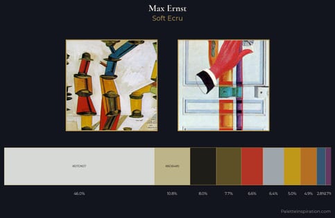
Max Ernst Palette 6 - Soft Ecru

Max Ernst

46.0% Gainsboro

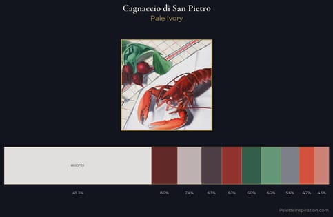
Cagnaccio di San Pietro Palette 3 - Pale Ivory

Cagnaccio di San Pietro

45.3% Gainsboro

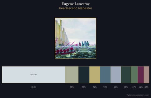
Eugene Lanceray Palette 4 - Pearlescent Alabaster

Eugene Lanceray

43.0% Gainsboro

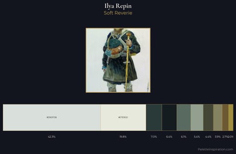
Ilya Repin Palette 5 - Soft Reverie

Ilya Repin

42.3% Gainsboro

Choose another color