Colors that go with

Platinum

#E5E4E2

Or pick a different color

Open on color wheel →

Platinum (#E5E4E2) is a very pale neutral shade that appears across 20+ master palettes in our corpus, most prominently in the work of Gustavo Obiols Delgado, Marie Bracquemond, and Carl Larsson and the Realism tradition. Master painters paired it most often with Khaki (#C3B091), Raisin black (#242124), and Bistre (#3D2B1F). The combination forms a chalk-and-linen chord, pulls a neutral anchor into a warm composition, with a sharp light/dark contrast that lets the darker companions read as depth.
Artworks Featuring This Color

Portsmouth Dockyard palette card
Portsmouth Dockyard
James Tissot · 1877
Strawberries palette card
Strawberries
Pierre-Auguste Renoir · 1905
The Marne at Lagny palette card
The Marne at Lagny
Maxime Maufra
View of monument to Peter I on the Senate Square in St. Petersburg palette card
View of monument to Peter I on the Senate Square in St. Petersburg
Vasily Surikov · 1870
Canal in Flanders palette card
Canal in Flanders
Theo van Rysselberghe · 1894
Portrait of Suzanne Manet palette card
Portrait of Suzanne Manet
Edouard Manet · 1870

Master palettes

Palettes Featuring Platinum

6 palettes where Platinum appears prominently — one per artist.

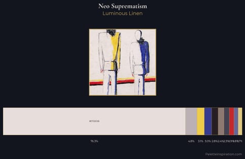
Neo-Suprematism Palette 4 - Luminous Linen

Neo-Suprematism

76.3% Platinum

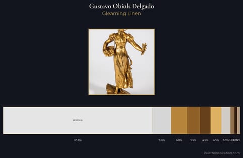
Gustavo Obiols Delgado Palette 1 - Gleaming Linen

Gustavo Obiols Delgado

63.1% Platinum

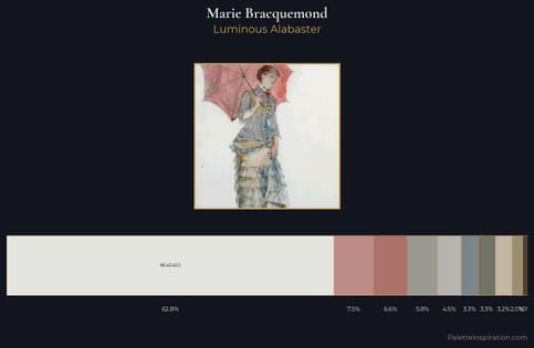
Marie Bracquemond Palette 1 - Luminous Alabaster

Marie Bracquemond

62.8% Platinum

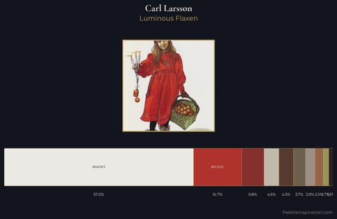
Carl Larsson Palette 10 - Luminous Flaxen

Carl Larsson

57.5% Platinum

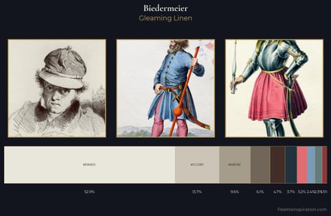
Biedermeier Palette 9 - Gleaming Linen

Biedermeier

52.9% Platinum

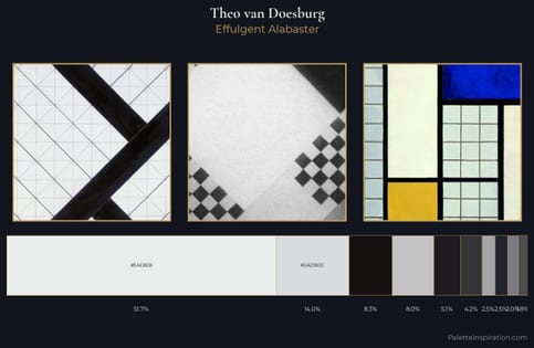
Theo van Doesburg Palette 7 - Effulgent Alabaster

Theo van Doesburg

51.7% Platinum

Choose another color