Colors that go with

Princeton orange

#F58025

Or pick a different color

Open on color wheel →

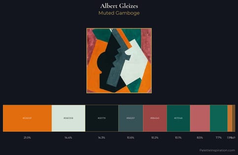
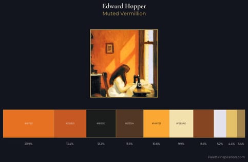
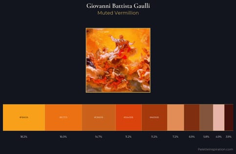
Princeton orange (#F58025) is a mid-tone warm shade that appears across 3 master palettes in our corpus, most prominently in the work of Albert Gleizes, Edward Hopper, and Giovanni Battista Gaulli and the Cubism tradition. Master painters paired it most often with Cinnabar (#E34234), MSU green (#18453B), and Eerie black (#1B1B1B). The combination forms a sun-bleached, daylight chord, spans a mixed temperature range, with a moderate step down in value that keeps the source forward.
Artworks Featuring This Color

Elijah the Prophet palette card
Elijah the Prophet
Nicholas Roerich · 1931
Seated Boy with Cap palette card
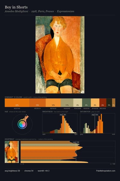
Seated Boy with Cap
Amedeo Modigliani · 1918
Untitled palette card
Untitled
Paul Ranson
Small Interior with Round Marble Table palette card
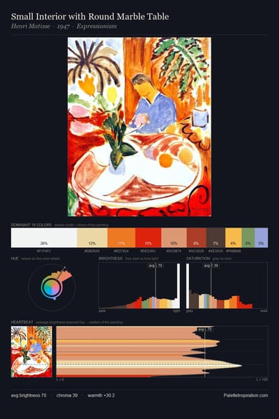
Small Interior with Round Marble Table
Henri Matisse · 1947
Arrows of sky - spears of land palette card
Arrows of sky - spears of land
Nicholas Roerich · 1915
Santa-Fe palette card
Santa-Fe
Nicholas Roerich · 1921

Master palettes

Palettes Featuring Princeton orange

3 palettes where Princeton orange appears prominently — one per artist.

Albert Gleizes Palette 6 - Muted Gamboge

Albert Gleizes

21.0% Princeton orange

Edward Hopper Palette 2 - Muted Vermillion

Edward Hopper

20.9% Princeton orange

Giovanni Battista Gaulli Palette 3 - Muted Vermillion

Giovanni Battista Gaulli

16.1% Princeton orange

Choose another color