Colors that go with

Outrageous Orange

#FF6E4A

Or pick a different color

Open on color wheel →

Outrageous Orange (#FF6E4A) is a mid-tone warm shade that appears across 5 master palettes in our corpus, most prominently in the work of Erich Buchholz, Janos Mattis-Teutsch, and Rose O'Neill and the Constructivism tradition. Master painters paired it most often with Cadet blue (#5F9EA0), Smoky black (#100C08), and Camel (#C19A6B). The combination forms a sun-bleached, daylight chord, reads as a unified warm palette, with a moderate step down in value that keeps the source forward.
Artworks Featuring This Color

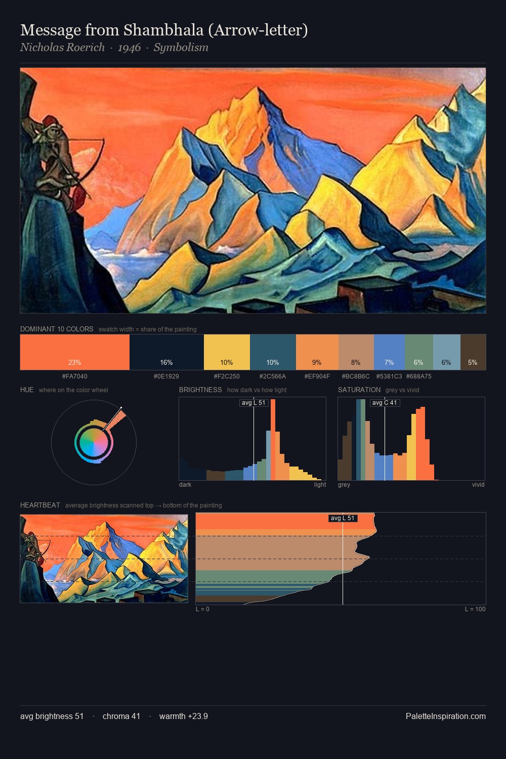
Message from Shambhala (Arrow-letter) palette card
Message from Shambhala (Arrow-letter)
Nicholas Roerich · 1946
The Abduction palette card
The Abduction
Paul Cezanne · 1867
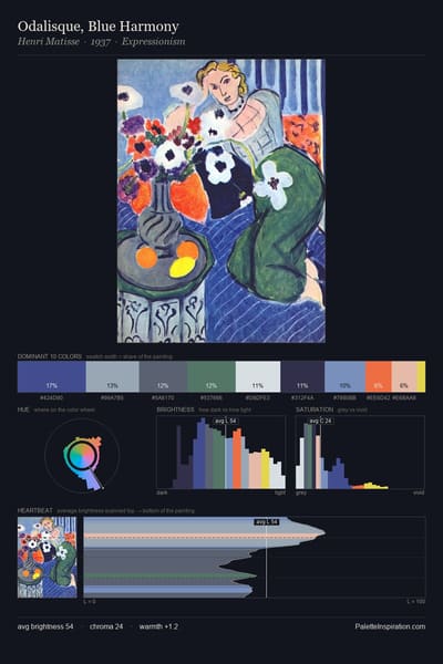
Odalisque, Blue Harmony palette card
Odalisque, Blue Harmony
Henri Matisse · 1937
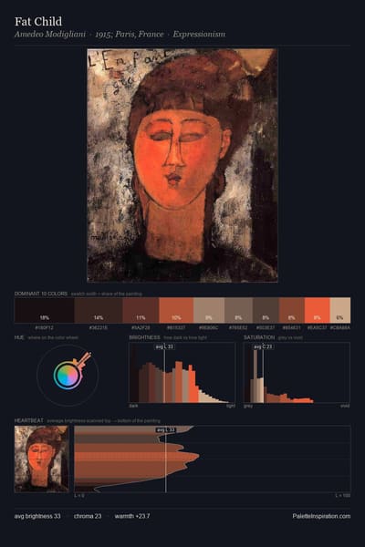
Fat Child palette card
Fat Child
Amedeo Modigliani · 1915
Dawn palette card
Dawn
Jules Breton · 1896
Dancer palette card
Dancer
Henri Matisse · 1925

Master palettes

Palettes Featuring Outrageous Orange

5 palettes where Outrageous Orange appears prominently — one per artist.

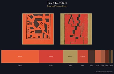
Erich Buchholz Palette 5 - Muted Vermillion

Erich Buchholz

33.5% Outrageous Orange

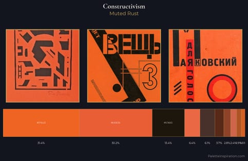
Constructivism Palette 15 - Muted Rust

Constructivism

30.1% Outrageous Orange

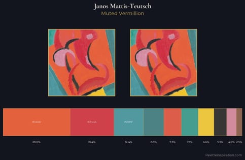
Janos Mattis-Teutsch Palette 6 - Muted Vermillion

Janos Mattis-Teutsch

28.0% Outrageous Orange

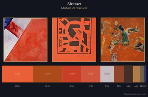
abstract Palette 30 - Muted Vermillion

abstract

21.6% Outrageous Orange

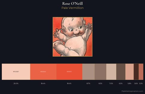
Rose O'Neill Palette 2 - Pale Vermillion

Rose O'Neill

18.4% Outrageous Orange

Choose another color