Color one

Fern green

#4F7942

Color two

Tufts blue

#3E8EDE

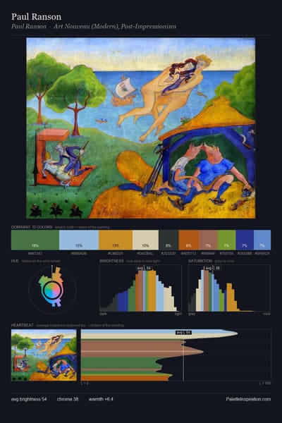
Fern green (#4F7942) and Tufts blue (#3E8EDE) appear together across 5 master palettes in our corpus, most prominently in the work of Paul Ranson, and Odilon Redon and the Post-Impressionism tradition. Painters typically deployed fern green at an average of 8% of the canvas, with tufts blue at 5%. Third colors most often completing the combination include New Car (#214FC6), Copper (#B87333), and Beaver (#9F8170).
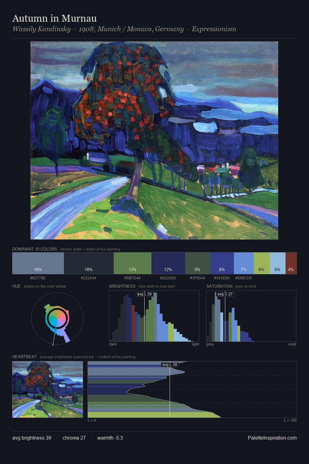
Artworks Featuring Fern green & Tufts blue

Autumn in Murnau palette card
Autumn in Murnau
Wassily Kandinsky · 1908
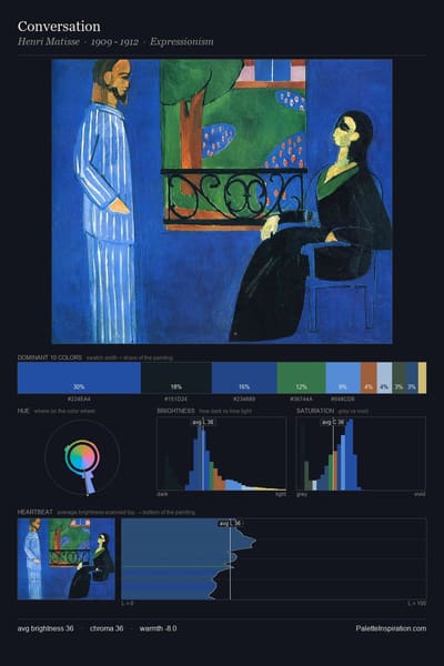
Conversation palette card
Conversation
Henri Matisse · 1909
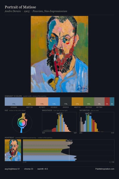
Portrait of Matisse palette card
Portrait of Matisse
Andre Derain · 1905
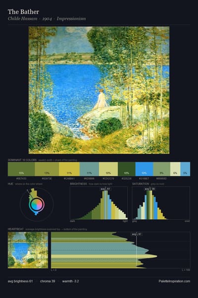
The Bather palette card
The Bather
Childe Hassam · 1904
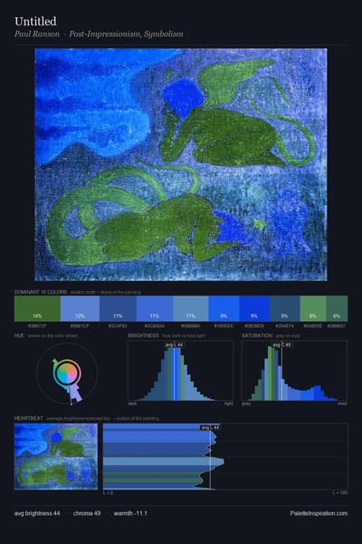
Untitled palette card
Untitled
Paul Ranson
A Fire in the Sky or the Black Cottage palette card
A Fire in the Sky or the Black Cottage
Alfred Freddy Krupa · 2015

Master palettes

Palettes Featuring Fern green & Tufts blue

3 master palettes where Fern green and Tufts blue appear together most prominently.

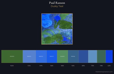
Paul Ranson Palette 7 - Dusky Teal

Paul Ranson

19.2% Fern green · 11.6% Tufts blue

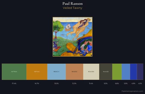
Paul Ranson Palette 3 - Veiled Tawny

Paul Ranson

17.4% Fern green · 5.9% Tufts blue

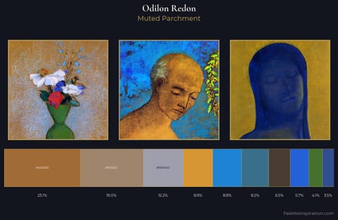
Odilon Redon Palette 13 - Muted Parchment

Odilon Redon

4.1% Fern green · 8.8% Tufts blue

Choose another color