Colors that go with

Tufts blue

#3E8EDE

Or pick a different color

Open on color wheel →

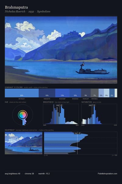
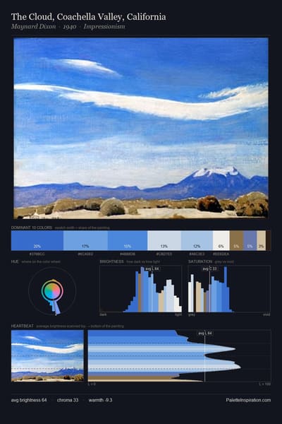
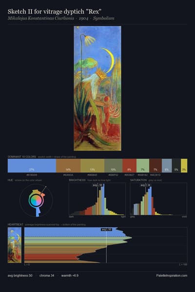
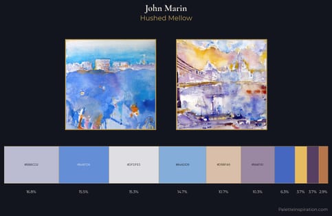
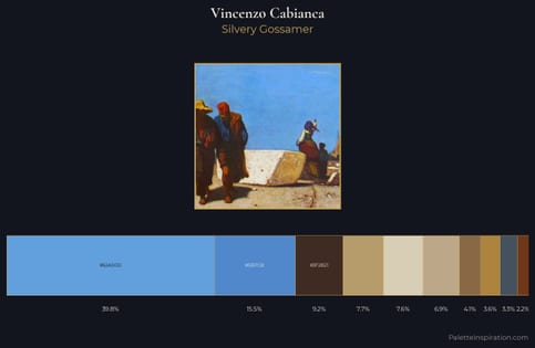
Tufts blue (#3E8EDE) is a mid-tone cool shade that appears across 5 master palettes in our corpus, most prominently in the work of Piet Mondrian, John Marin, and Vincenzo Cabianca and the quadratura tradition. Master painters paired it most often with Marigold (#EAA221), Copper (#B87333), and Fern green (#4F7942). The combination forms a steady, atmospheric chord, built on a complementary hue split, leans on warm companions to lift a cool source color, with the pair colors held at a similar value to the source.
Artworks Featuring This Color

Himalayas palette card
Himalayas
Nicholas Roerich · 1937
Cloud palette card
Cloud
Arkhyp Kuindzhi · 1908
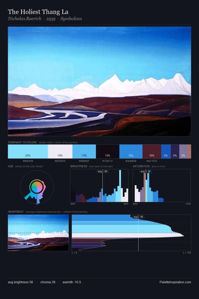
The Holiest Thang La palette card
The Holiest Thang La
Nicholas Roerich · 1939
Sortavala islands palette card
Sortavala islands
Nicholas Roerich · 1917
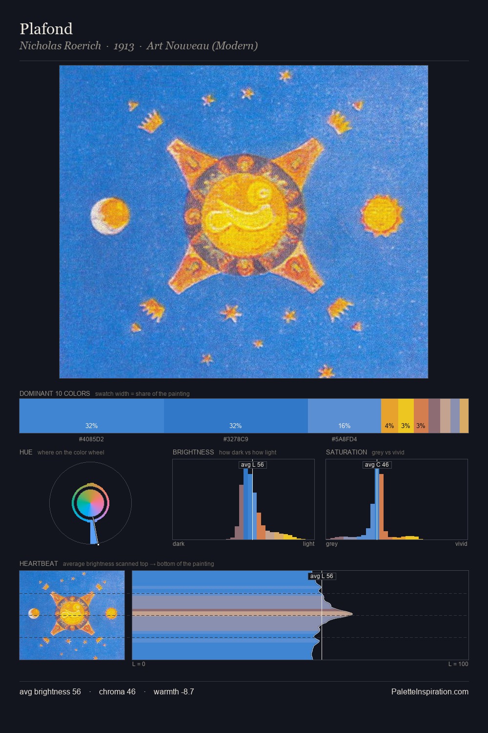
Plafond palette card
Plafond
Nicholas Roerich · 1913
Fire palette card
Fire
Nicholas Roerich · 1943

Master palettes

Palettes Featuring Tufts blue

5 palettes where Tufts blue appears prominently — one per artist.

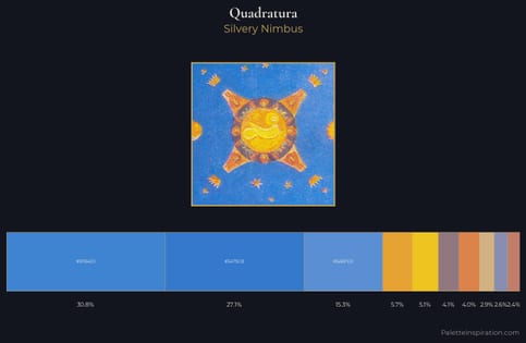
quadratura Palette 1 - Silvery Nimbus

quadratura

30.8% Tufts blue

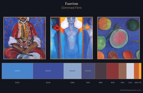
Fauvism Palette 15 - Dimmed Flint

Fauvism

22.3% Tufts blue

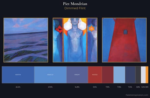
Piet Mondrian Palette 8 - Dimmed Flint

Piet Mondrian

21.9% Tufts blue

John Marin Palette 1 - Hushed Mellow

John Marin

15.5% Tufts blue

Vincenzo Cabianca Palette 4 - Silvery Gossamer

Vincenzo Cabianca

15.5% Tufts blue

Choose another color