Claude Monet Palette 4
Pearlescent Vellum
Pearlescent Iridescent light quality - high-key with subtle hue variation, like mother-of-pearl.
Vellum Smooth pale tan - the color of prepared calf-skin vellum, warmer than parchment.

Palette Analysis
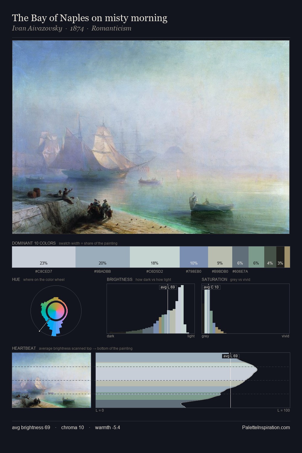
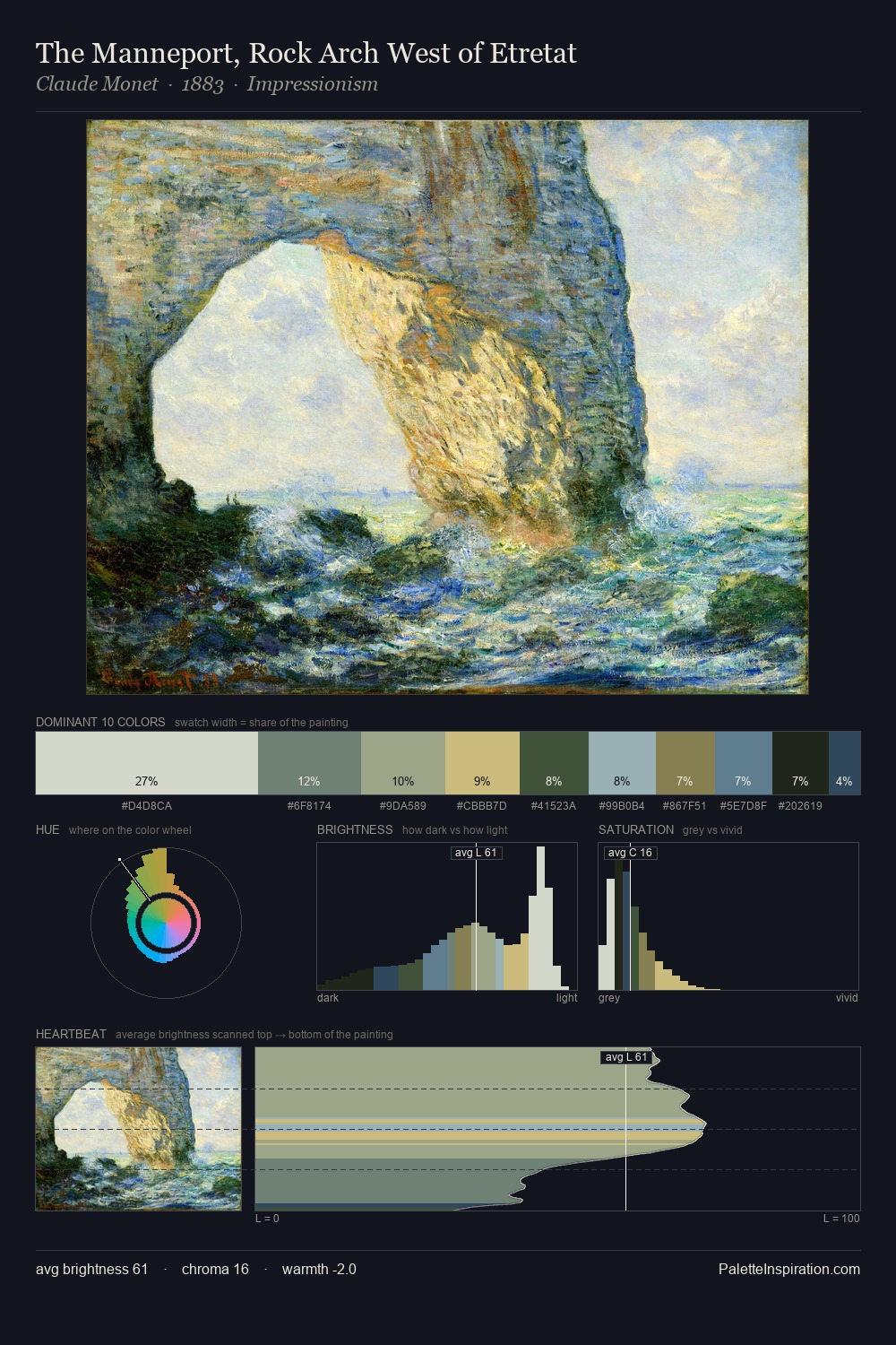
The high-key values of Claude Monet give it an effulgent, almost bleached quality. Cool tones set the register here - the blues and greens easily outweigh any warm accents. The absence of saturated colour is itself an expressive choice: this is a palette of restraint and atmosphere. The saturated accent, #978557, registers at 3.8% - sparse enough to feel like a deliberate surprise. Value range is moderate at 42 units - enough contrast for legibility, not so much as to fragment the tonal unity. The mid-to-high key, cool bias, and moderate chroma point to outdoor observation - sky and diffused daylight as the dominant light source. Palette 4 sits within the larger chromatic argument that Claude Monet's complete body of work advances.
Example use cases
- museums & galleries
- academic publishing
- heritage brands
- auction houses
- exhibition design
I Love This!
Use This Palette
Copy, export, or download for your project
Copy, export, or download for your project
Copy:
Download:
Share: