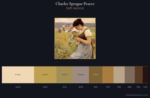
Charles Sprague Pearce Palette 4
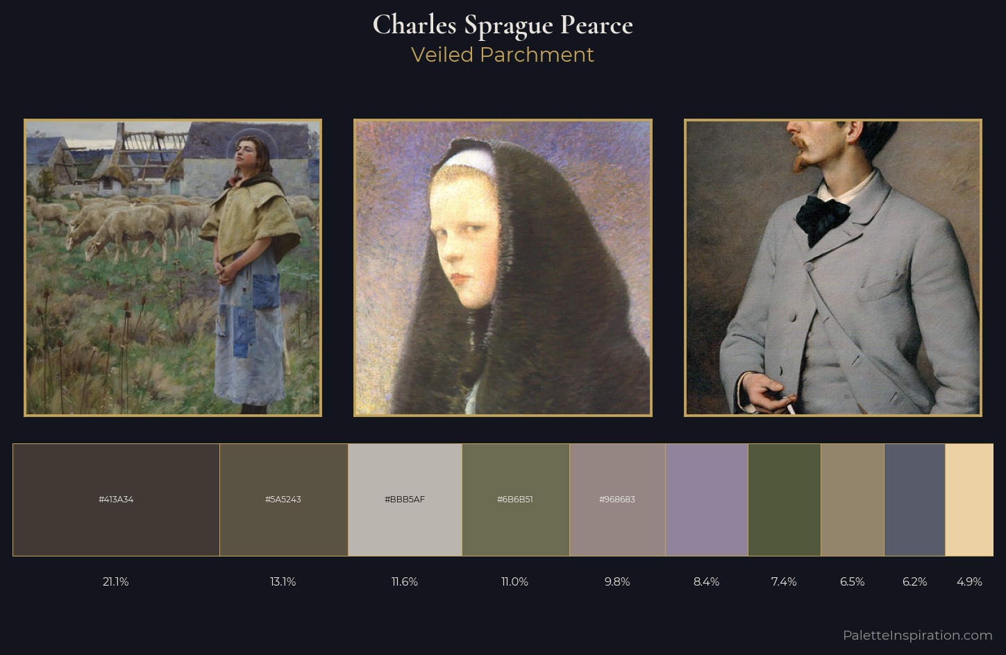
Palette Analysis
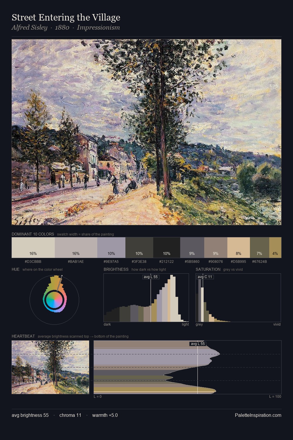
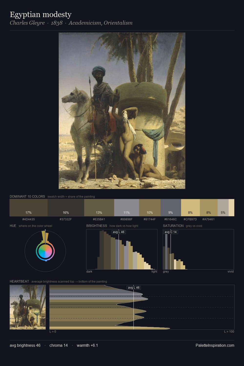
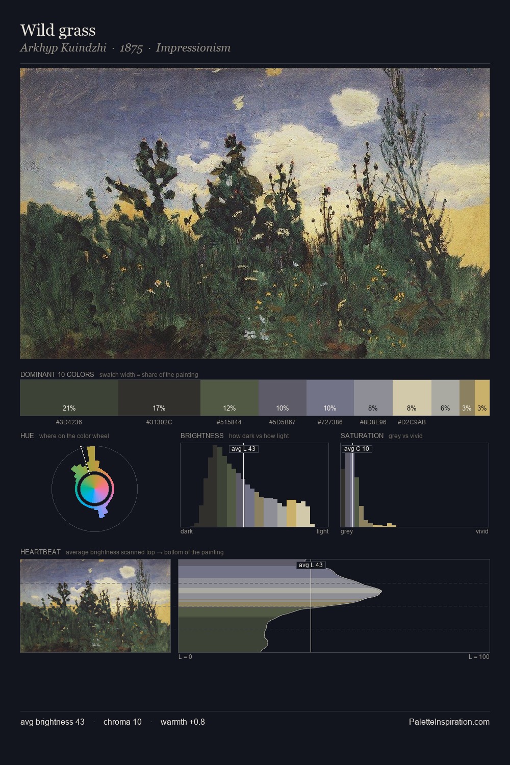
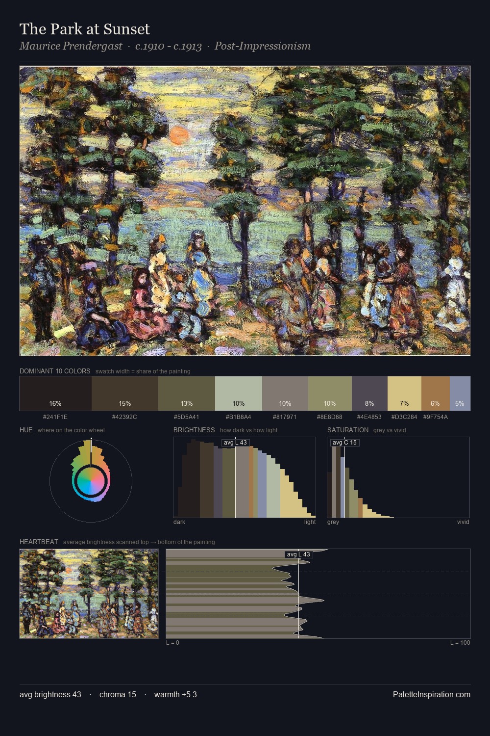
Charles Sprague Pearce sits in the centre of the value range, lending the palette a sense of even, sustained light. Charles Sprague Pearce tilts toward cool - blues and silver-greys carry the structural weight. Saturation is deliberately withheld - the beauty here lies in the near-monochromatic gradations rather than colour difference. Only 7.4% is devoted to #50573A, yet that small allocation delivers the palette's entire chromatic tension. 52 units of value spread create a palette that is varied but unified - contrast in the service of harmony. The mid-to-high key, cool bias, and moderate chroma point to outdoor observation - sky and diffused daylight as the dominant light source. Charles Sprague Pearce's palette 4 carries its own internal logic while remaining in conversation with the artist's broader colour intelligence.
Example use cases
- exhibition design
- foundation branding
- estate management
- art education
- museums & galleries
I Love This!
Copy, export, or download for your project