Charles Sprague Pearce Palette 1

Palette Analysis
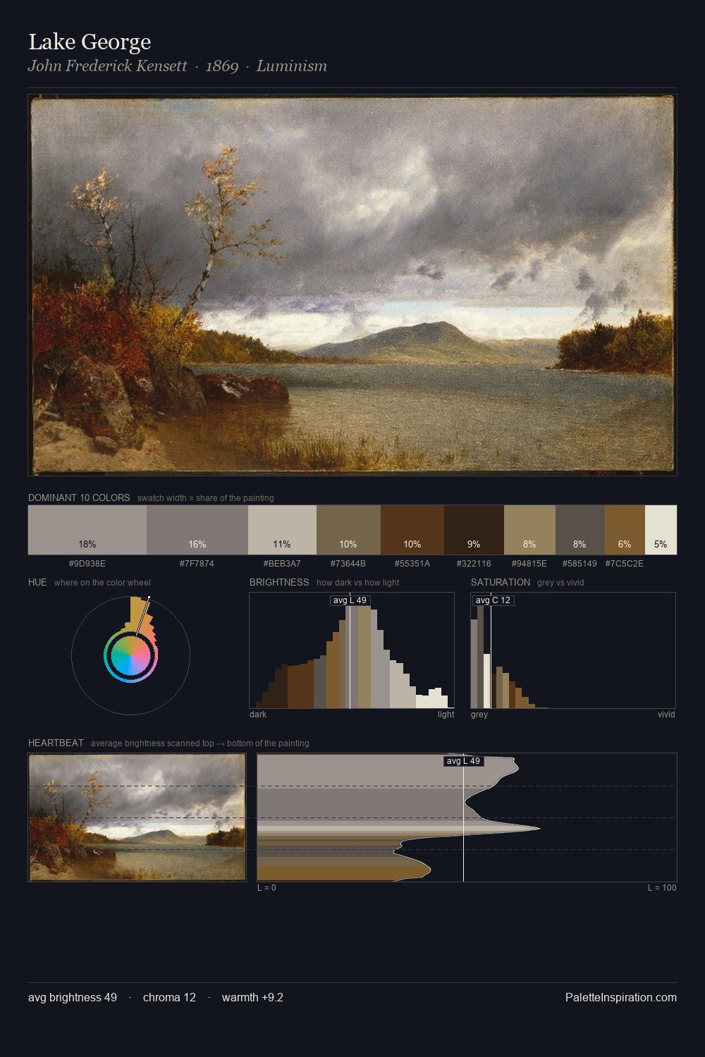
Values in Charles Sprague Pearce tilt decisively toward white, giving the palette its luminous character. Temperature is cool-dominant, with blue and green families claiming the largest areas. The absence of saturated colour is itself an expressive choice: this is a palette of restraint and atmosphere. At 9.8%, #646240 carries the palette's sharpest chromatic charge: an accent that earns its place precisely because it is withheld. The full value range is 65 units: broad enough to build convincing three-dimensional form. The mid-to-high key, cool bias, and moderate chroma point to outdoor observation - sky and diffused daylight as the dominant light source. This is palette 1 of Charles Sprague Pearce's sequence - a single chapter in a chromatic story told across many works.
Example use cases
- exhibition design
- foundation branding
- estate management
- art education
- museums & galleries
I Love This!
Copy, export, or download for your project