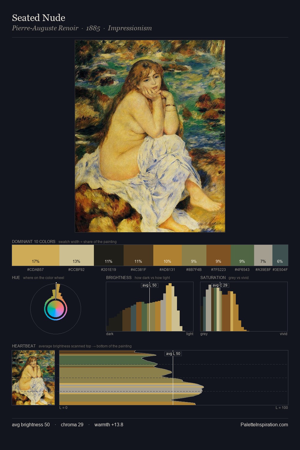
Caravaggio Palette 2

Palette Analysis
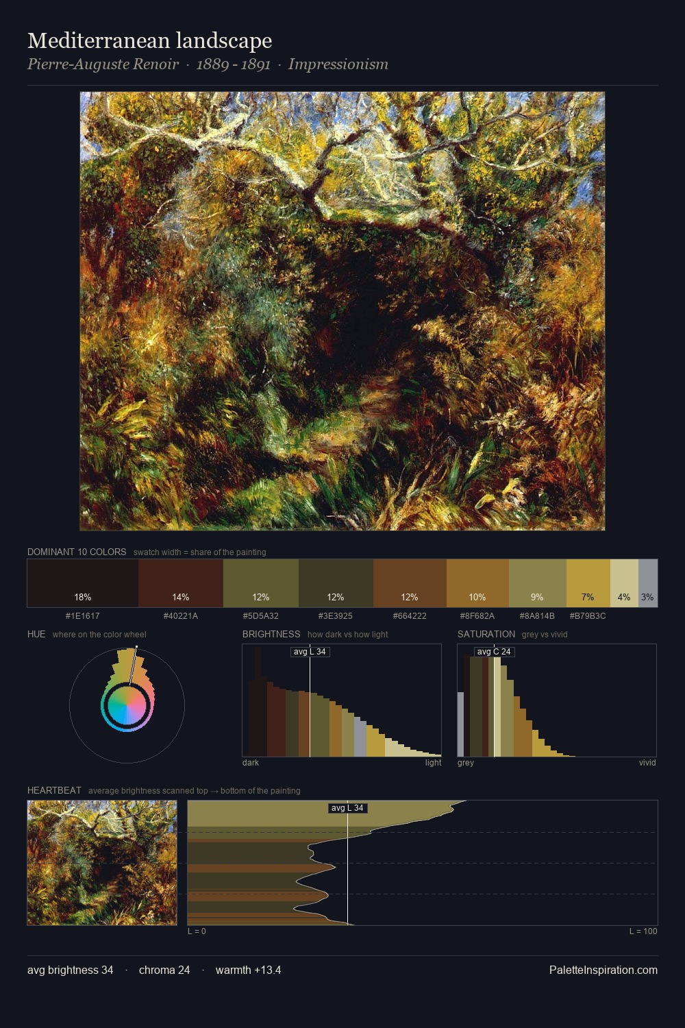
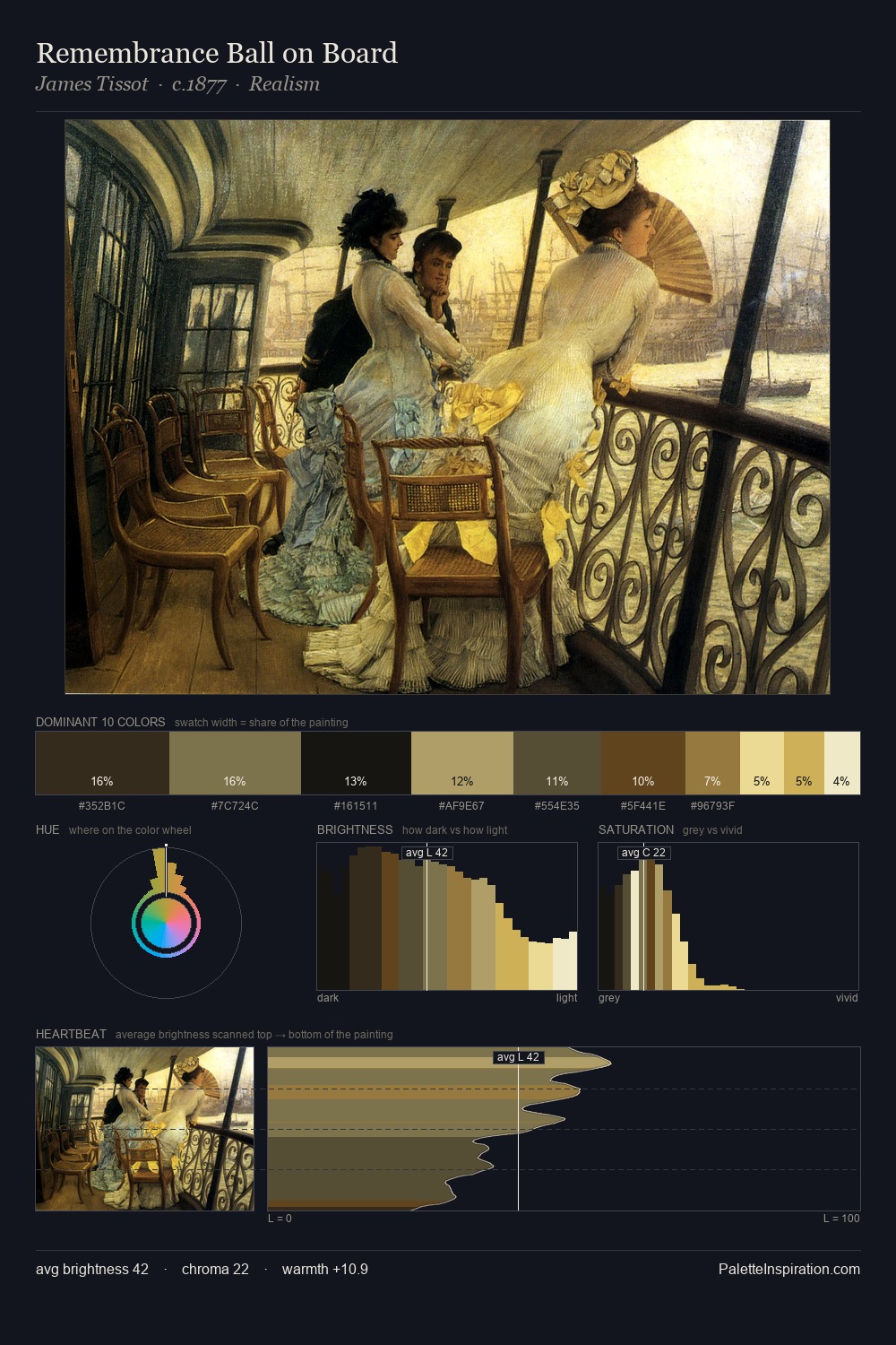
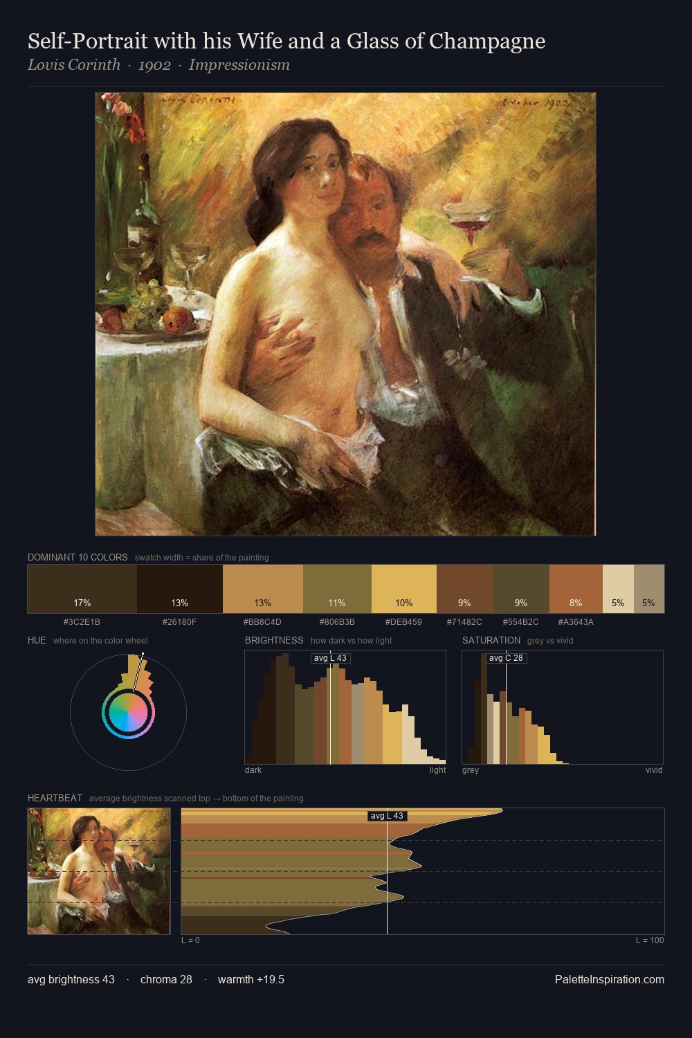
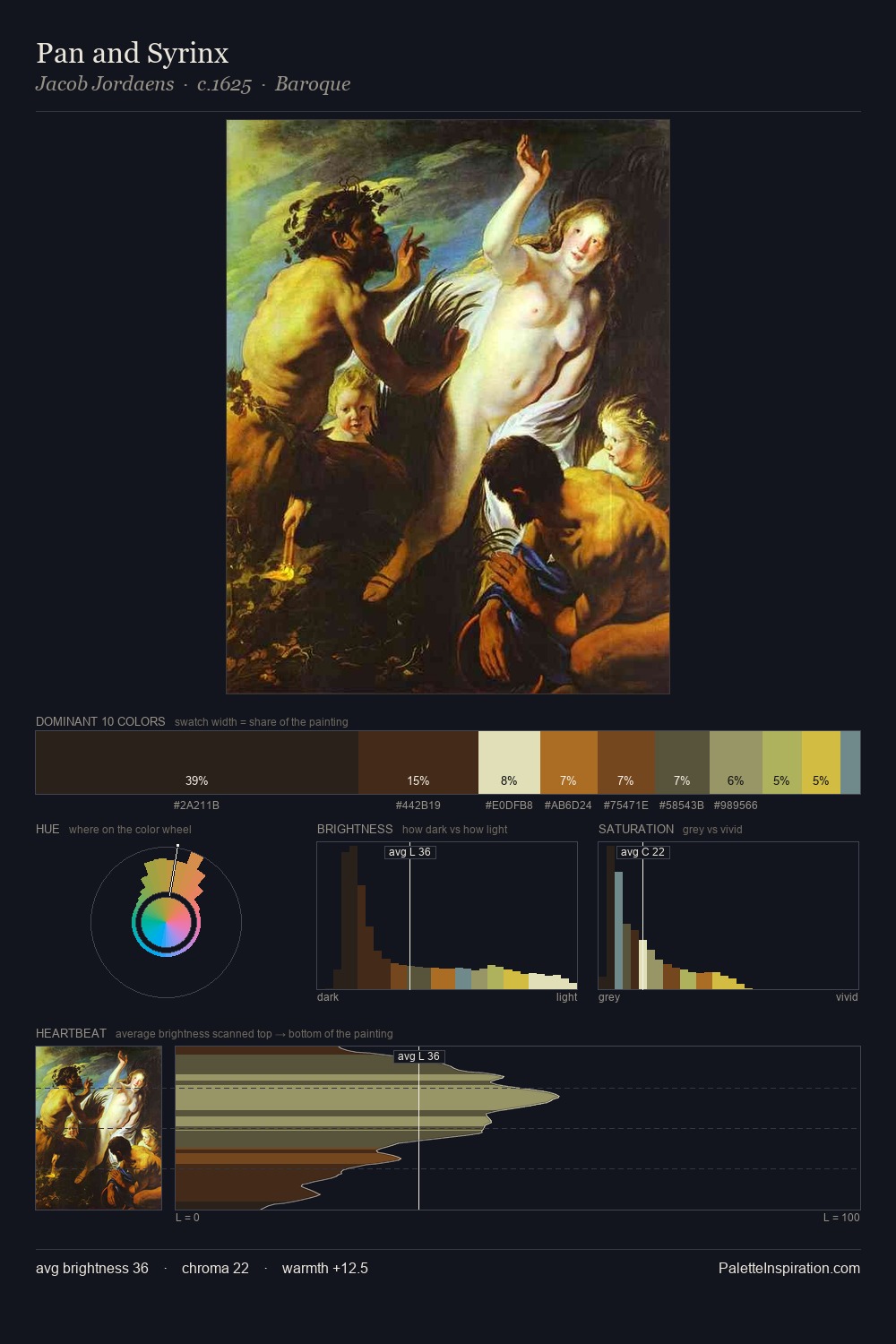
Caravaggio is strongly light-biased - shadow is suggested rather than declared. Cool hues prevail: blues, greens, and greys anchor the palette's emotional temperature. The absence of saturated colour is itself an expressive choice: this is a palette of restraint and atmosphere. #E3D6B2 at 37.9% of the palette: an overwhelming presence that pulls all other colours into its gravitational field. The highest-chroma note - #D1AF40 - appears at just 2.6%, deployed as a precision accent against the quieter ground. At 70 units of value range, the palette has the tonal breadth to sustain complex spatial readings. The palette has the character of outdoor light: cool, mid-bright, with colour rendered faithfully rather than expressively. In the context of Caravaggio's full range of palettes, group 2 represents one movement in an ongoing chromatic dialogue.
Example use cases
- publishing
- corporate identity
- consumer apps
- hospitality
- design agencies
I Love This!
Copy, export, or download for your project