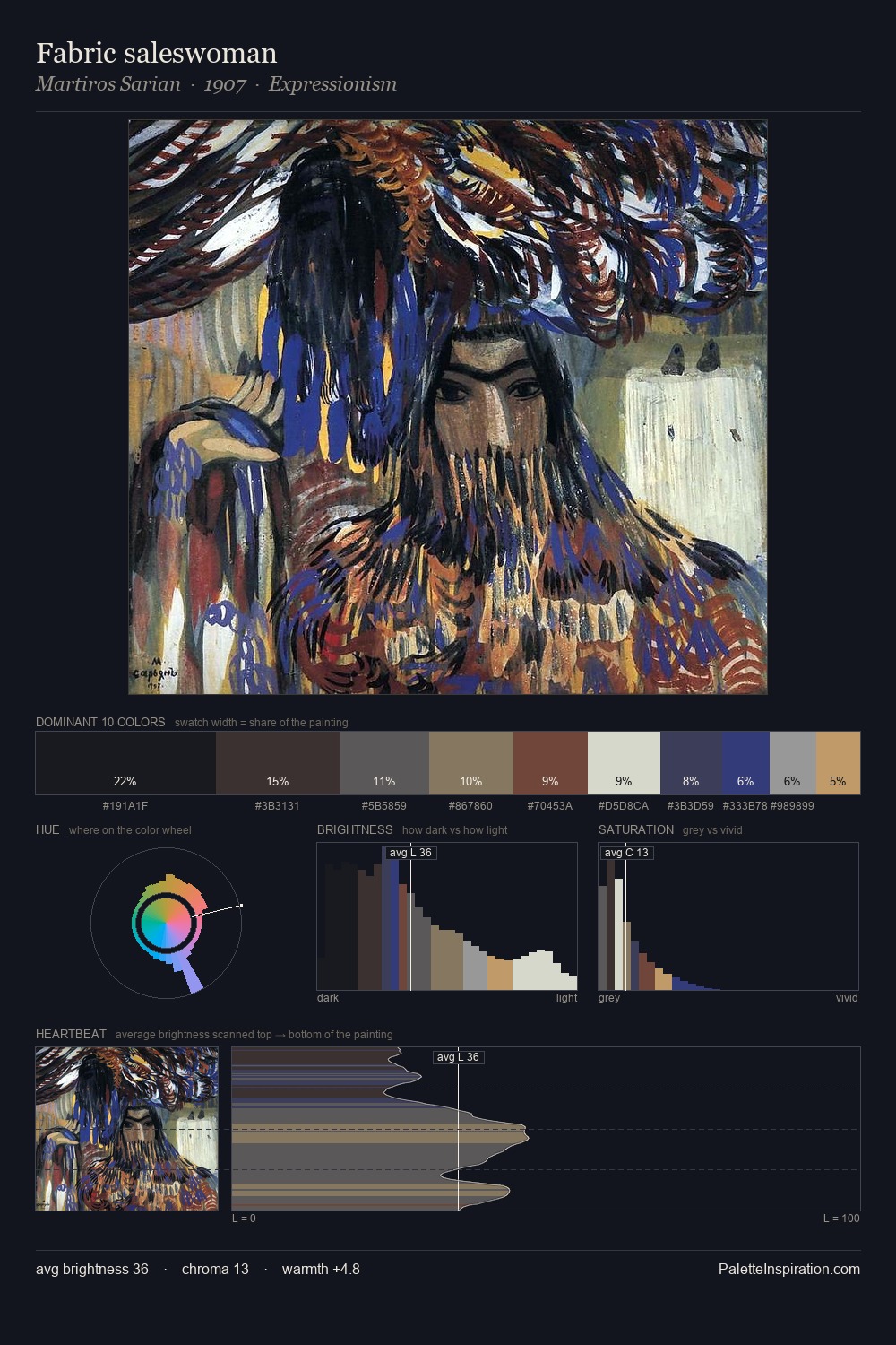
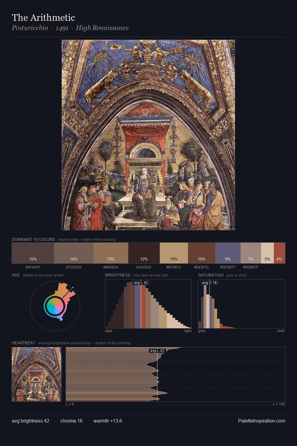
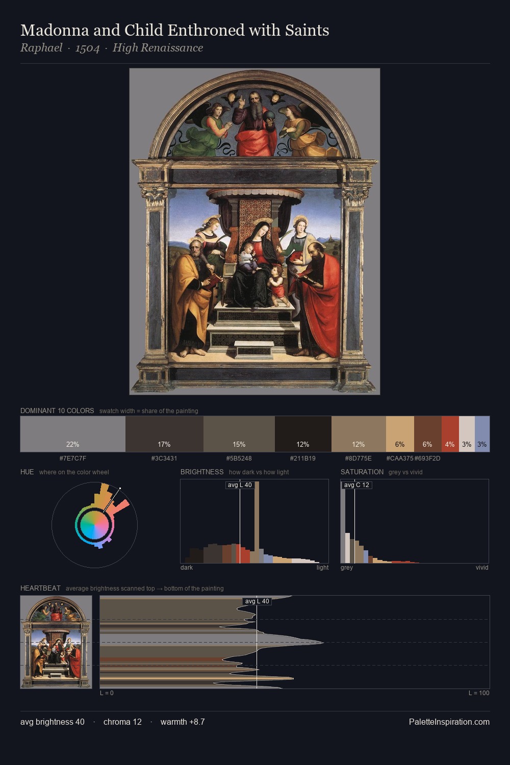
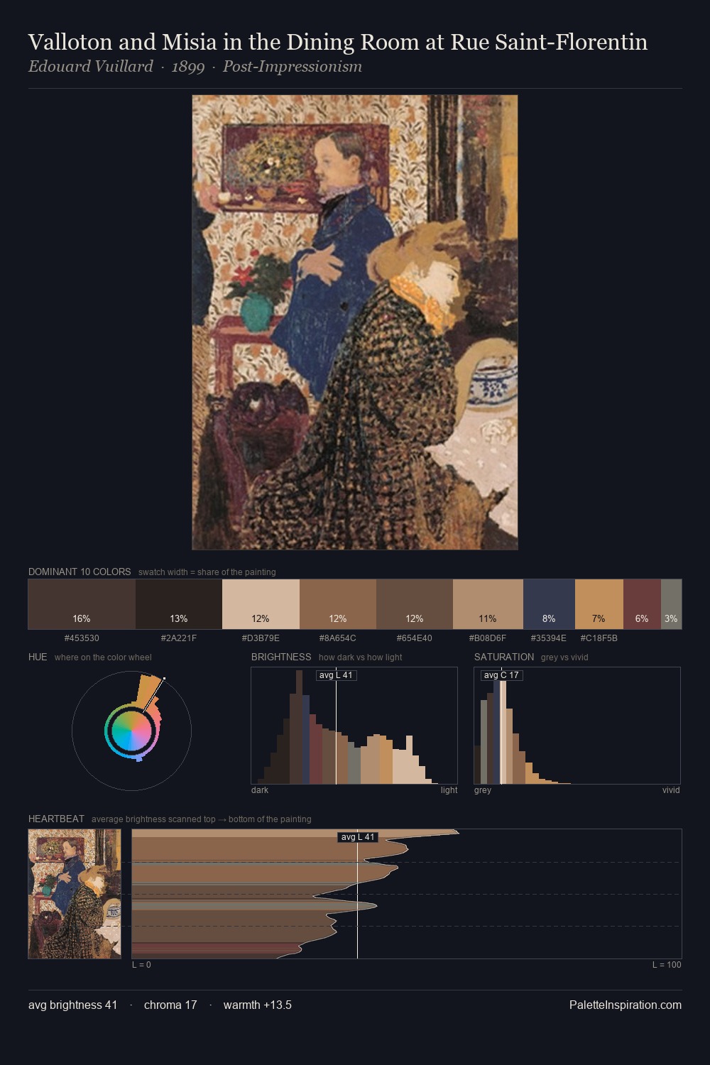
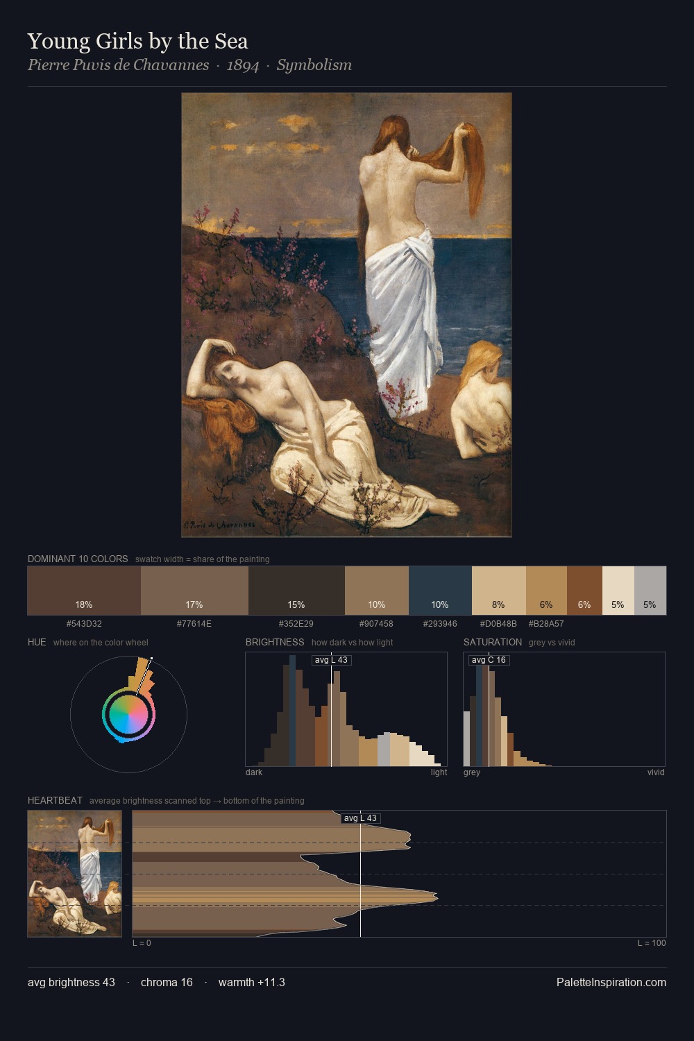
Bertalan Por Palette 4

Palette Analysis
Bertalan Por keeps values measured and balanced, a hallmark of tonal restraint. Temperature reads distinctly warm: the reds and earth tones from Bertalan Por carry the compositional weight. Chroma hovers near zero; colour declares itself through subtle shifts in hue rather than outright saturation. The dominant colour, #2A2320, takes 25.0% of the total area, establishing the overall mood before any other hue is introduced. The saturated accent, #6D4037, registers at 6.4% - sparse enough to feel like a deliberate surprise. 58 units of value range underpin the palette's structural clarity: the eye always knows where light falls. In the context of Bertalan Por's full range of palettes, group 4 represents one movement in an ongoing chromatic dialogue.
Example use cases
- premium streaming
- cocktail bars
- fashion campaigns
- book covers
- music labels
I Love This!
Copy, export, or download for your project