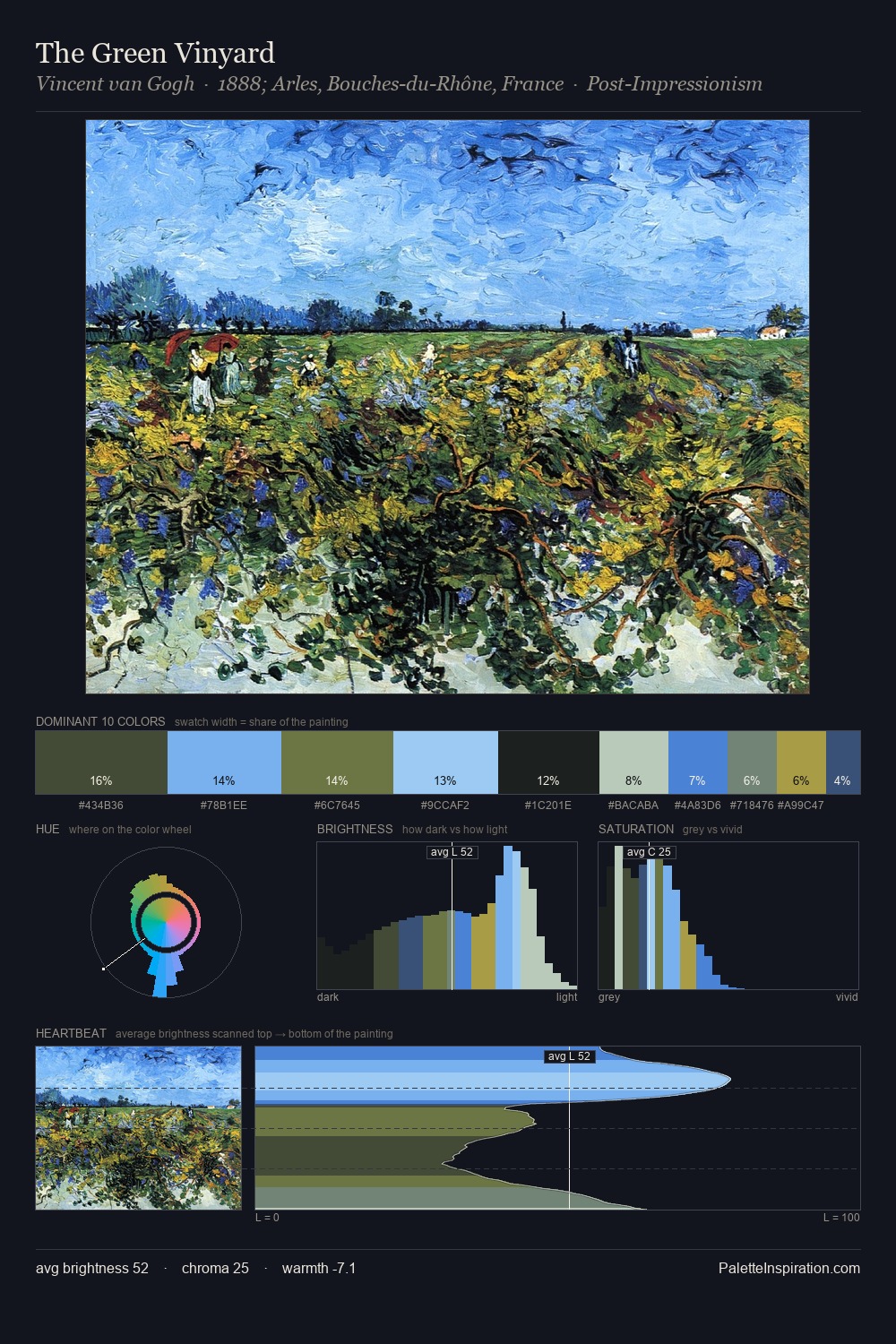
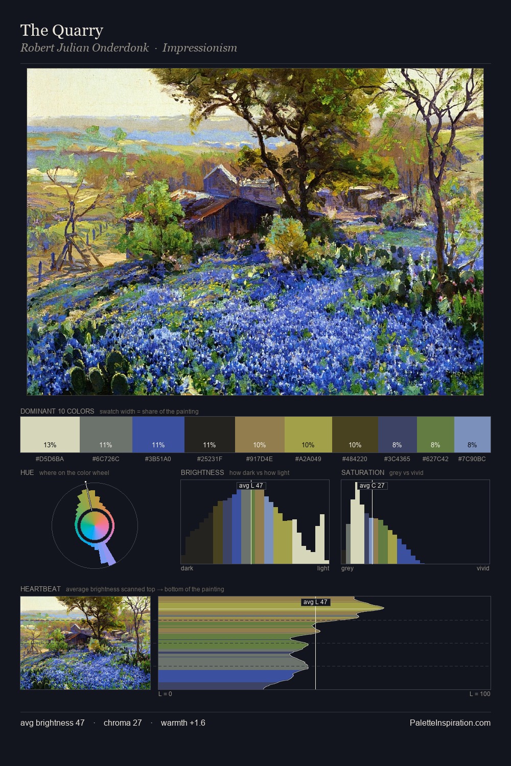
Bertalan Por Palette 5

Palette Analysis
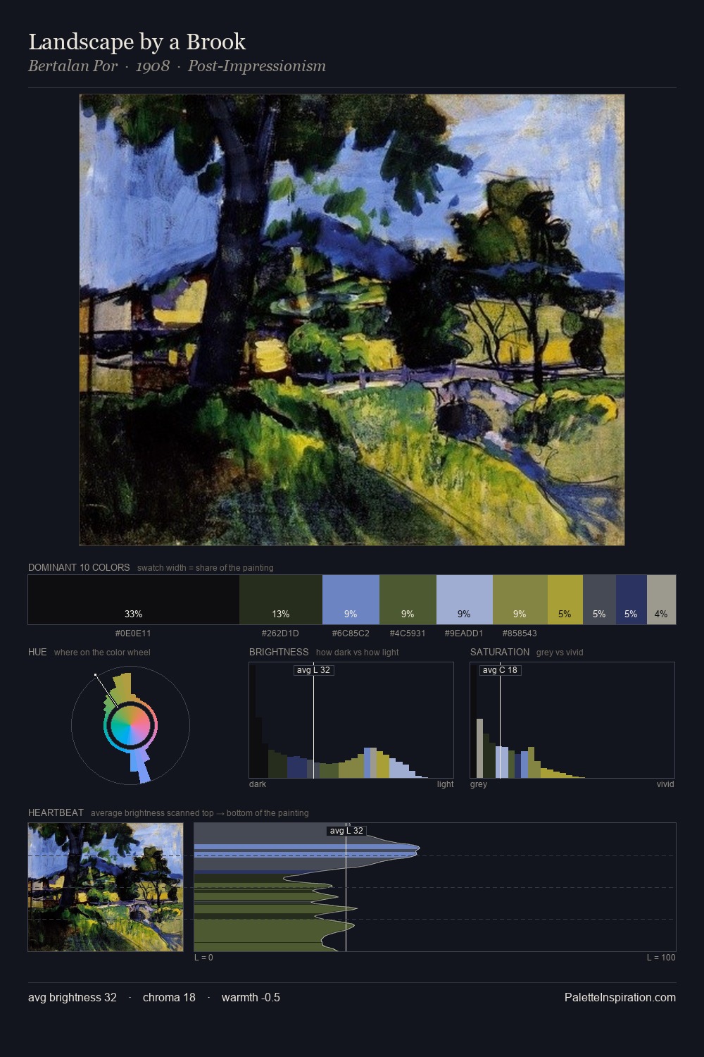
Bertalan Por sits in the centre of the value range, lending the palette a sense of even, sustained light. Bertalan Por builds on cool foundations: the palette favours the blue-cyan-green arc. Muted throughout, the palette achieves its effects through value and temperature rather than chromatic force. At 32.1%, #0D0D0E functions less as a colour accent and more as a complete atmospheric environment. The saturated accent, #546630, registers at 8.5% - sparse enough to feel like a deliberate surprise. At 59 units of value range, the palette has the tonal breadth to sustain complex spatial readings. The mid-to-high key, cool bias, and moderate chroma point to outdoor observation - sky and diffused daylight as the dominant light source. Bertalan Por's palette 5 carries its own internal logic while remaining in conversation with the artist's broader colour intelligence.
Example use cases
- legal services
- corporate identity
- industrial design
- professional services
- fintech
I Love This!
Copy, export, or download for your project