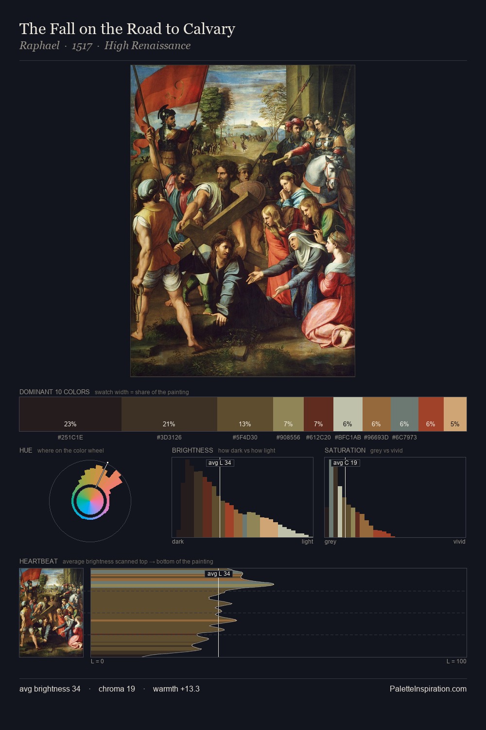
Bartolomeo Manfredi Palette 3
Tenebrous Bister
Tenebrous Dark and murky - low-key values with obscured form, Baroque in temperament.
Bister Dark warm brown - a traditional ink and wash pigment made from wood soot.

Palette Analysis
Bartolomeo Manfredi keeps values measured and balanced, a hallmark of tonal restraint. Warm and cool are kept in productive tension, creating the kind of chromatic harmony that sustains the eye. Every colour is desaturated; the palette proceeds through near-neutrals and gently-coloured greys. At 25.4%, #2F2114 functions less as a colour accent and more as a complete atmospheric environment. Only 5.4% is devoted to #60492C, yet that small allocation delivers the palette's entire chromatic tension. 48 units of value spread create a palette that is varied but unified - contrast in the service of harmony. This is palette 3 of Bartolomeo Manfredi's sequence - a single chapter in a chromatic story told across many works.
Example use cases
- music labels
- luxury hospitality
- editorial photography
- leather goods
- premium streaming
I Love This!
Use This Palette
Copy, export, or download for your project
Copy, export, or download for your project
Copy:
Download:
Share: