Bartolomeo Manfredi Palette 2

Palette Analysis
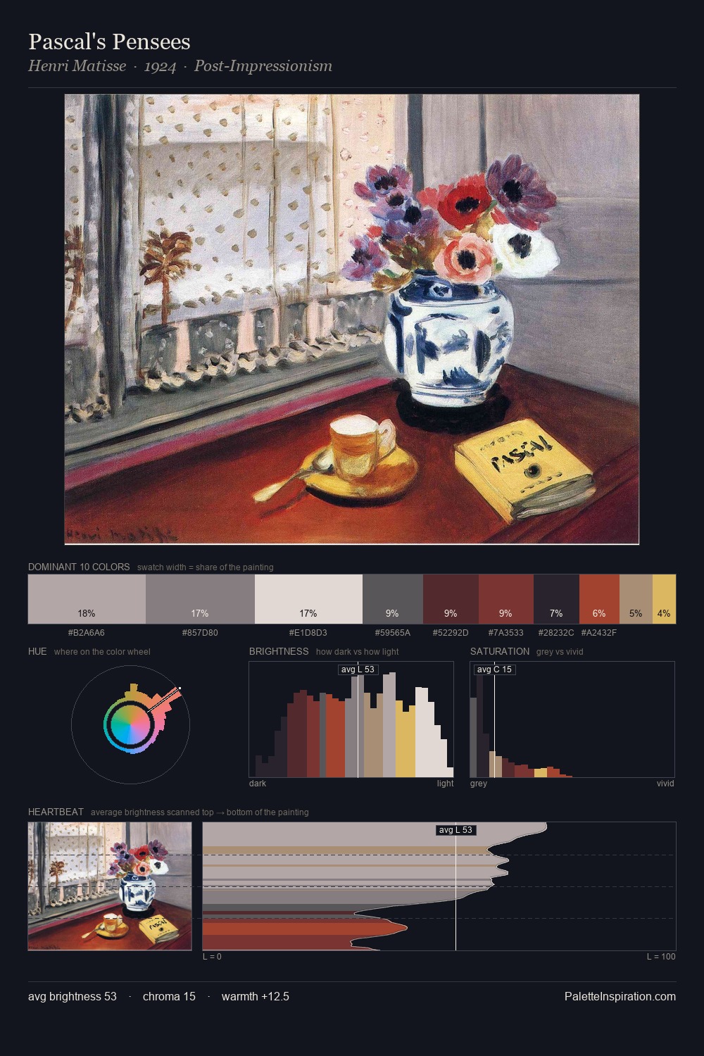
Darkness anchors Bartolomeo Manfredi; light is rationed, creating dramatic contrast rather than open air. Temperature is cool-dominant, with blue and green families claiming the largest areas. The absence of saturated colour is itself an expressive choice: this is a palette of restraint and atmosphere. 42.4% of the palette belongs to #161D2C, a concentration that makes it the unmistakable visual centre. The highest-chroma note - #977752 - appears at just 1.4%, deployed as a precision accent against the quieter ground. The value range spans 62 units across the palette, providing the full gamut from deep shadow to near-white and ensuring clear tonal hierarchy. This tonal restraint is characteristic of the Bartolomeo Manfredi approach: colour serves light, not the reverse. Palette 2 sits within the larger chromatic argument that Bartolomeo Manfredi's complete body of work advances.
Example use cases
- legal services
- corporate identity
- industrial design
- professional services
- fintech
I Love This!
Copy, export, or download for your project