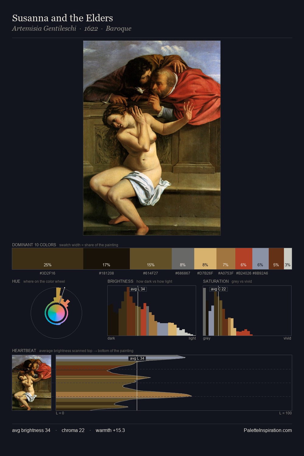
Artemisia Gentileschi Palette 4
Penumbral Terracotta
Penumbral Partial shadow - the transitional zone between light and full dark, soft-edged.
Terracotta Fired clay red-orange - the color of unglazed earthenware pottery.

Palette Analysis
Values in Artemisia Gentileschi rest in the mid-range - neither dramatically lit nor steeped in shadow. The palette achieves thermal balance - reds and blues, ochres and greens, each holding the other in check. Chroma hovers near zero; colour declares itself through subtle shifts in hue rather than outright saturation. At 26.8%, #1A1007 functions less as a colour accent and more as a complete atmospheric environment. The most saturated colour, #EAD7A5, is reserved to 11.1% of the surface, where it acts as a focal punctuation. At 70 units of value range, the palette has the tonal breadth to sustain complex spatial readings. Palette 4 sits within the larger chromatic argument that Artemisia Gentileschi's complete body of work advances.
Example use cases
- theater design
- jewelry brands
- tobacco-adjacent retail
- event branding
- film & entertainment
I Love This!
Use This Palette
Copy, export, or download for your project
Copy, export, or download for your project
Copy:
Download:
Share: