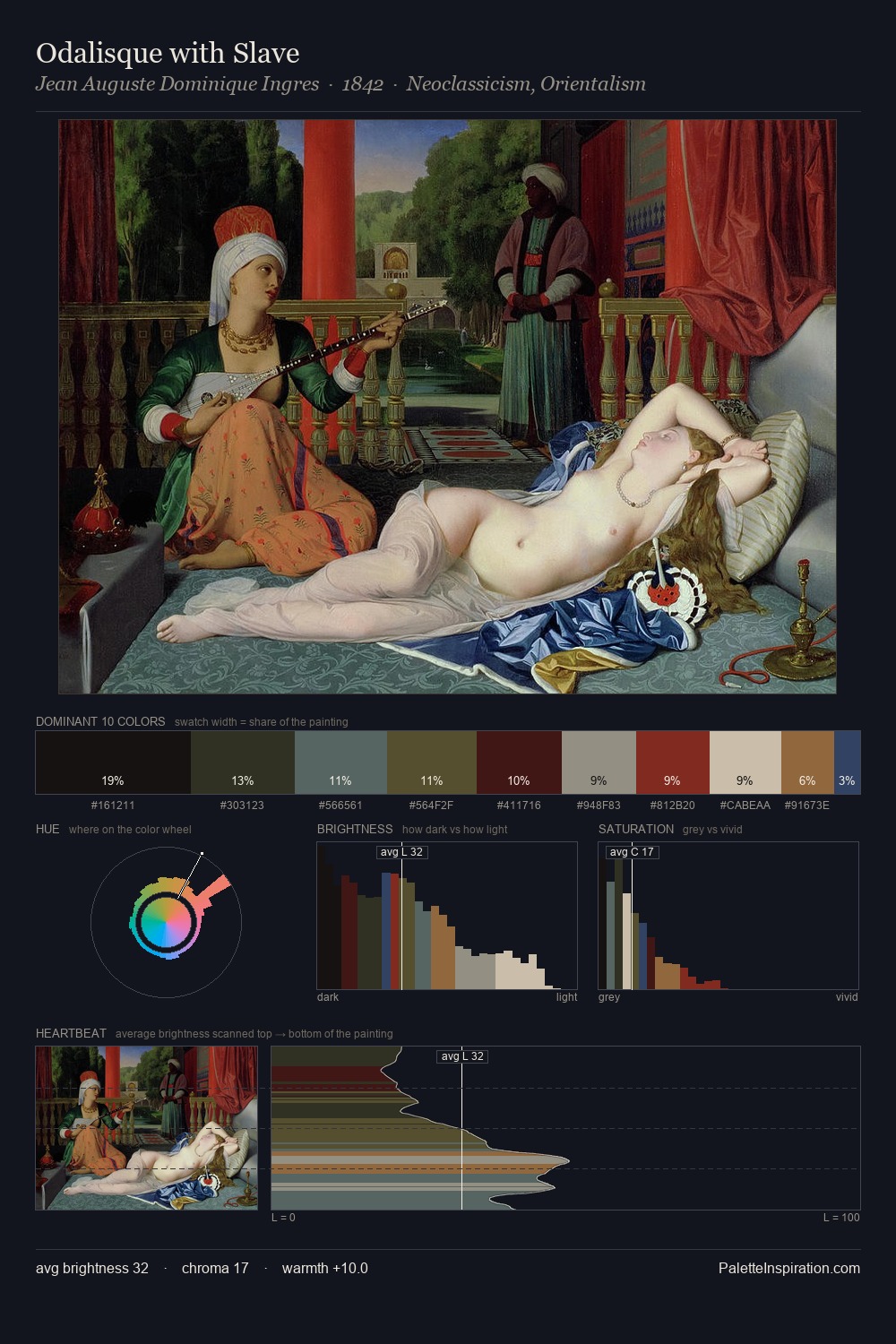
Artemisia Gentileschi Palette 5

Palette Analysis
Artemisia Gentileschi distributes its values across the middle register, creating harmony without high contrast. Temperature reads distinctly warm: the reds and earth tones from Artemisia Gentileschi carry the compositional weight. Saturation is deliberately withheld - the beauty here lies in the near-monochromatic gradations rather than colour difference. At 41.9%, #0C0A0B functions less as a colour accent and more as a complete atmospheric environment. Only 2.1% is devoted to #062C4D, yet that small allocation delivers the palette's entire chromatic tension. The value range spans 73 units across the palette, providing the full gamut from deep shadow to near-white and ensuring clear tonal hierarchy. Artemisia Gentileschi's palette 5 carries its own internal logic while remaining in conversation with the artist's broader colour intelligence.
Example use cases
- theater design
- jewelry brands
- tobacco-adjacent retail
- event branding
- film & entertainment
I Love This!
Copy, export, or download for your project