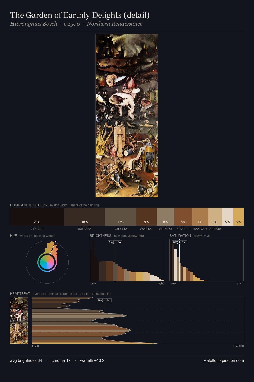
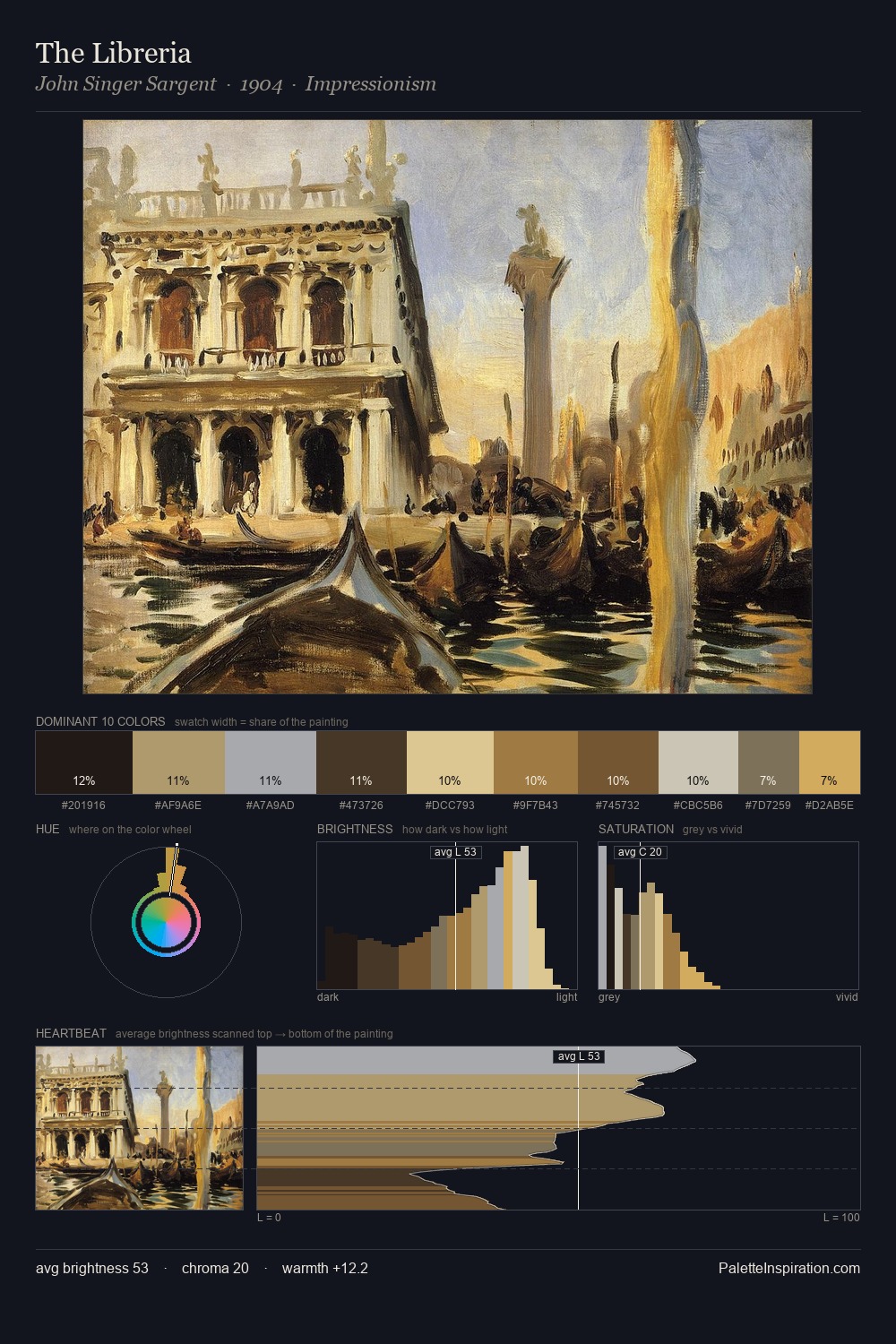
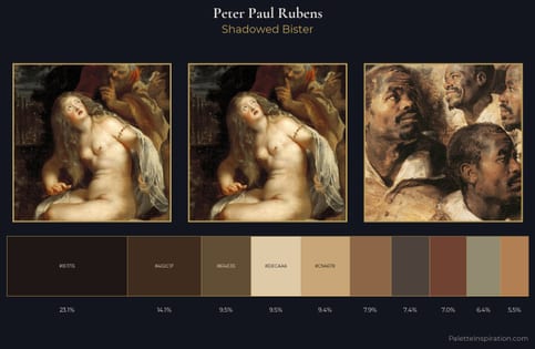
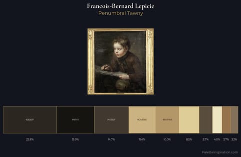
Arnold Böcklin Master Palette
Shadowed Bister
Shadowed Low-key - values weighted toward shadow, the palette of dim interiors and overcast skies.
Bister Dark warm brown - a traditional ink and wash pigment made from wood soot.
Palette Analysis
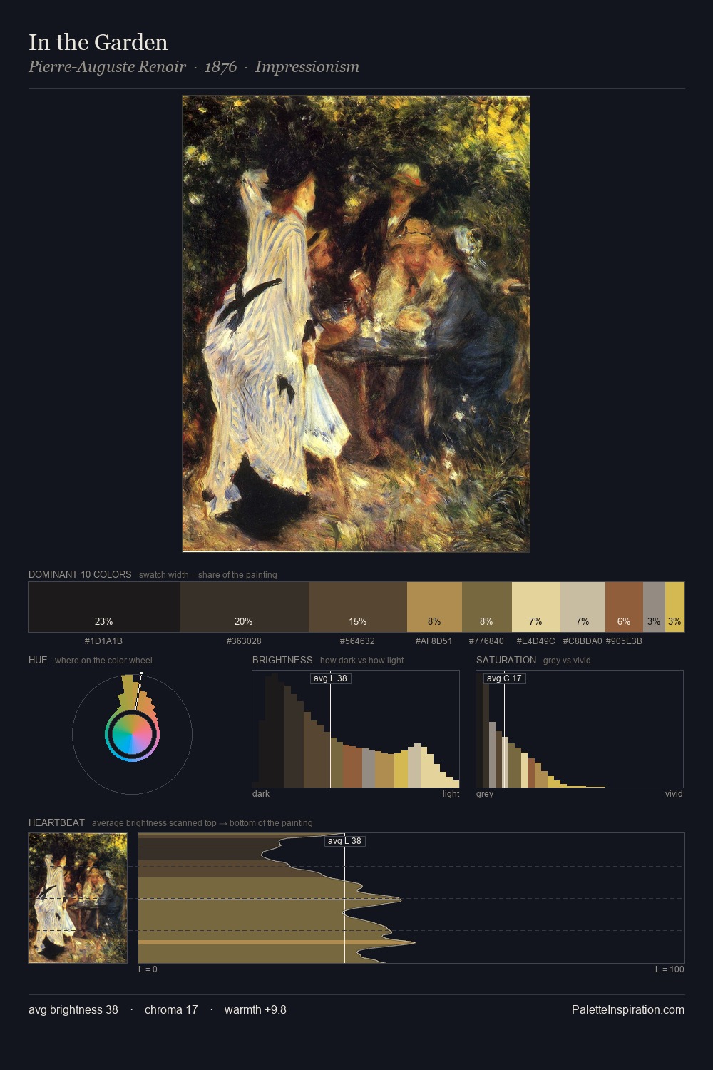
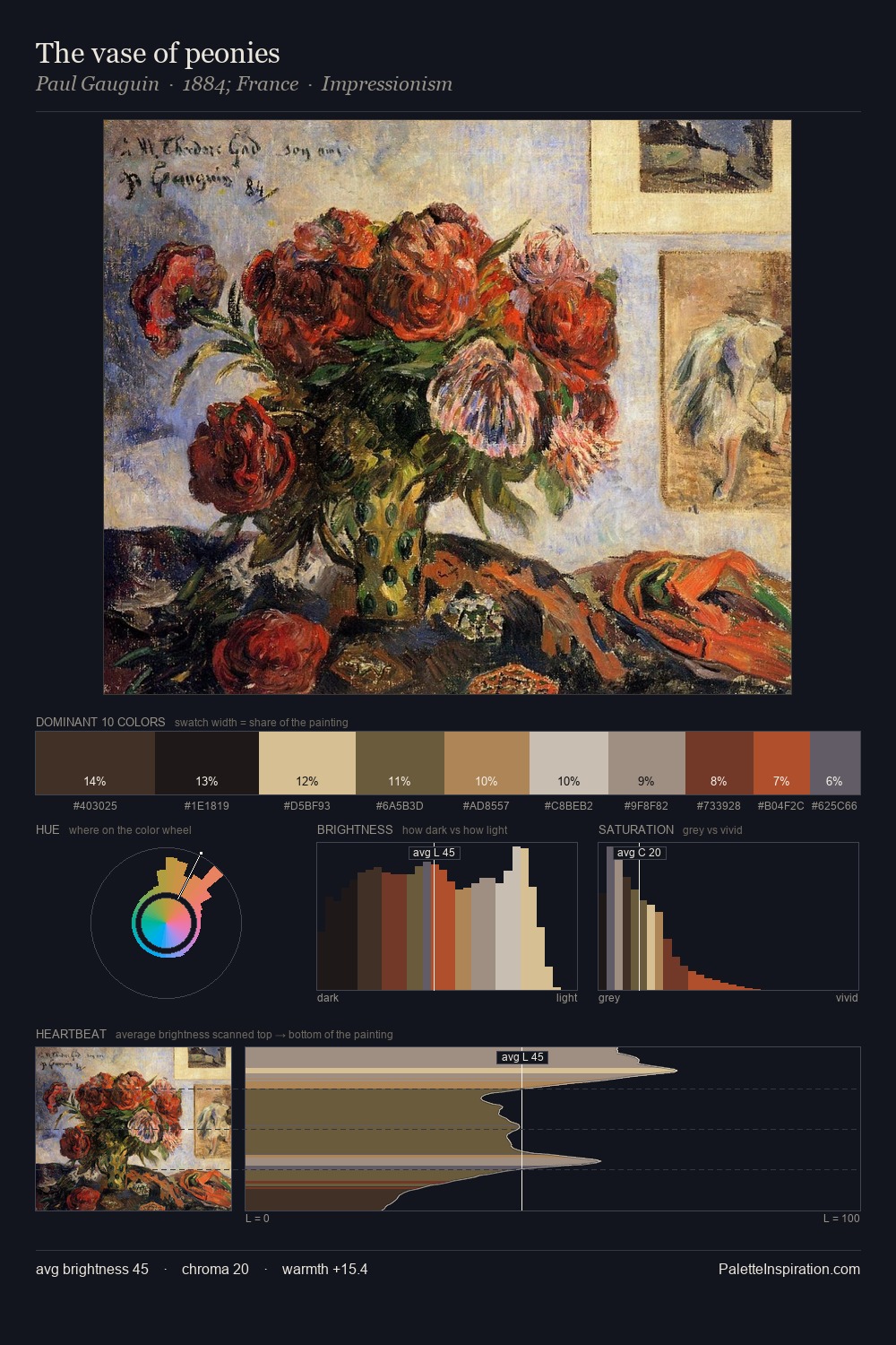
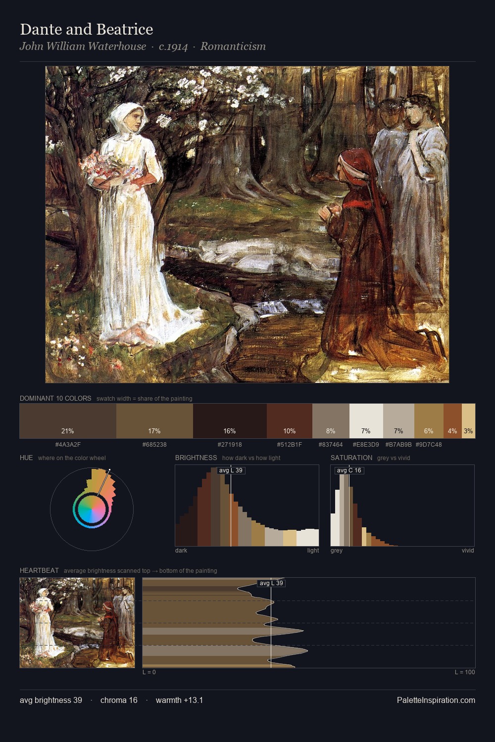
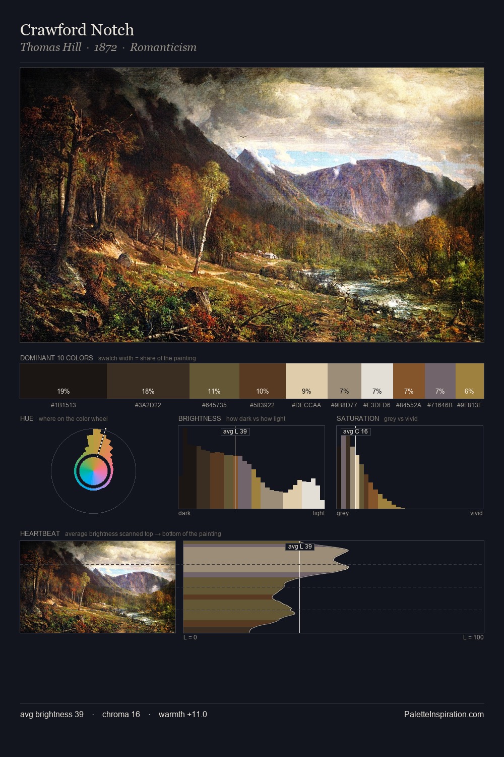
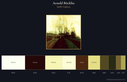
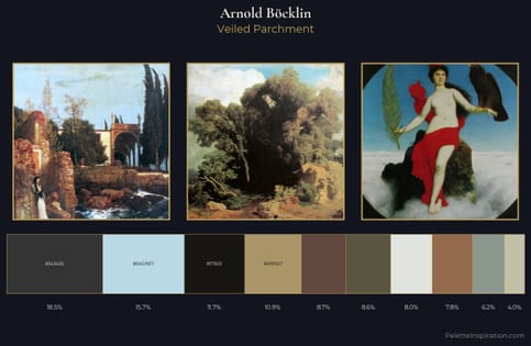
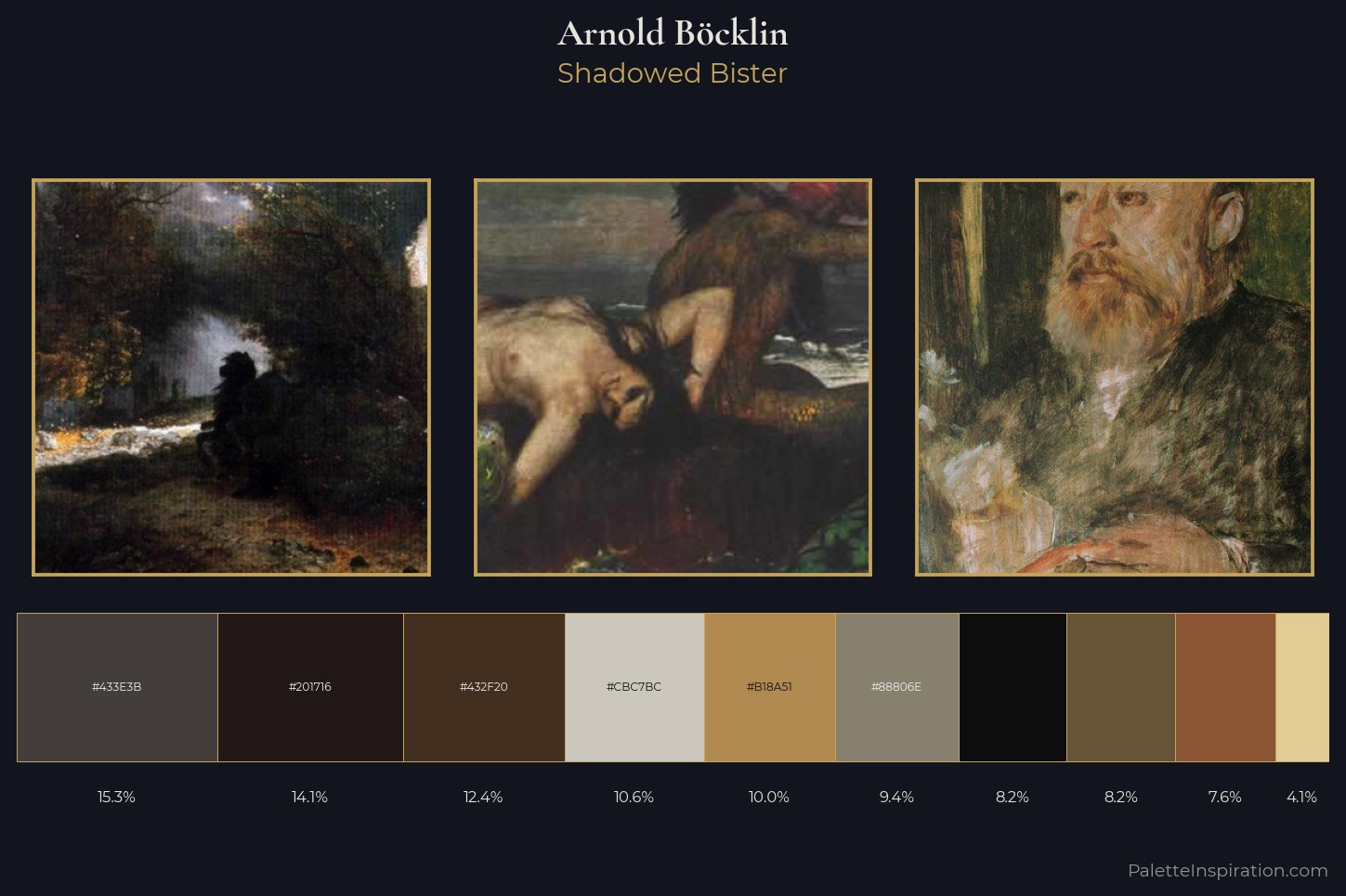
Arnold Böcklin distributes its values across the middle register, creating harmony without high contrast. Warm hues command this palette; Arnold Böcklin favours the reds, oranges, and yellows of firelight and earth. Chroma hovers near zero; colour declares itself through subtle shifts in hue rather than outright saturation. The most saturated colour, #8C5635, is reserved to 7.6% of the surface, where it acts as a focal punctuation. At 69 units of value range, the palette has the tonal breadth to sustain complex spatial readings. The palette is a signature: Arnold Böcklin's particular sense of value, warmth, and colour weight made legible.
Example use cases
- music labels
- luxury hospitality
- editorial photography
- leather goods
- premium streaming
I Love This!
Use This Palette
Copy, export, or download for your project
Copy, export, or download for your project
Copy:
Download:
Share: