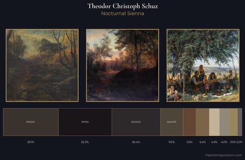
Arnold Böcklin Palette 10
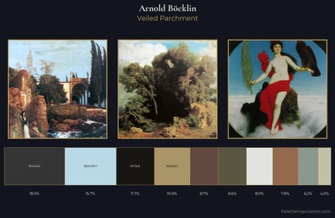
Nocturnal Sienna
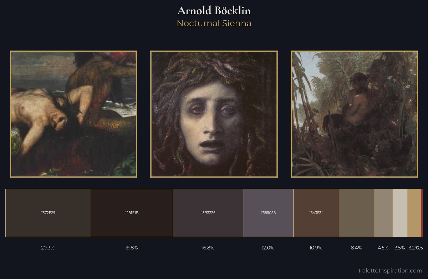
Nocturnal Night-register palette - very low values, the world after dark.
Sienna Warm red-brown earth - named after the Sienese pigment, a fundamental artist earth color.
Palette Analysis
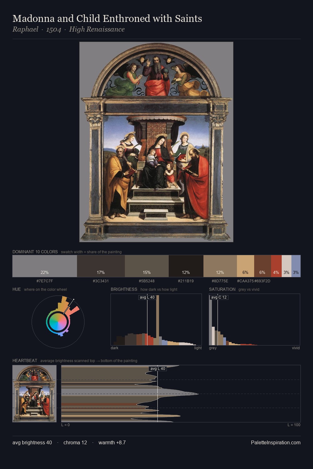
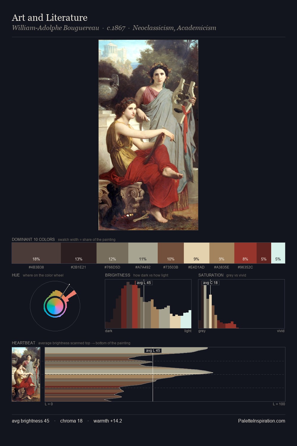
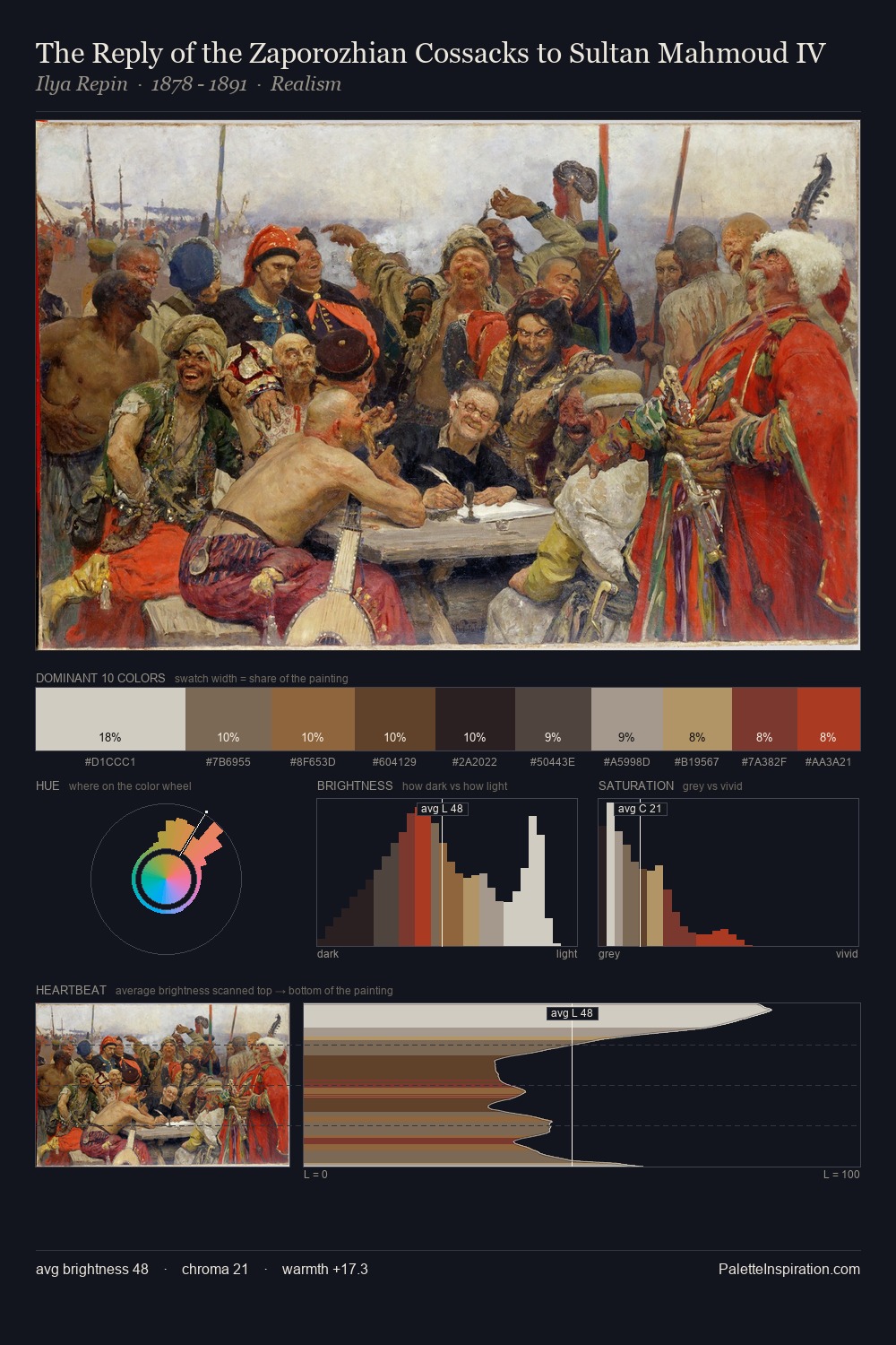
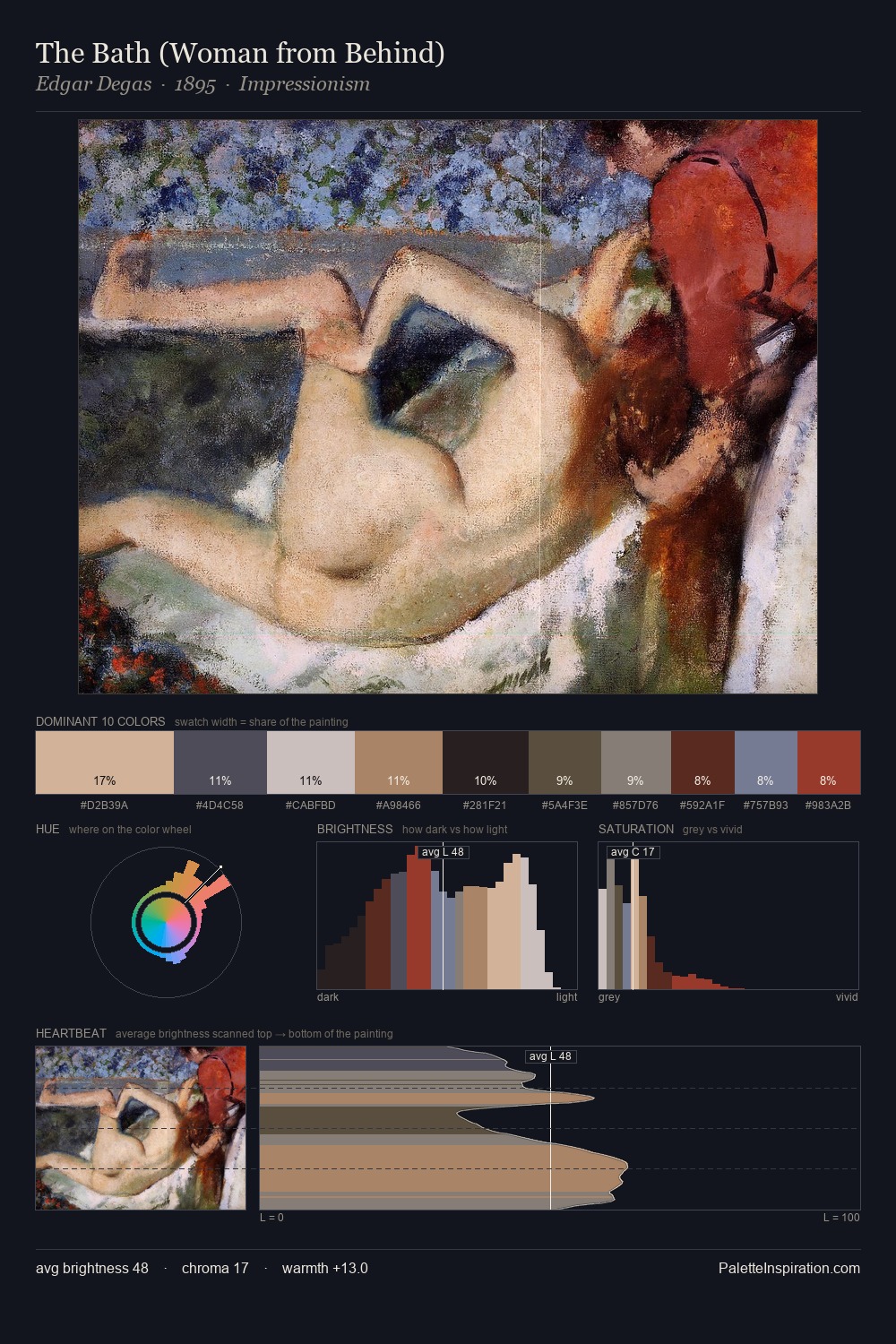
Arnold Böcklin sits in the centre of the value range, lending the palette a sense of even, sustained light. Warm hues command this palette; Arnold Böcklin favours the reds, oranges, and yellows of firelight and earth. The absence of saturated colour is itself an expressive choice: this is a palette of restraint and atmosphere. Only 10.9% is devoted to #543F34, yet that small allocation delivers the palette's entire chromatic tension. From deepest dark to palest light, the palette traverses 55 units of the value scale - a span that creates natural depth. Palette 10 sits within the larger chromatic argument that Arnold Böcklin's complete body of work advances.
Example use cases
- theater design
- jewelry brands
- tobacco-adjacent retail
- event branding
- film & entertainment
I Love This!
Use This Palette
Copy, export, or download for your project
Copy, export, or download for your project
Copy:
Download:
Share: