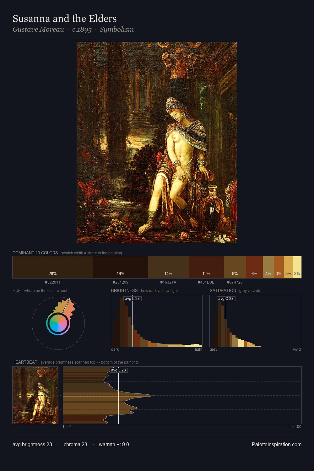
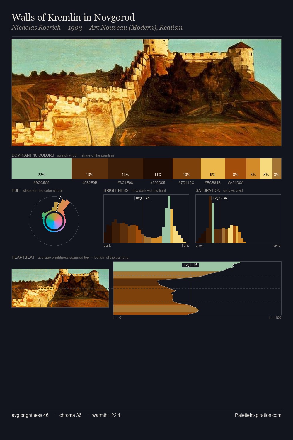
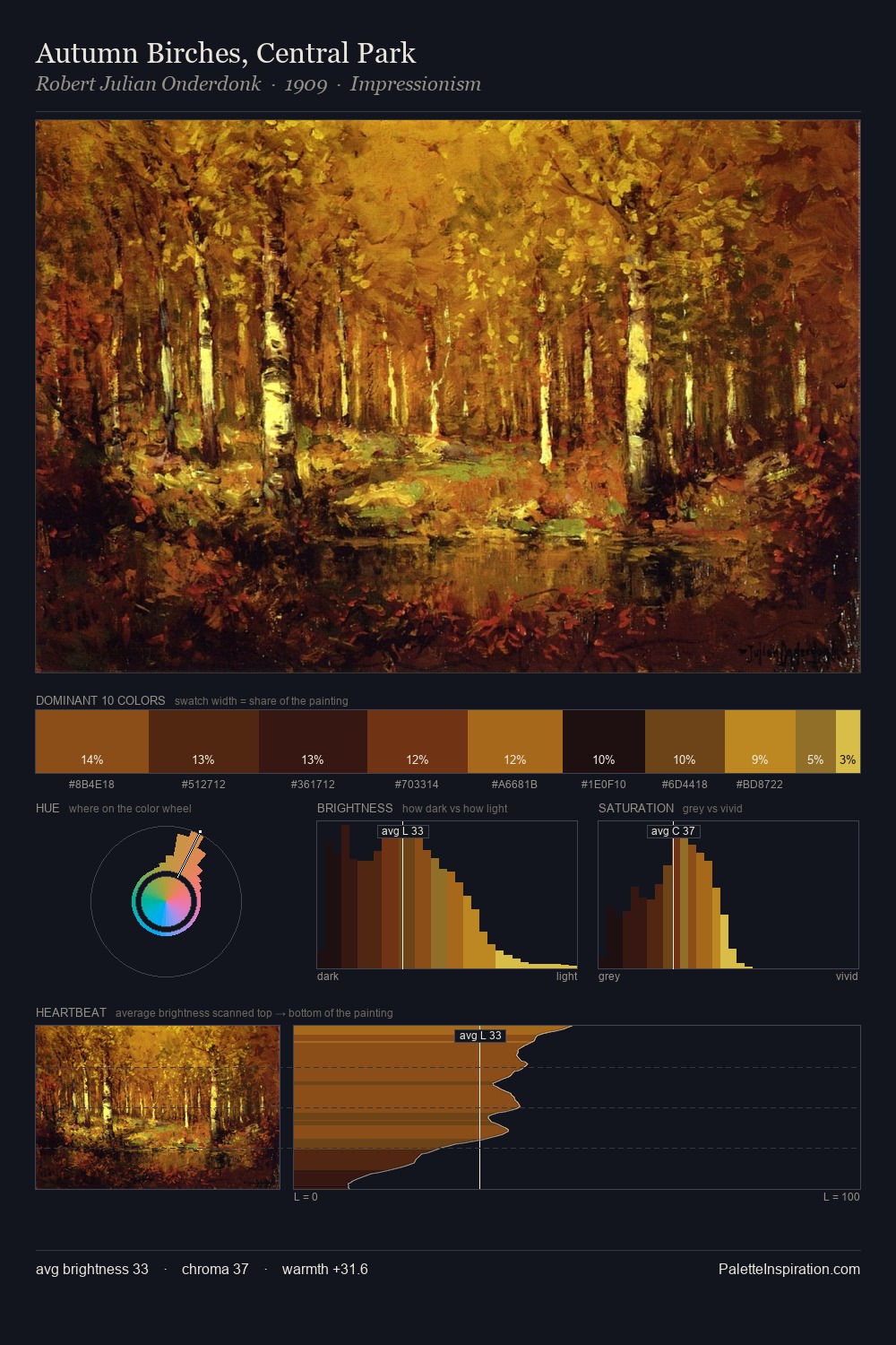
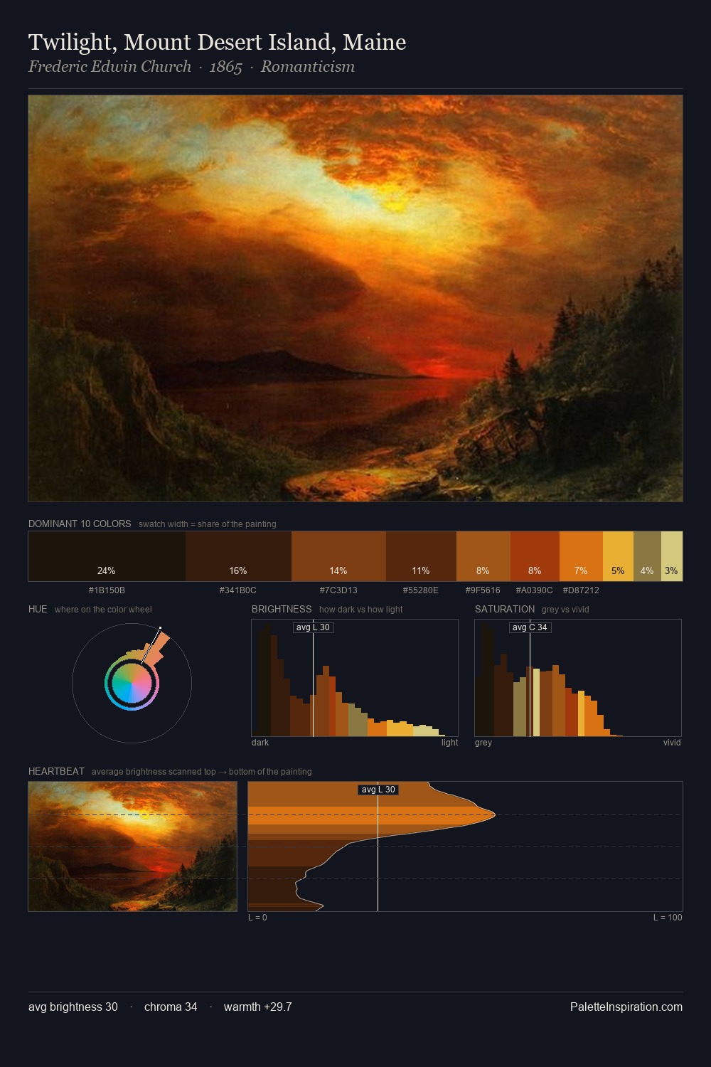
Adriaen van Ostade Palette 9

Palette Analysis
Adriaen van Ostade is built on dark foundations, with values clustered toward shadow. Adriaen van Ostade orchestrates warmth above all else - reds, ambers, and siennas take the lead. Saturation is deliberately withheld - the beauty here lies in the near-monochromatic gradations rather than colour difference. The most saturated colour, #A3570C, is reserved to 4.8% of the surface, where it acts as a focal punctuation. A value spread of 55 units gives the palette both depth and air - shadows are genuinely dark, lights genuinely light. Together these qualities place Adriaen van Ostade firmly in the tonal tradition - concerned with mood and atmosphere rather than chromatic display. This is palette 9 of Adriaen van Ostade's sequence - a single chapter in a chromatic story told across many works.
Example use cases
- theater design
- jewelry brands
- tobacco-adjacent retail
- event branding
- film & entertainment
I Love This!
Copy, export, or download for your project