Adriaen van Ostade Palette 8
Tenebrous Bister
Tenebrous Dark and murky - low-key values with obscured form, Baroque in temperament.
Bister Dark warm brown - a traditional ink and wash pigment made from wood soot.

Palette Analysis
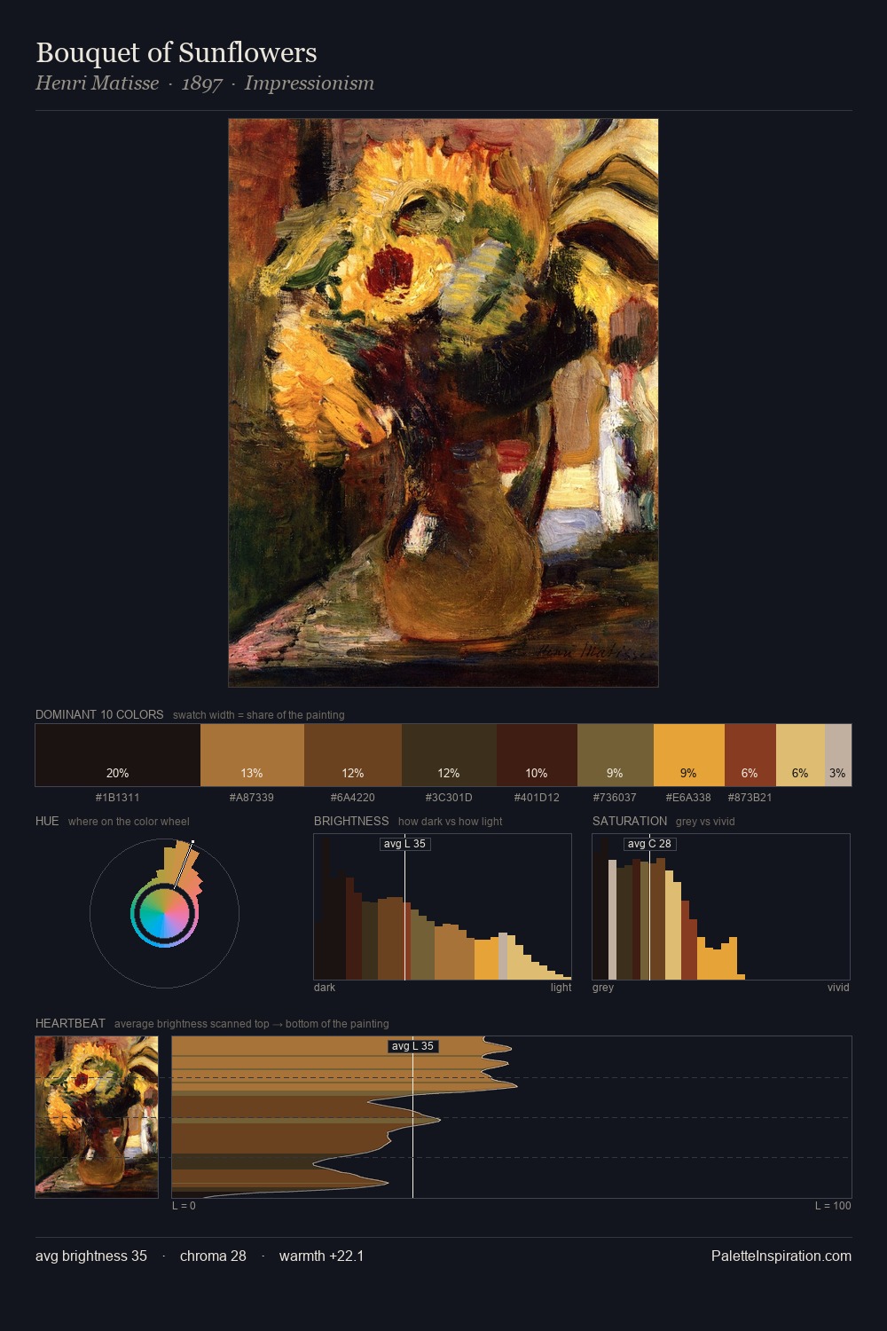
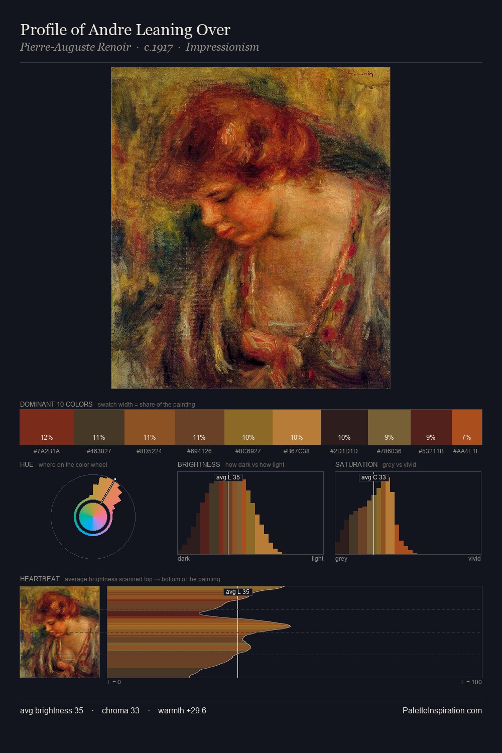
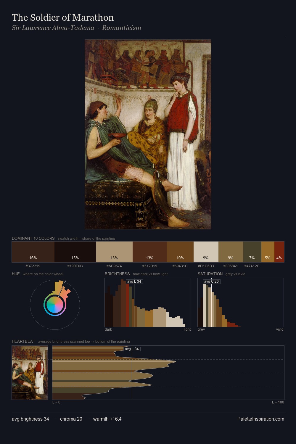
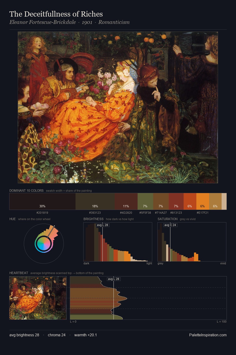
Adriaen van Ostade distributes its values across the middle register, creating harmony without high contrast. Adriaen van Ostade keeps warm and cool in parity, a balance that lends the work a perceptual shimmer. All colours lean toward grey, building depth through value rather than colour punch. The dominant colour, #120D12, takes 33.8% of the total area, establishing the overall mood before any other hue is introduced. #752A14 functions as the palette's exclamation mark: highest chroma, lowest percentage (1.1%). At 42 units across the value scale, the palette keeps contrast readable without letting it dominate. In the context of Adriaen van Ostade's full range of palettes, group 8 represents one movement in an ongoing chromatic dialogue.
Example use cases
- premium streaming
- cocktail bars
- fashion campaigns
- book covers
- music labels
I Love This!
Use This Palette
Copy, export, or download for your project
Copy, export, or download for your project
Copy:
Download:
Share: