Abstract Expressionism Master Palette

Palette Analysis
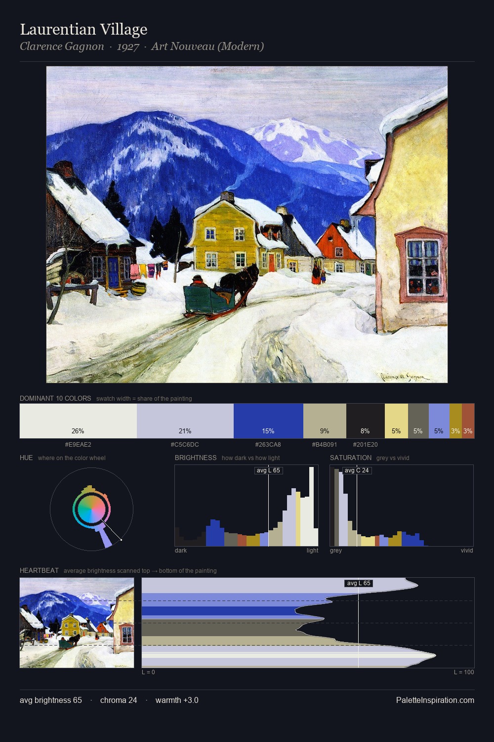
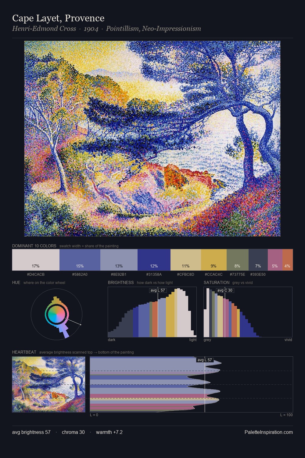
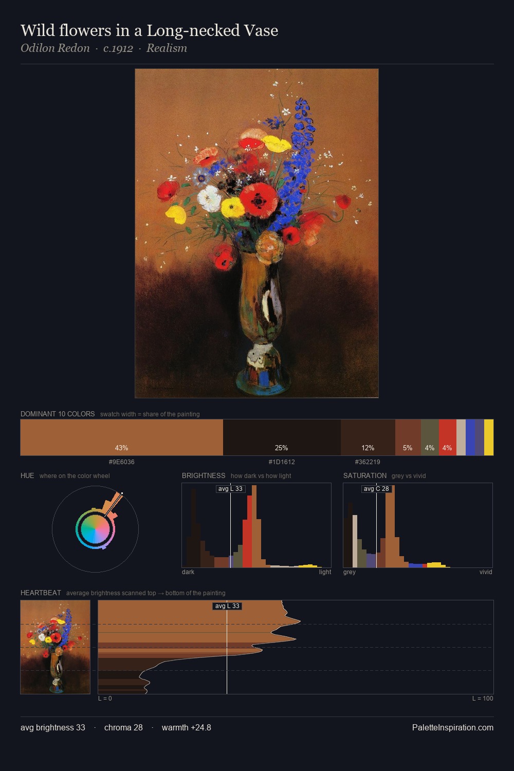
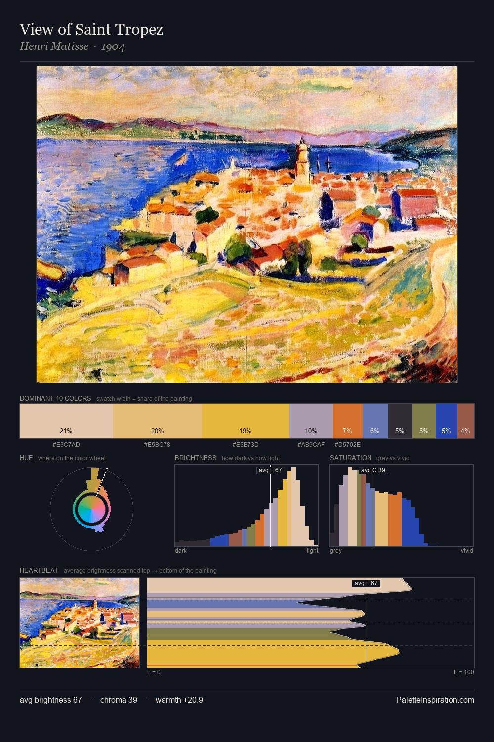
The colour logic of Abstract Expressionism is concentrated here: its characteristic value range, temperature bias, and chroma level. Abstract Expressionism sits in the centre of the value range, lending the palette a sense of even, sustained light. Neither warm nor cool has the upper hand here; the equilibrium between the two generates the palette's visual energy. Every colour is desaturated; the palette proceeds through near-neutrals and gently-coloured greys. The most saturated colour, #BF6141, is reserved to 7.0% of the surface, where it acts as a focal punctuation. 58 units of value range underpin the palette's structural clarity: the eye always knows where light falls. This is the light that Abstract Expressionism painters chose to live inside.
Example use cases
- ceramics & pottery
- boutique hospitality
- menswear
- heritage food brands
- craft & artisan brands
I Love This!
Copy, export, or download for your project