Abstract Expressionism Palette 2
Luminous Ivory
Luminous Self-illuminated feeling - high-key values with an inner glow quality.
Ivory Warm creamy white - the color of natural ivory, warmer than pure white.

Palette Analysis
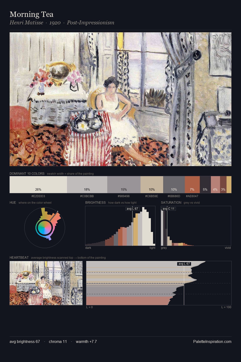
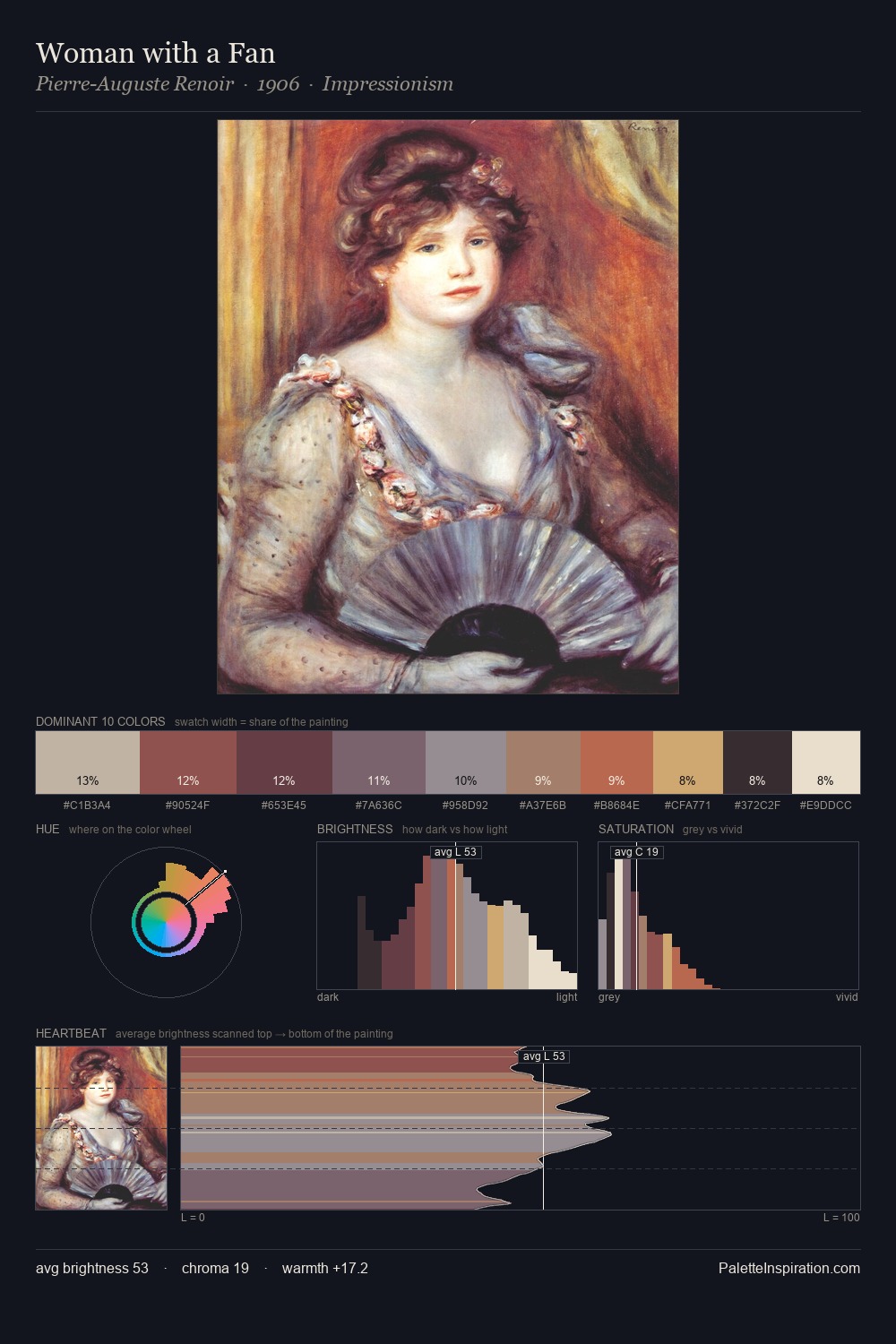
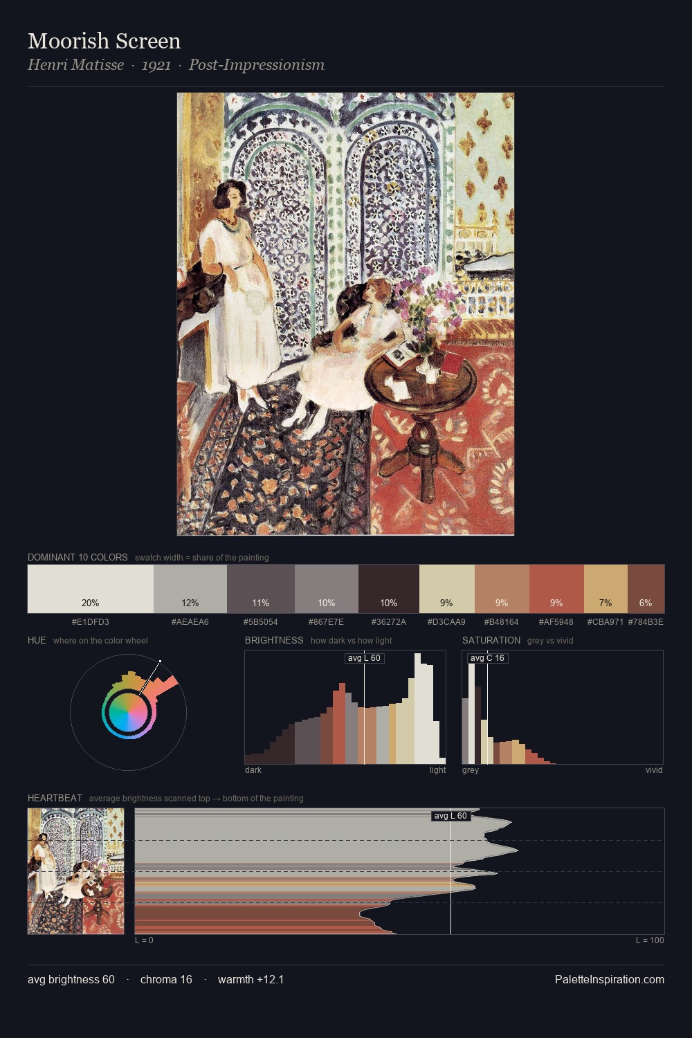
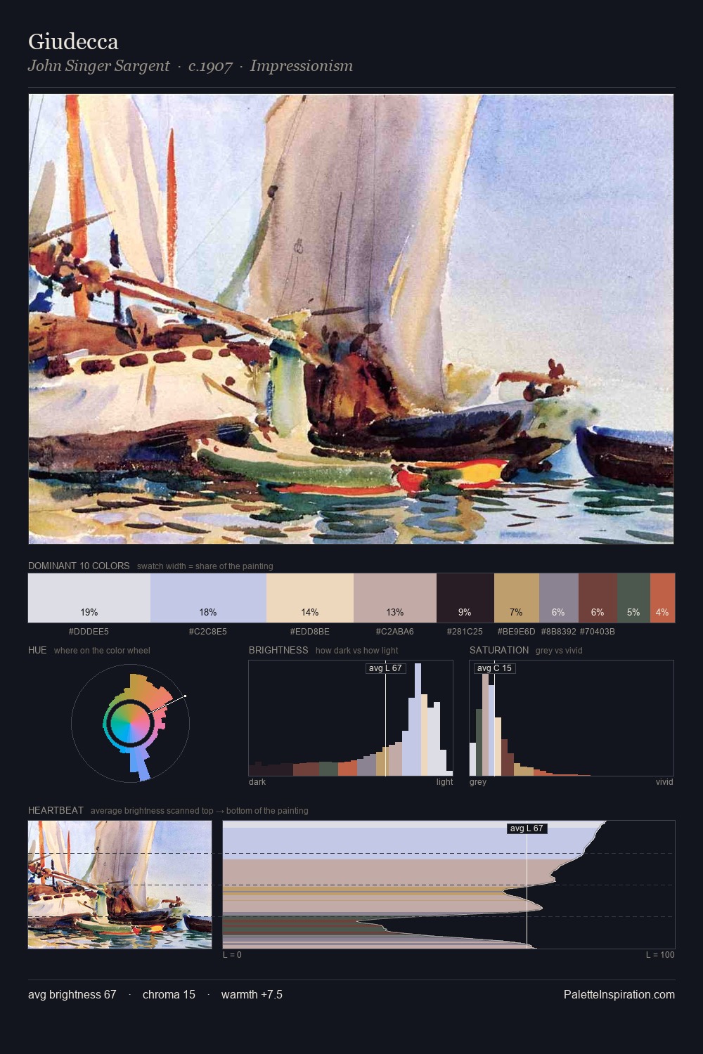
Abstract Expressionism is high in key: pale, luminous, and filled with optical air. The palette balances warm and cool with remarkable evenness, giving the composition its characteristic vibrancy. Chroma hovers near zero; colour declares itself through subtle shifts in hue rather than outright saturation. Only 2.9% is devoted to #7C4A4C, yet that small allocation delivers the palette's entire chromatic tension. A value spread of 62 units gives the palette both depth and air - shadows are genuinely dark, lights genuinely light.
Example use cases
- ceramics & pottery
- boutique hospitality
- menswear
- heritage food brands
- craft & artisan brands
I Love This!
Use This Palette
Copy, export, or download for your project
Copy, export, or download for your project
Copy:
Download:
Share: