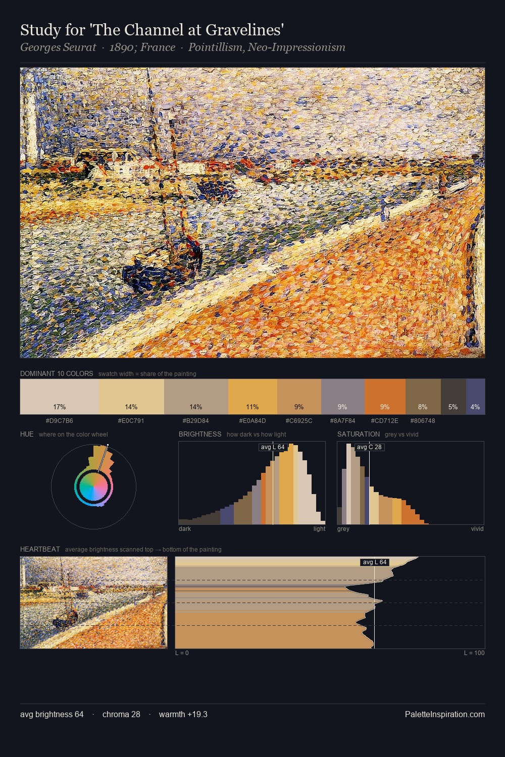
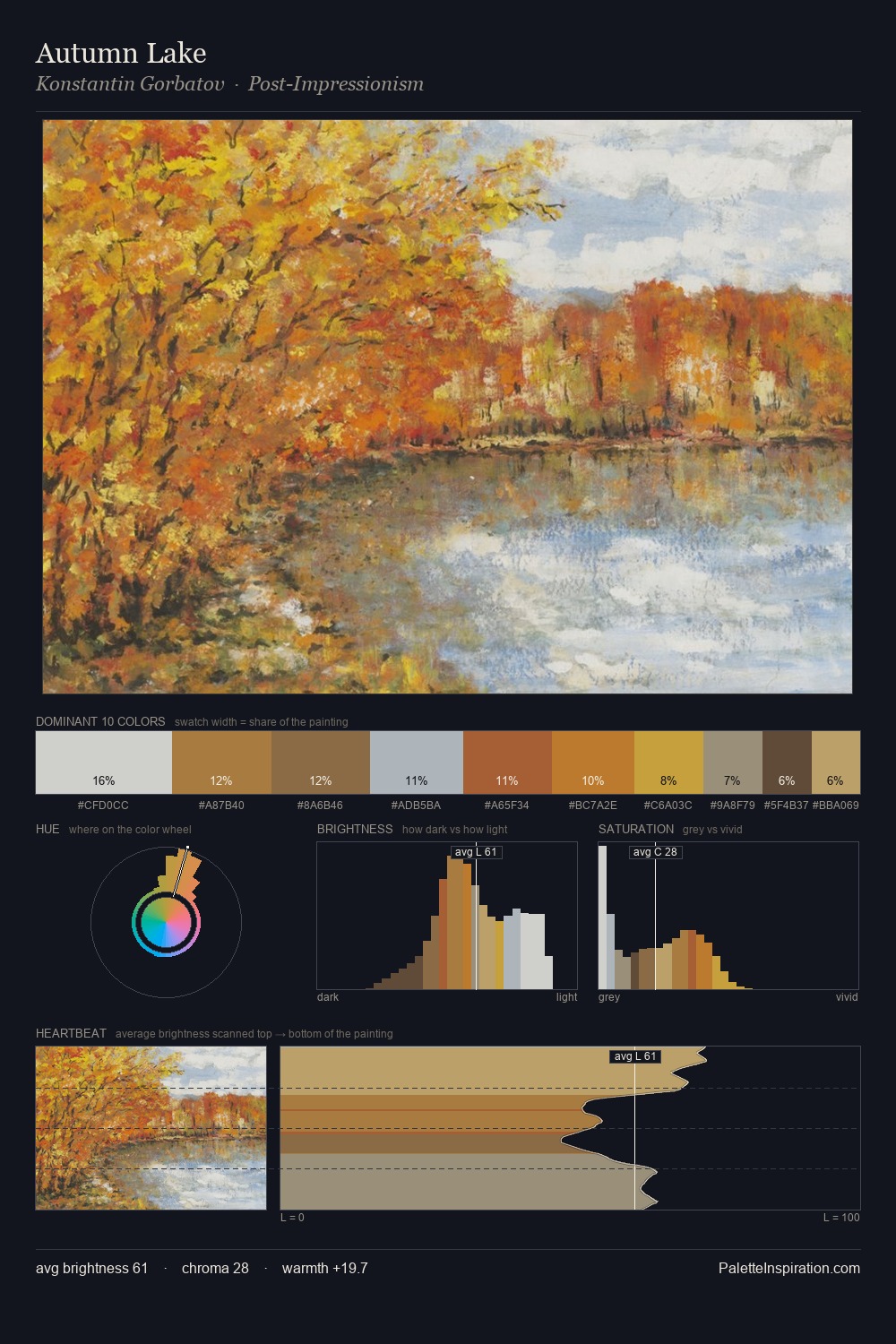
Abstract Expressionism Palette 5
Soft Apricot
Soft Low-contrast, gentle chroma - mid-key values and low saturation, approachable and calm.
Apricot Soft warm orange - peach-adjacent, the color of ripe stone fruit.

Palette Analysis
Abstract Expressionism occupies the comfortable middle of the value scale, avoiding both extremes to hold the eye in a sustained middle grey. Cool tones set the register here - the blues and greens easily outweigh any warm accents. Chroma is held at a comfortable level - distinct colours, but no single hue is allowed to overwhelm. The most saturated colour, #CE9626, is reserved to 7.8% of the surface, where it acts as a focal punctuation. The palette spans 50 value units: a measured range that delivers coherence over drama. The mid-to-high key, cool bias, and moderate chroma point to outdoor observation - sky and diffused daylight as the dominant light source.
Example use cases
- ceramics & pottery
- boutique hospitality
- menswear
- heritage food brands
- craft & artisan brands
I Love This!
Use This Palette
Copy, export, or download for your project
Copy, export, or download for your project
Copy:
Download:
Share: