William Stanley Haseltine Palette 4

Palette Analysis
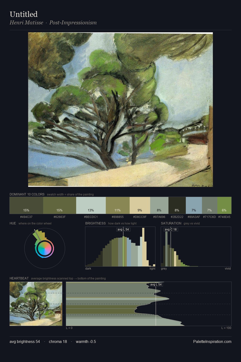
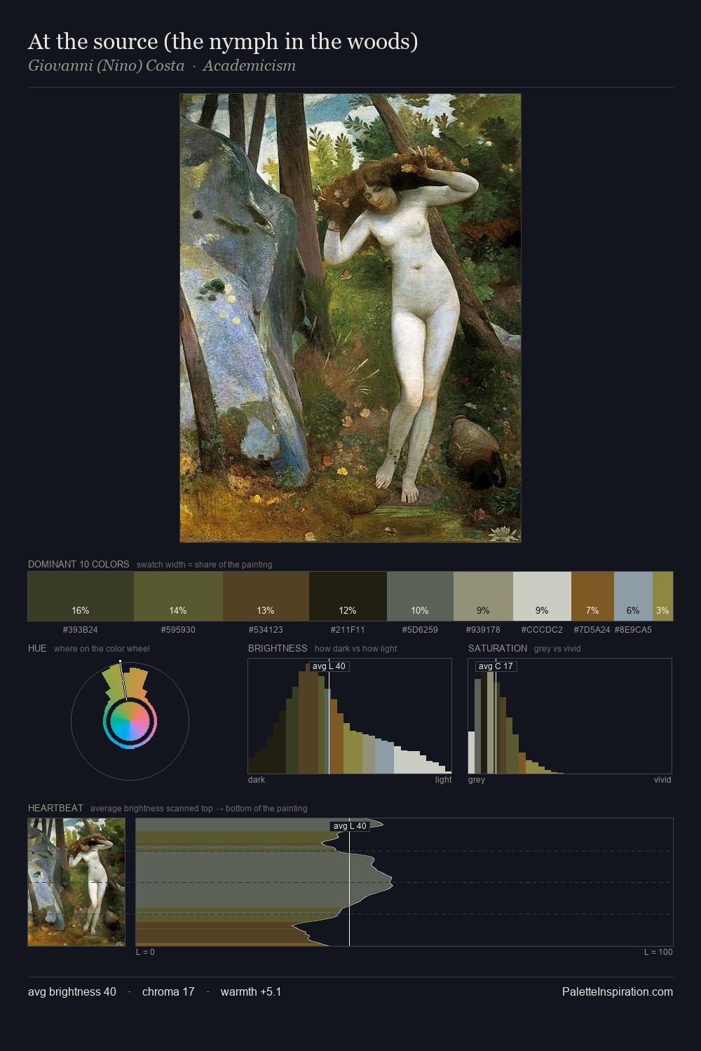
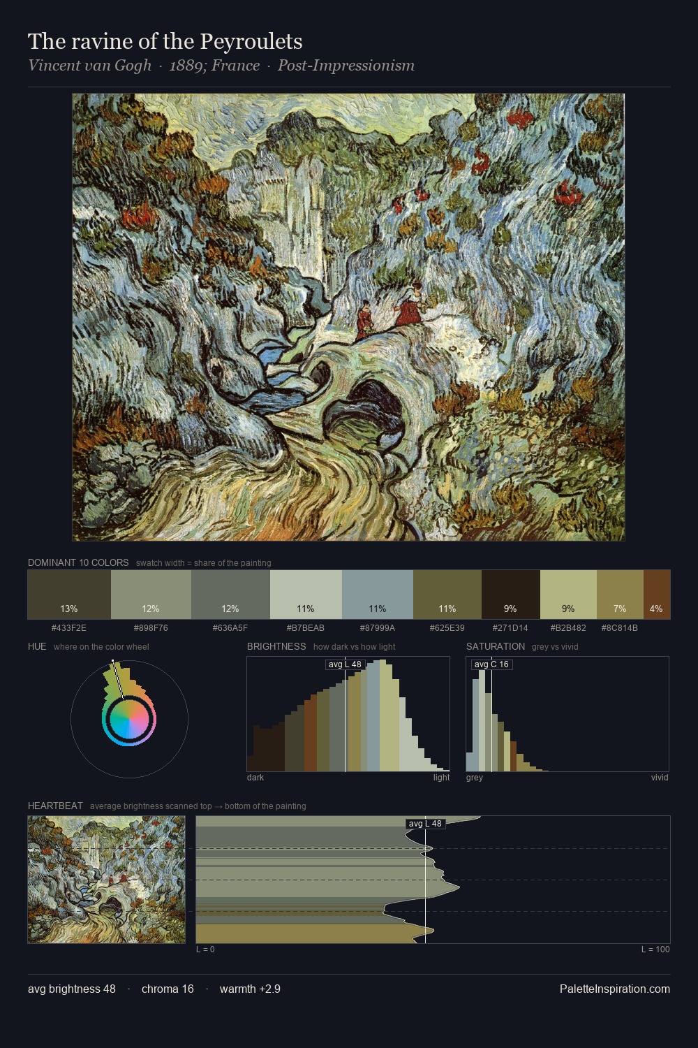
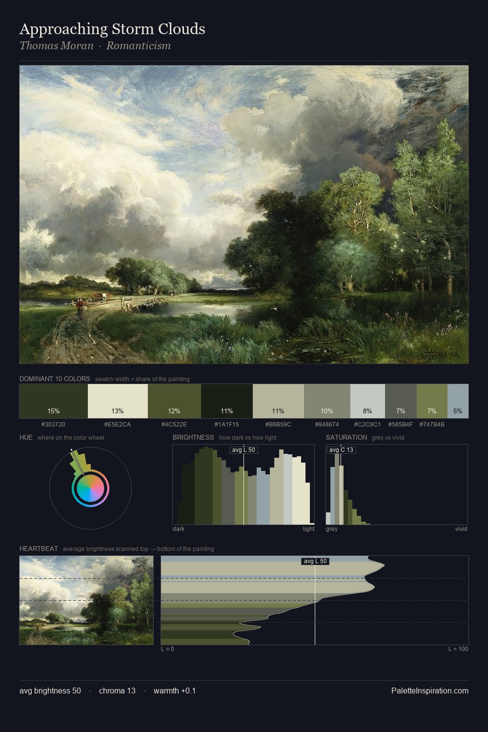
The value structure of William Stanley Haseltine is mid-key: quiet, controlled, and cohesive. Cool hues prevail: blues, greens, and greys anchor the palette's emotional temperature. Saturation is deliberately withheld - the beauty here lies in the near-monochromatic gradations rather than colour difference. The most saturated colour, #85ADB7, is reserved to 4.5% of the surface, where it acts as a focal punctuation. From deepest dark to palest light, the palette traverses 58 units of the value scale - a span that creates natural depth. The mid-to-high key, cool bias, and moderate chroma point to outdoor observation - sky and diffused daylight as the dominant light source. William Stanley Haseltine's palette 4 carries its own internal logic while remaining in conversation with the artist's broader colour intelligence.
Example use cases
- nonprofit identity
- public libraries
- historical sites
- literary journals
- archival print
I Love This!
Copy, export, or download for your project