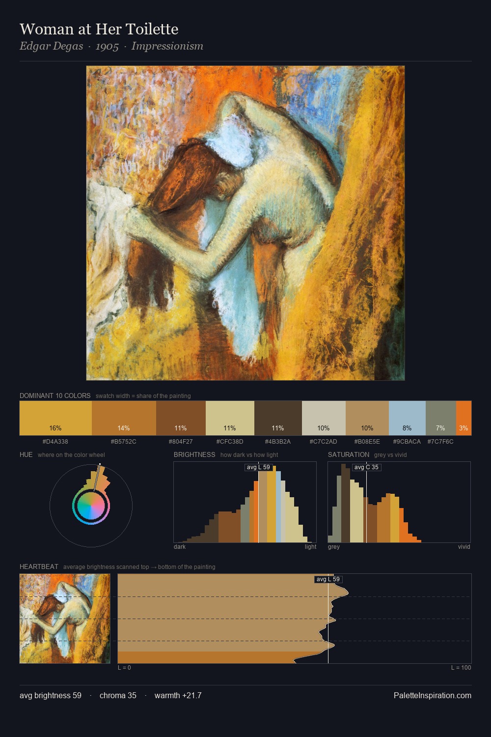
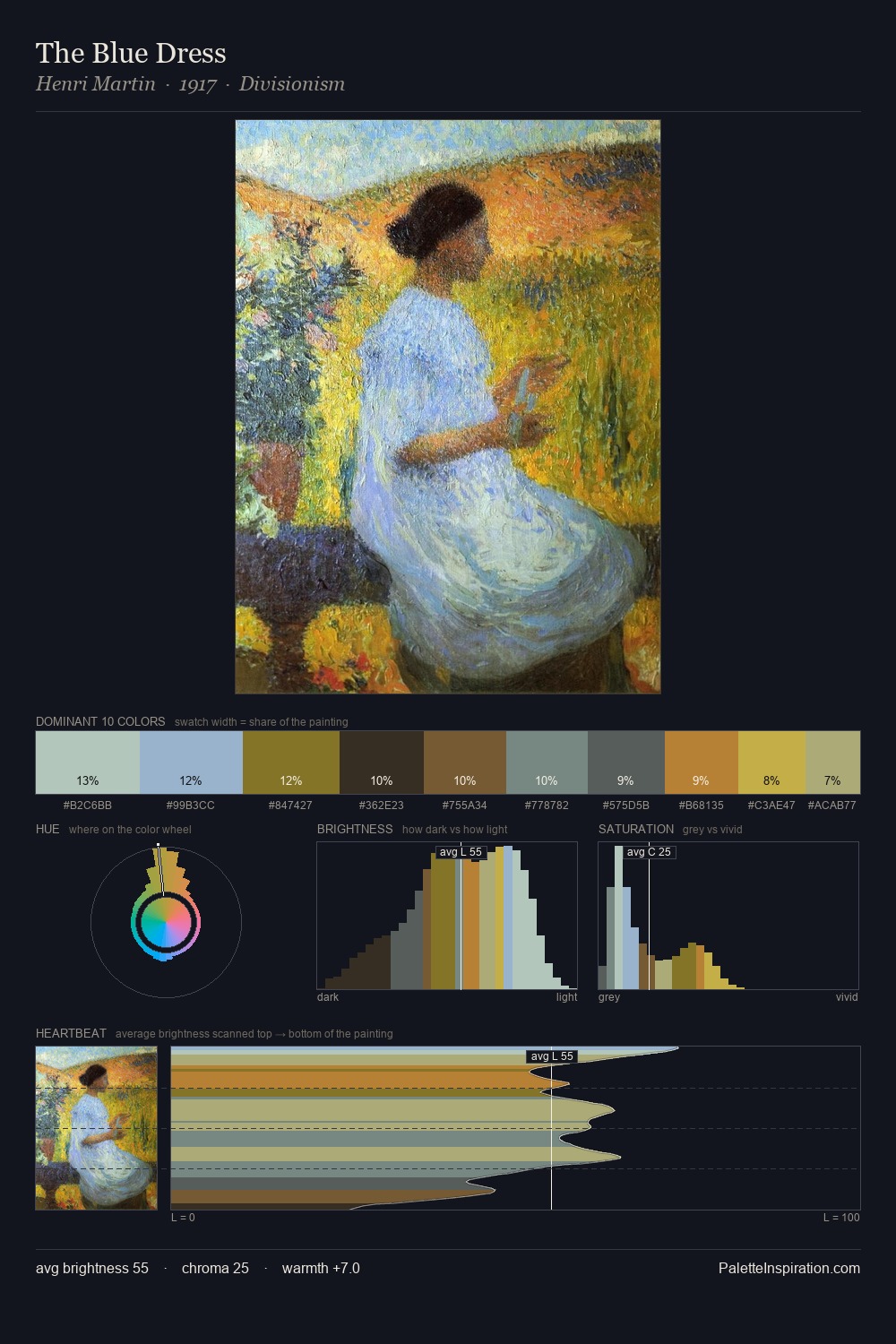
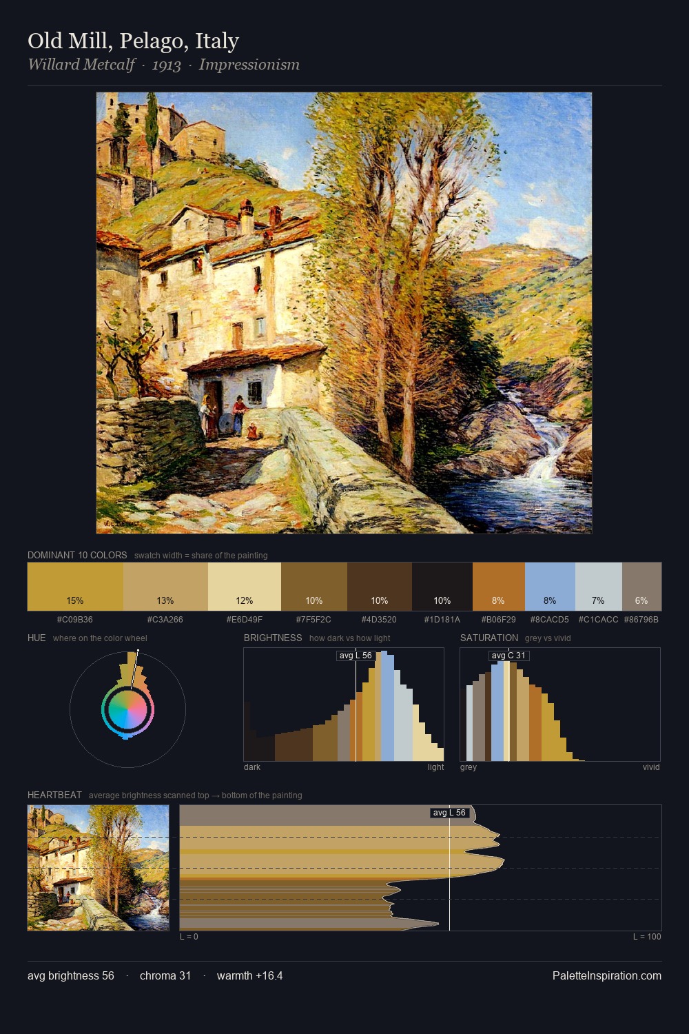
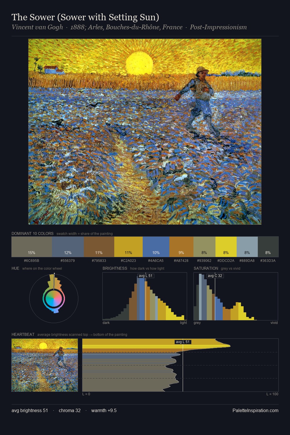
William Stanley Haseltine Palette 3
Muted Tawny
Muted Deliberately desaturated - chroma pulled toward gray, the restraint of tonal painting.
Tawny Warm orange-brown - a traditional term for the color of tanned leather or lion fur.

Palette Analysis
William Stanley Haseltine occupies the comfortable middle of the value scale, avoiding both extremes to hold the eye in a sustained middle grey. The dominant temperature is warm, with earth tones and fire-hues setting the emotional key. Saturation is deliberately withheld - the beauty here lies in the near-monochromatic gradations rather than colour difference. Only 2.9% is devoted to #B46D1C, yet that small allocation delivers the palette's entire chromatic tension. Value range is moderate at 45 units - enough contrast for legibility, not so much as to fragment the tonal unity. William Stanley Haseltine's palette 3 carries its own internal logic while remaining in conversation with the artist's broader colour intelligence.
Example use cases
- ceramics & pottery
- boutique hospitality
- menswear
- heritage food brands
- craft & artisan brands
I Love This!
Use This Palette
Copy, export, or download for your project
Copy, export, or download for your project
Copy:
Download:
Share: