Wilhelm Marstrand Palette 1

Palette Analysis
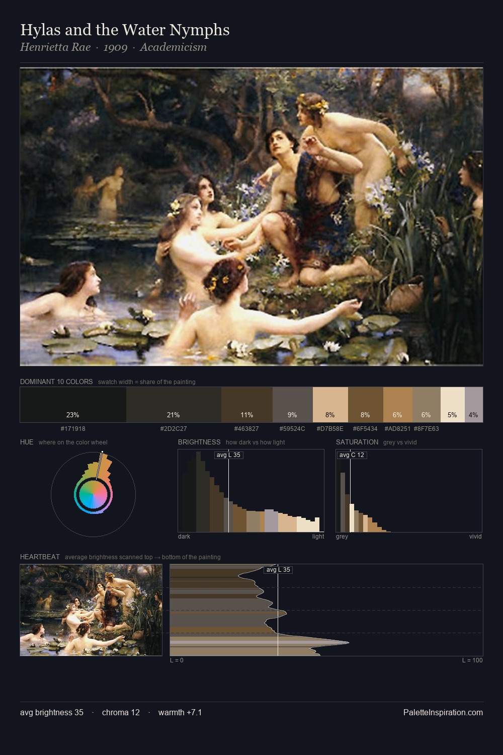
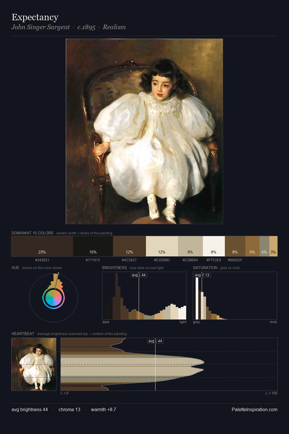
Wilhelm Marstrand occupies the comfortable middle of the value scale, avoiding both extremes to hold the eye in a sustained middle grey. Cool tones set the register here - the blues and greens easily outweigh any warm accents. Saturation is deliberately withheld - the beauty here lies in the near-monochromatic gradations rather than colour difference. Wilhelm Marstrand gives 27.6% of the composition to a single #101314 - a decisive chromatic anchor. The highest-chroma note - #422E1C - appears at just 3.4%, deployed as a precision accent against the quieter ground. The value range spans 74 units across the palette, providing the full gamut from deep shadow to near-white and ensuring clear tonal hierarchy. The mid-to-high key, cool bias, and moderate chroma point to outdoor observation - sky and diffused daylight as the dominant light source. Palette 1 sits within the larger chromatic argument that Wilhelm Marstrand's complete body of work advances.
Example use cases
- boutique hospitality
- film production
- menswear
- art prints & posters
- heritage brands
I Love This!
Copy, export, or download for your project