Wilhelm Kotarbinski Palette 8

Palette Analysis
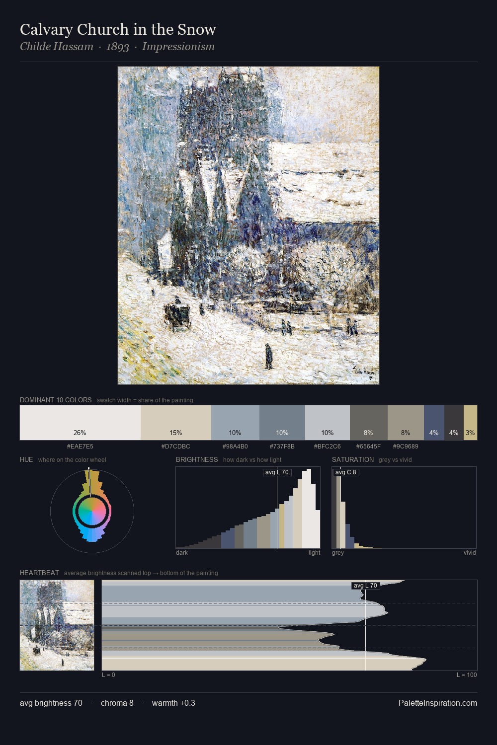
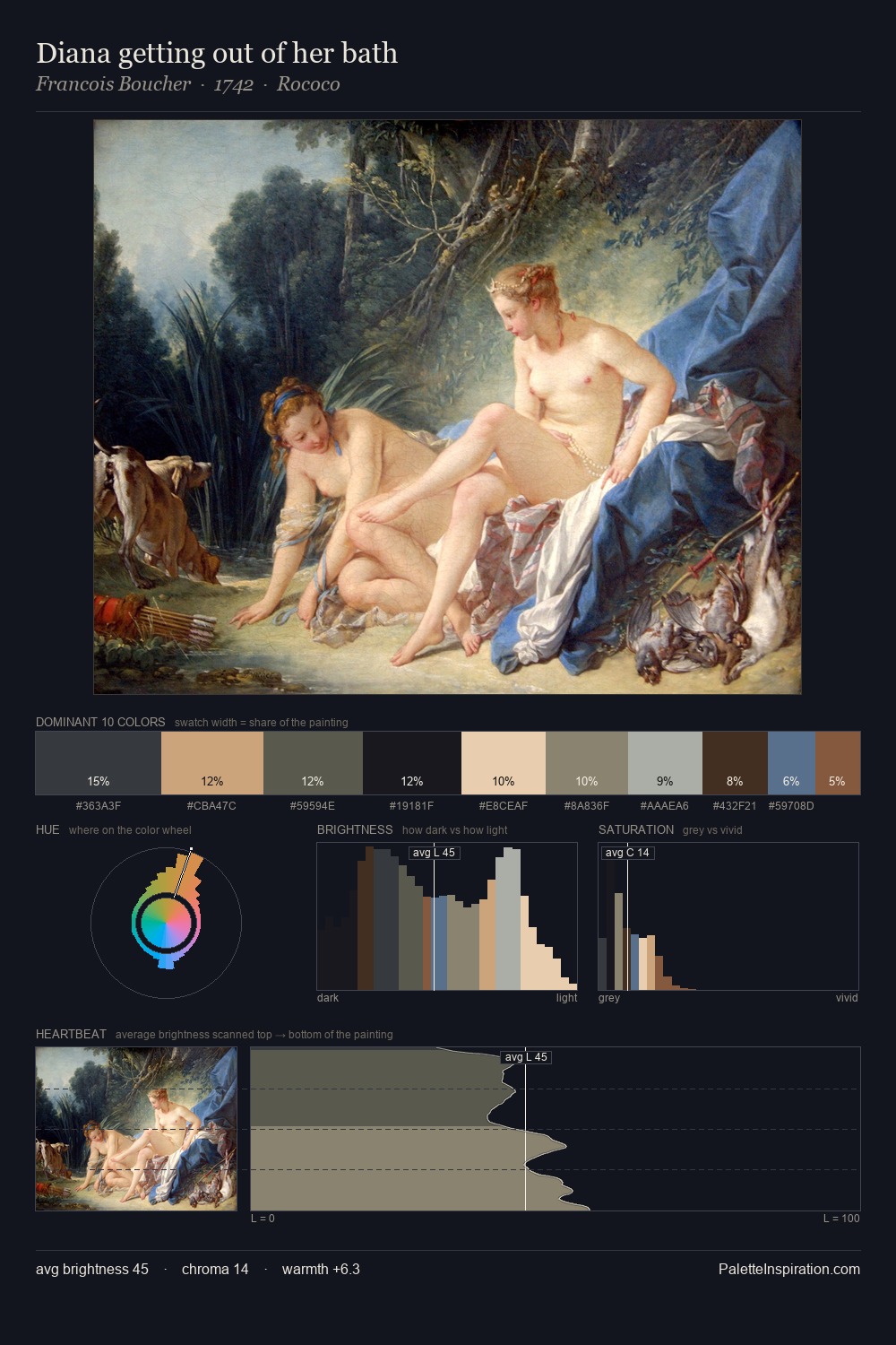
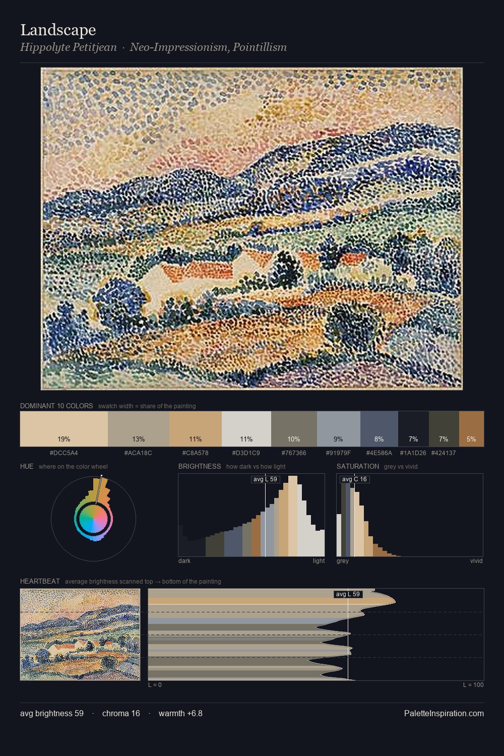
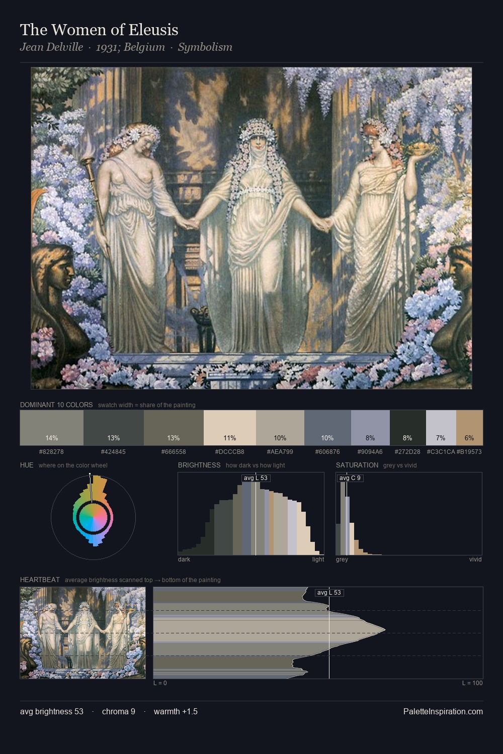
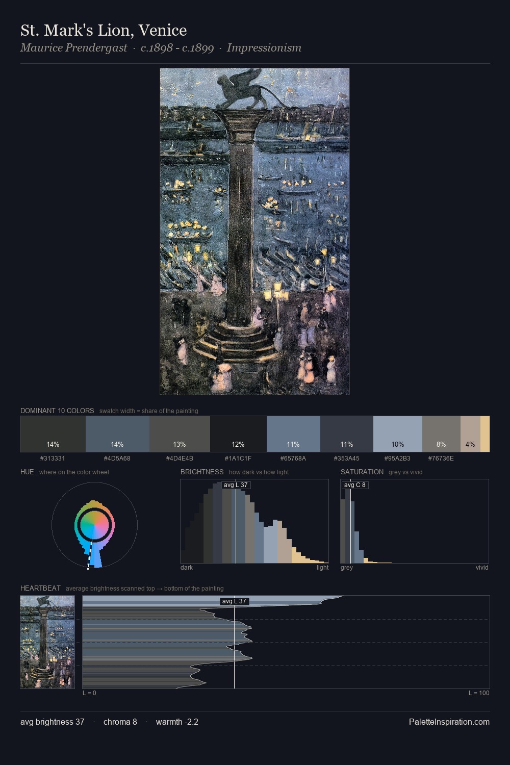
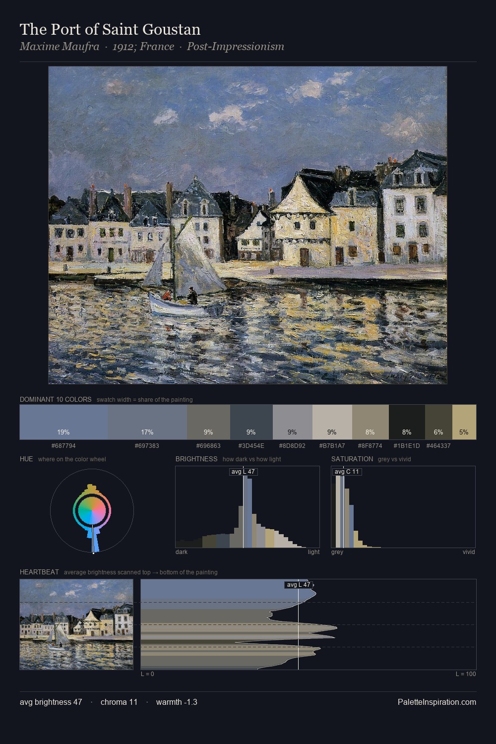
Wilhelm Kotarbinski sits in the centre of the value range, lending the palette a sense of even, sustained light. A distinctly cool atmosphere runs through this palette: sky, water, and mist given colour form. All colours lean toward grey, building depth through value rather than colour punch. Only 11.0% is devoted to #375A7A, yet that small allocation delivers the palette's entire chromatic tension. The value range of 53 units sits in the comfortable middle: enough depth, enough light, neither extreme. The palette has the character of outdoor light: cool, mid-bright, with colour rendered faithfully rather than expressively. Wilhelm Kotarbinski's palette 8 carries its own internal logic while remaining in conversation with the artist's broader colour intelligence.
Example use cases
- publishing
- corporate identity
- consumer apps
- hospitality
- design agencies
I Love This!
Copy, export, or download for your project