Wilhelm Kotarbinski Palette 2

Palette Analysis
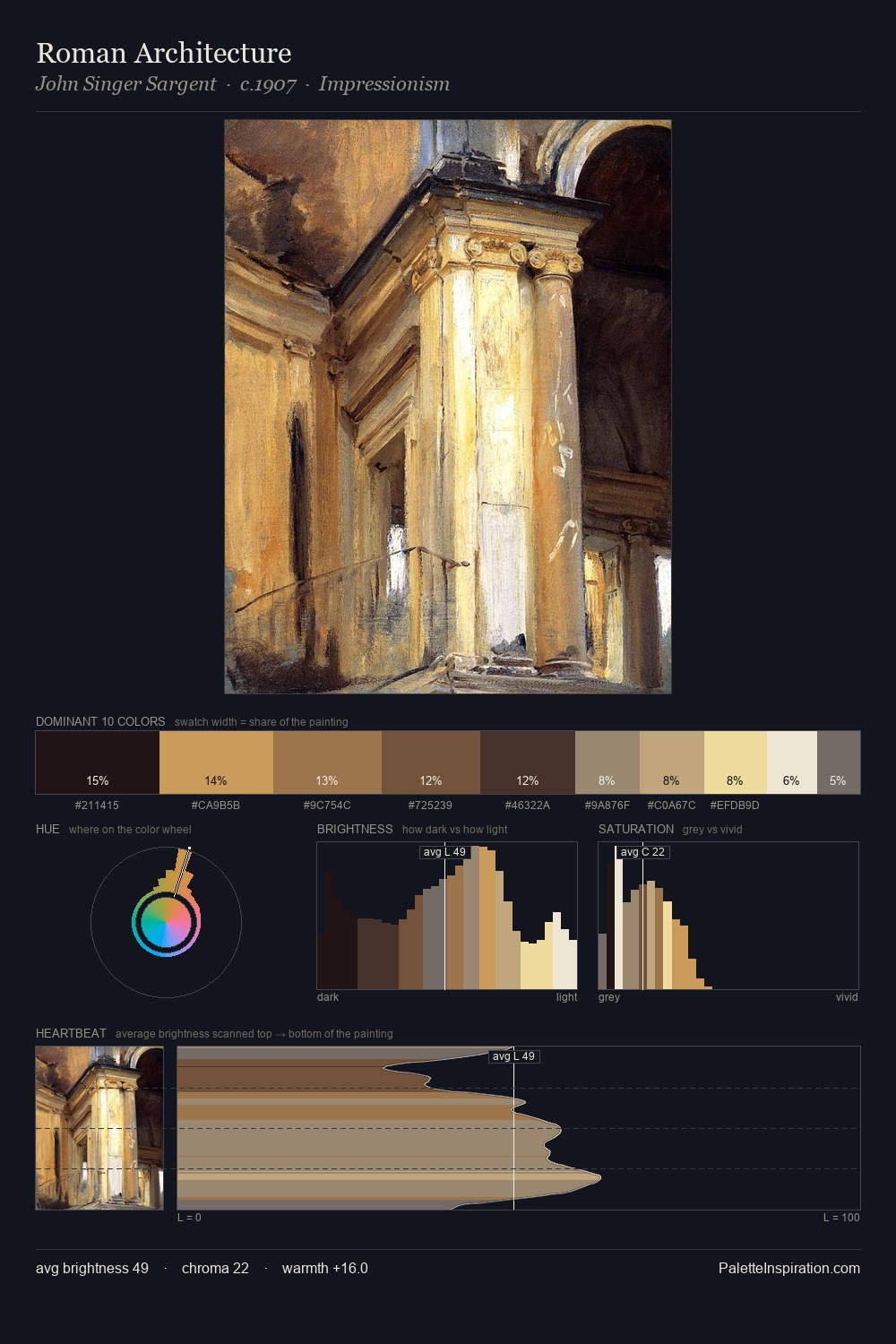
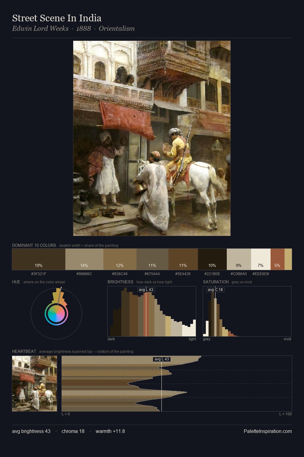
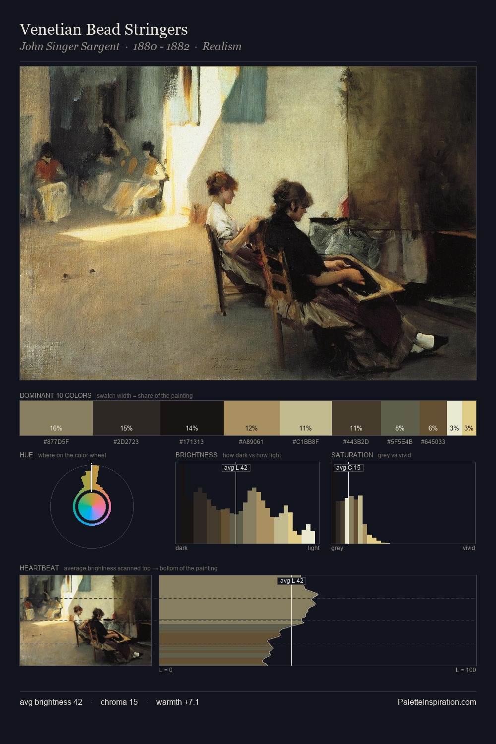
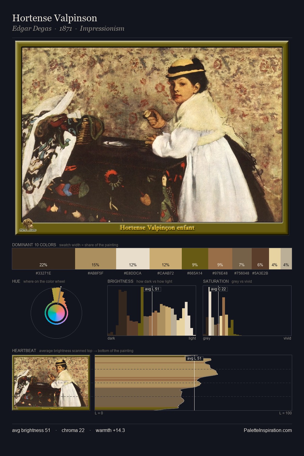
Mid-key values give Wilhelm Kotarbinski its characteristic quietness - nothing blazes, nothing disappears. Wilhelm Kotarbinski tilts toward cool - blues and silver-greys carry the structural weight. Every colour is desaturated; the palette proceeds through near-neutrals and gently-coloured greys. Only 10.2% is devoted to #6A4D33, yet that small allocation delivers the palette's entire chromatic tension. A value spread of 61 units gives the palette both depth and air - shadows are genuinely dark, lights genuinely light. High luminosity and cool temperature suggest the plein-air condition: unfiltered daylight and open sky. Wilhelm Kotarbinski's palette 2 carries its own internal logic while remaining in conversation with the artist's broader colour intelligence.
Example use cases
- interior design
- furniture brands
- cookbook publishing
- wine & spirits
- food packaging
I Love This!
Copy, export, or download for your project