Walter Osborne Palette 3

Palette Analysis
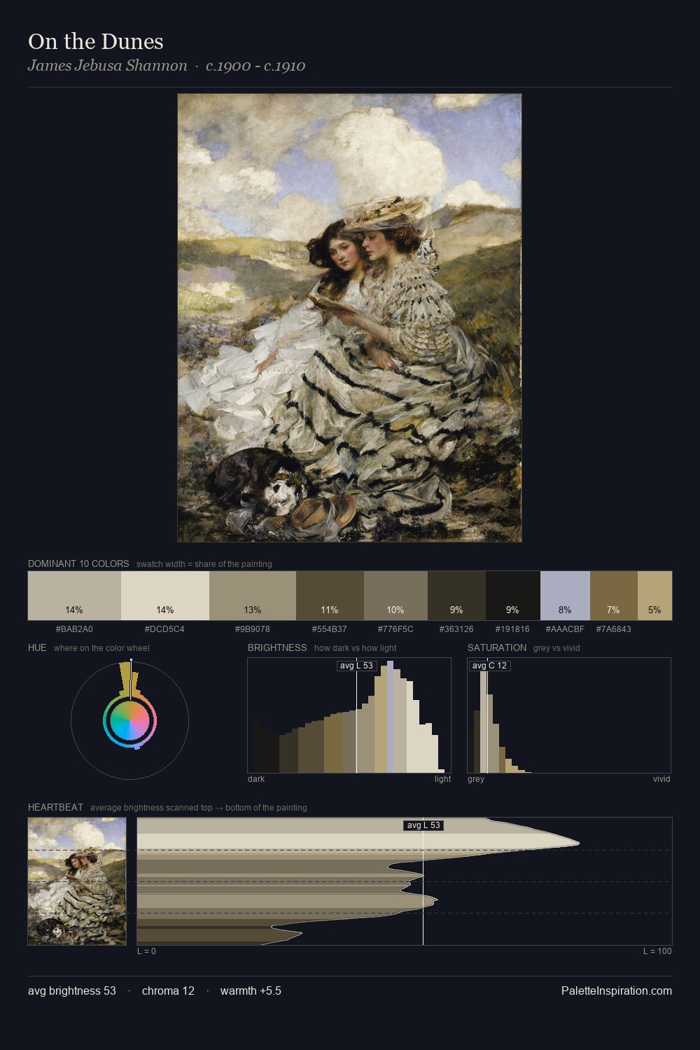
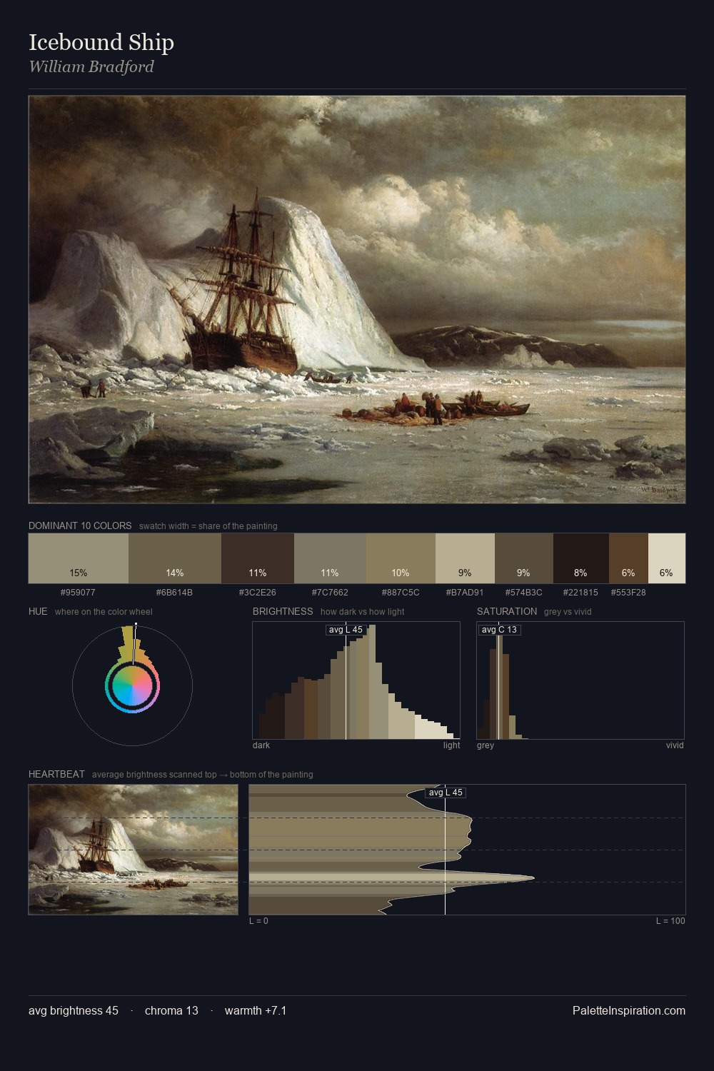
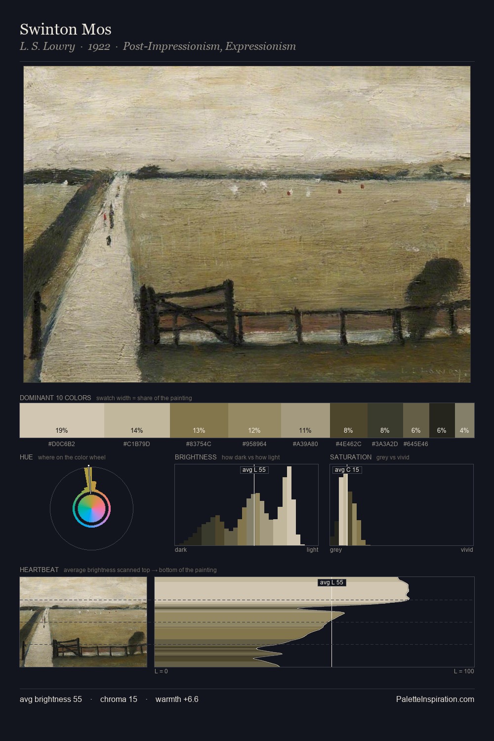
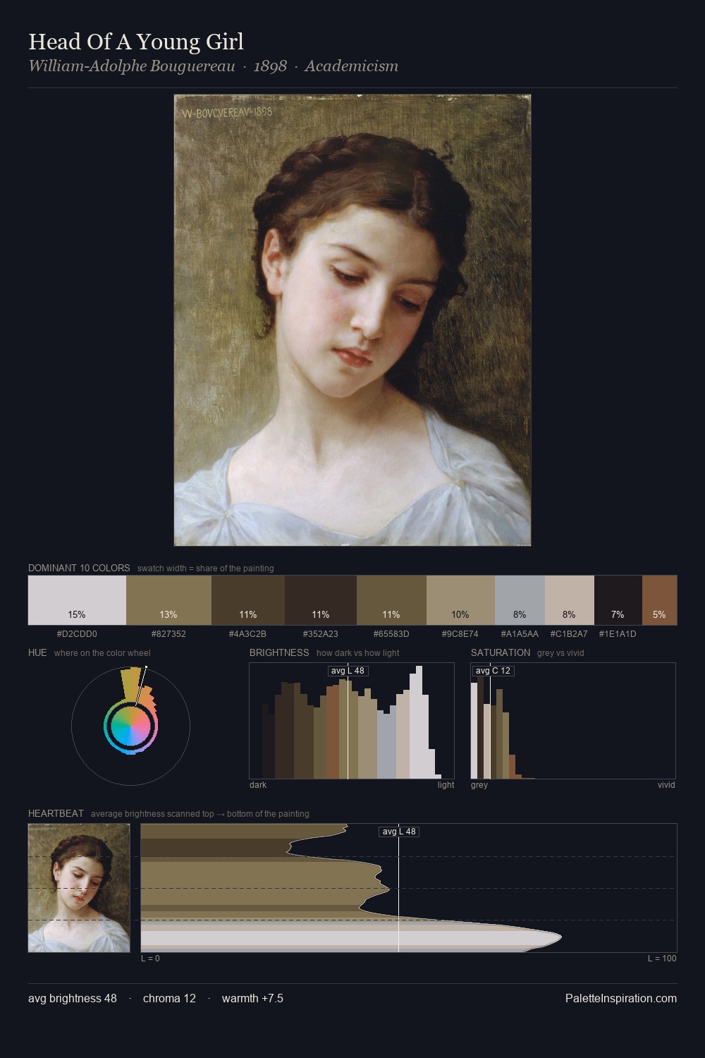
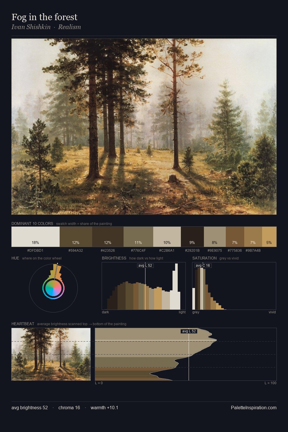
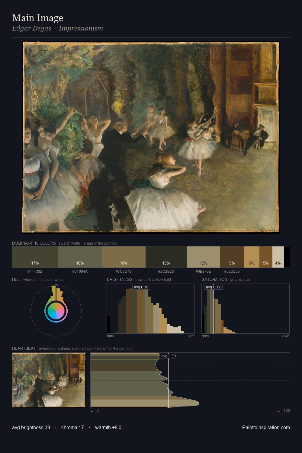
Walter Osborne distributes its values across the middle register, creating harmony without high contrast. Blues and teal-greys govern the palette, lending it an aquatic or atmospheric quality. Muted throughout, the palette achieves its effects through value and temperature rather than chromatic force. The saturated accent, #6E5C3E, registers at 6.2% - sparse enough to feel like a deliberate surprise. From deepest dark to palest light, the palette traverses 55 units of the value scale - a span that creates natural depth. The palette has the character of outdoor light: cool, mid-bright, with colour rendered faithfully rather than expressively. Walter Osborne's palette 3 carries its own internal logic while remaining in conversation with the artist's broader colour intelligence.
Example use cases
- exhibition design
- foundation branding
- estate management
- art education
- museums & galleries
I Love This!
Copy, export, or download for your project