Walter Osborne Palette 2
Muted Apricot
Muted Deliberately desaturated - chroma pulled toward gray, the restraint of tonal painting.
Apricot Soft warm orange - peach-adjacent, the color of ripe stone fruit.

Palette Analysis
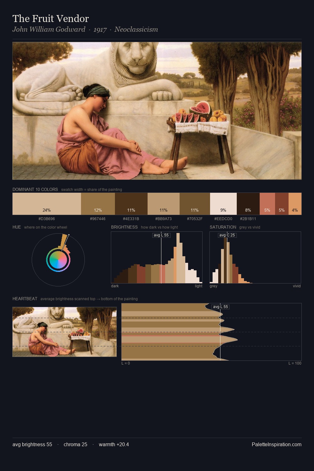
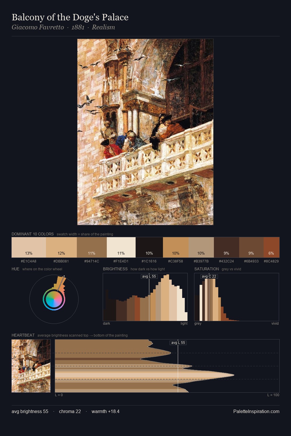
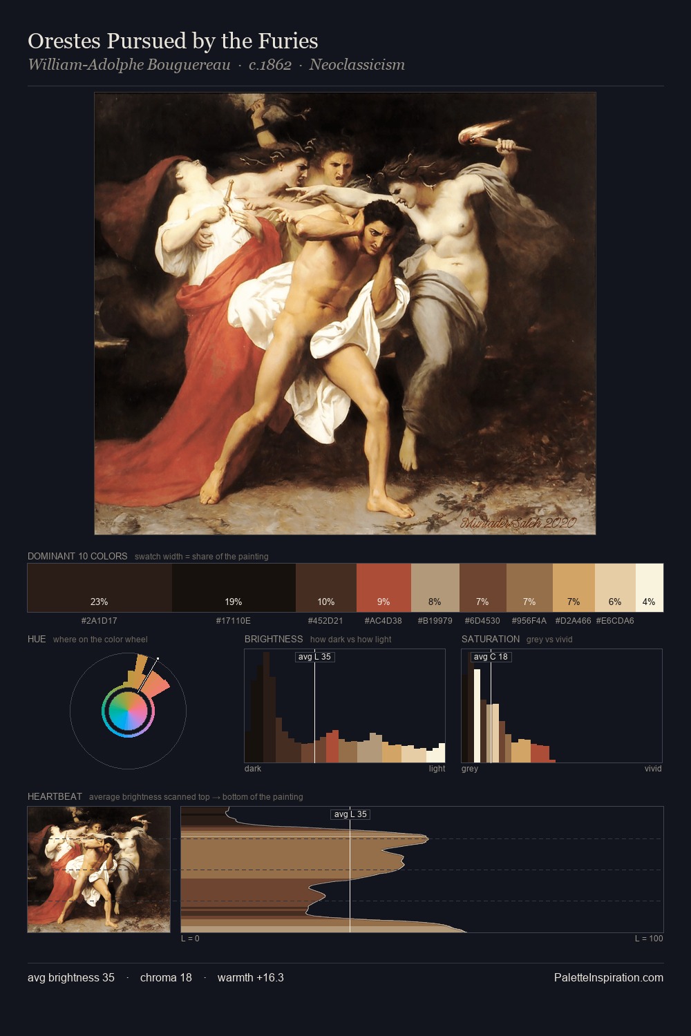
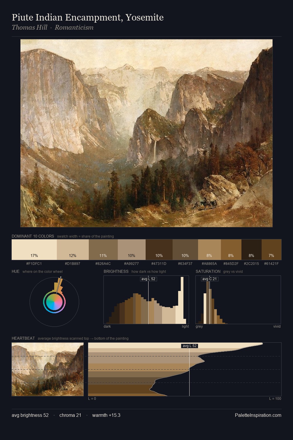
The value structure of Walter Osborne is mid-key: quiet, controlled, and cohesive. Temperature reads distinctly warm: the reds and earth tones from Walter Osborne carry the compositional weight. Every colour is desaturated; the palette proceeds through near-neutrals and gently-coloured greys. The highest-chroma note - #302116 - appears at just 5.4%, deployed as a precision accent against the quieter ground. From deepest dark to palest light, the palette traverses 69 units of the value scale - a span that creates natural depth. This is palette 2 of Walter Osborne's sequence - a single chapter in a chromatic story told across many works.
Example use cases
- art galleries
- creative studios
- consumer goods
- lifestyle media
- professional services
I Love This!
Use This Palette
Copy, export, or download for your project
Copy, export, or download for your project
Copy:
Download:
Share: